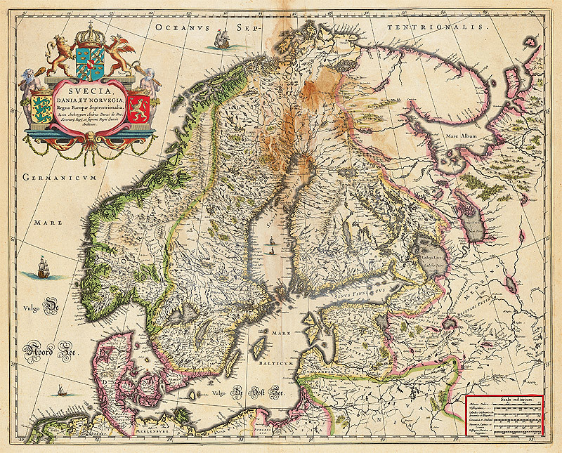

Most people assume medieval and Renaissance mapmakers were just guessing, filling blank spaces with sea monsters and hopeful scribbles. That’s the comfortable version of history. Then you actually look at the maps.
A strange pattern keeps surfacing in map archives, university libraries, and rare book vaults: coastlines, land bridges, and continents appearing on paper decades or even centuries before anyone officially “discovered” them. Skeptics call it coincidence, clever compilation, or outright forgery. Believers call it proof that lost knowledge kept resurfacing in the wrong hands. Either way, these documents have kept historians and archivists arguing for generations, and once you see what’s actually drawn on them, you’ll understand why.
#19 – The Ebstorf Map’s Vanished Original
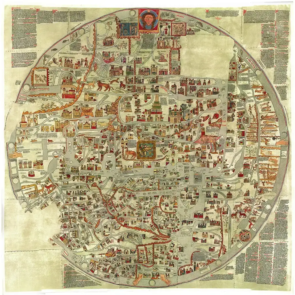
The Ebstorf Map was one of the largest medieval world maps ever produced, a sprawling circular chart that placed Jerusalem dead center and stretched the known world around it like a wheel. It blended religious symbolism with geography, marking cities, rivers, and mythical creatures side by side as if they carried equal weight. Historians still argue over how its makers fused monastic record-keeping with genuine travelers’ accounts.
What makes it maddening is the timing of its loss. The original medieval manuscript was rediscovered in the 1830s, photographed and studied for decades, then destroyed in an Allied bombing raid on Hanover in 1943. Everything scholars know now comes from black-and-white photographs and hand-copies made before the fire, which means the actual pigments, ink layers, and fine details are gone forever. That gap in the record is unsettling on its own, but the next map has almost the opposite problem: too much detail to explain.
Fast Facts
- Assembled from roughly 30 stitched goatskin parchment panels into a circle about 3.6 meters (12 feet) across.
- Believed to have been produced around 1235-1240, likely tied to the convent at Ebstorf in Lower Saxony.
- Vanished from historical memory for centuries before resurfacing in the 1830s.
- Destroyed in a 1943 bombing raid; only pre-war photographs and copies remain today.
#18 – The Hereford Mappa Mundi’s Impossible Detail Density
![#18 - The Hereford Mappa Mundi's Impossible Detail Density (File:Hereford Mappa Mundi 1300.jpg, notes in: 1.; 2.; 3.; [1]., CC BY-SA 3.0)](https://nvmwebsites-budwg5g9avh3epea.z03.azurefd.net/dws/b35676b1f6cf0a34444125ba33ab3a8d.webp)
The Hereford Mappa Mundi, drawn around 1300 and still housed in Hereford Cathedral, packs in more than a thousand illustrations and place names onto a single sheet of calfskin. It mixes real cities like Rome and Jerusalem with biblical locations, mythical islands, and creatures pulled from classical bestiaries. For a document made before printing presses existed, the sheer information density is staggering.
Historians generally agree the map’s makers drew from Roman geographic texts, biblical sources, and earlier world maps that no longer survive, which means the Hereford map may be the last visible trace of cartographic knowledge that otherwise vanished entirely. Nobody has ever located the source maps it was almost certainly copied from, meaning an unknown number of even older, more detailed charts simply disappeared from history. Sailors, it turns out, may have been sitting on an even bigger secret.
#17 – Portolan Charts and a Precision Nobody Can Fully Explain
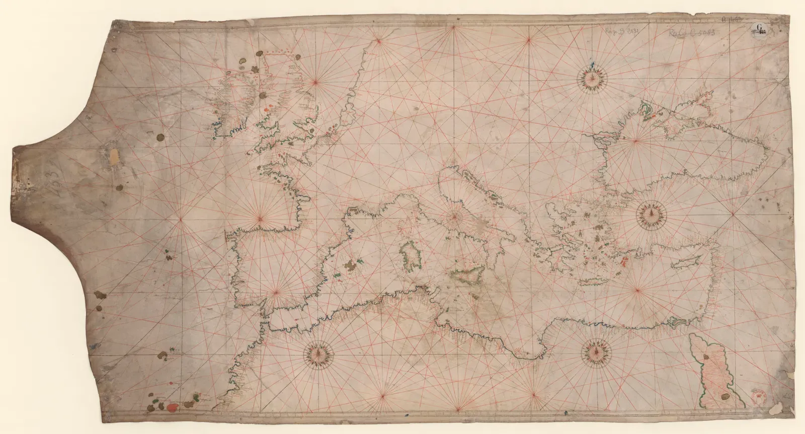
Portolan charts emerged in Italian and Catalan port cities during the 13th and 14th centuries, and they look shockingly different from the symbolic, religiously-oriented maps of the same era. Instead of biblical geography, they show tightly rendered coastlines, harbors, and navigational hazards connected by dense webs of compass lines called rhumb lines. Even now, sailors and historians consider them a beautiful, practical achievement, accurate enough that modern satellite comparisons still raise eyebrows.
The accepted explanation is dead reckoning, a technique that involves measuring speed and direction over time to estimate position, letting sailors navigate using only a compass, log, and astrolabe. That’s a reasonable technical answer. But some researchers push back, arguing the accuracy is too consistent for trial-and-error alone, suggesting older maps or oral navigation traditions passed down through generations of sailors. That’s a direct admission that even mainstream historians can’t fully close the gap. Sea monsters were about to make things a lot weirder.
#16 – The Carta Marina’s Monster-Filled Seas
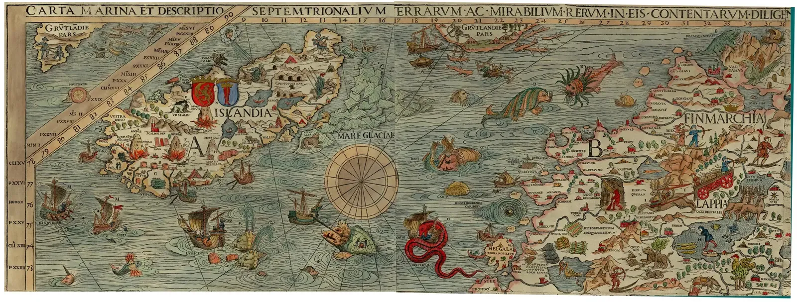
Olaus Magnus published the Carta Marina in 1539, and it remains one of the strangest maps ever printed. Instead of leaving unexplored waters blank, he filled the North Atlantic and Norwegian coastline with krakens, serpents, and beasts locked in combat with ships, turning empty ocean into a swarming, chaotic battlefield.
For centuries this was dismissed as pure medieval superstition. But maritime historians increasingly argue these illustrations were coded warnings, exaggerated stand-ins for real hazards like whirlpools, sudden storms, or whale pods that terrified sailors who had no modern vocabulary to describe them. The most surprising part is how specific some of the “monster” locations turn out to be – several correspond to genuinely dangerous stretches of water still avoided by modern shipping lanes. Back on land, one English map was about to embarrass modern surveyors.
#15 – The Gough Map’s Impossibly Modern Road Network
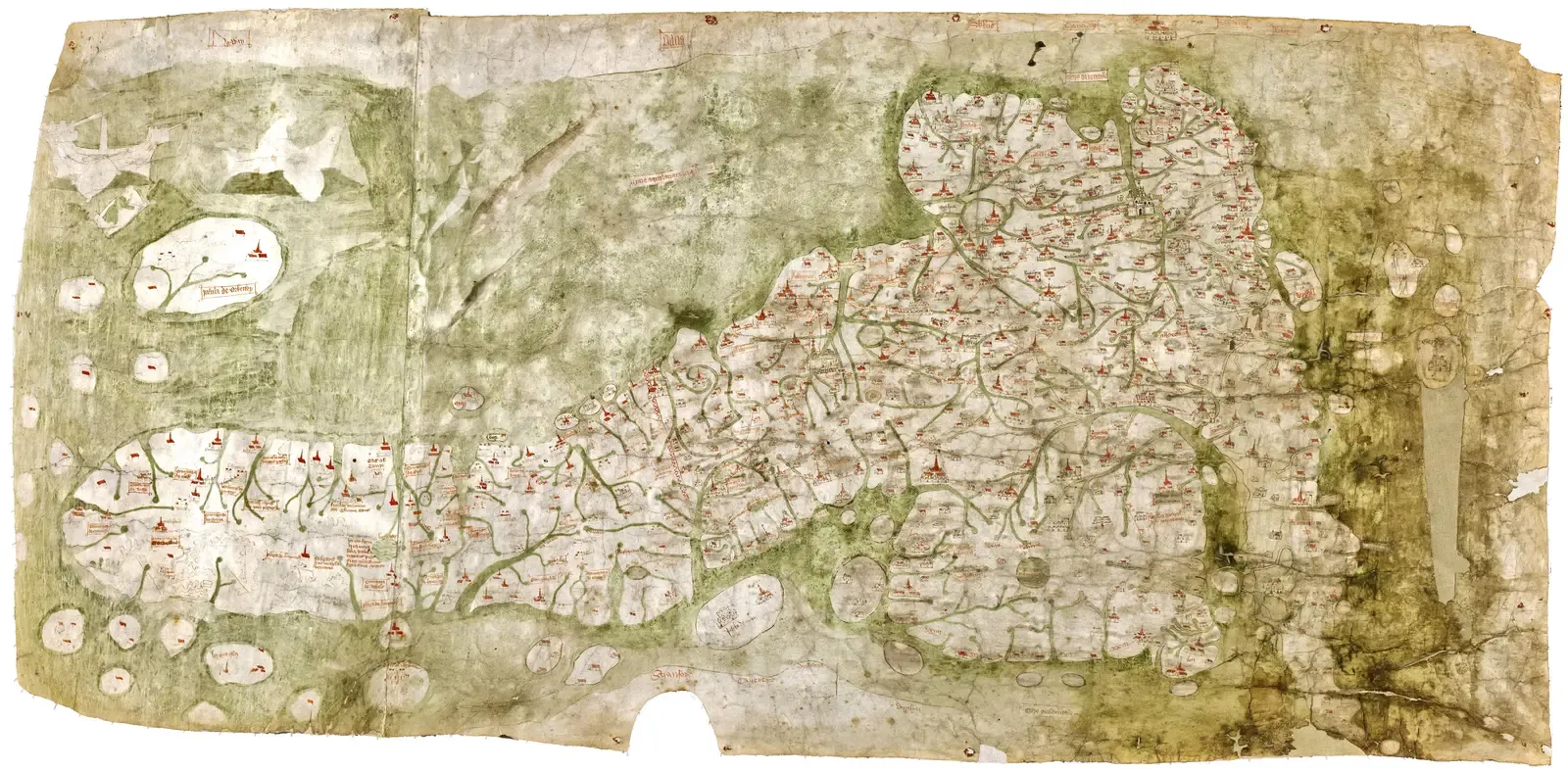
Created sometime in the 1300s, the Gough Map is the earliest known map to show recognizable English roads, rivers, and towns in relative proportion to each other. That alone puts it centuries ahead of comparable European regional maps, which were still largely symbolic at the time.
What genuinely puzzles historians is how a medieval mapmaker, without triangulation instruments or systematic land surveys, managed to render travel distances between towns accurately enough that the map remained useful for actual journey planning long after it was drawn. Named after 18th-century antiquarian Richard Gough, the map’s original purpose and cartographer remain unknown. Nobody has ever definitively identified who made it or why it’s this precise for its time. Meanwhile, in Egypt, someone had already mapped gold three thousand years earlier.
#14 – The Turin Papyrus and Egypt’s Secret Gold Map
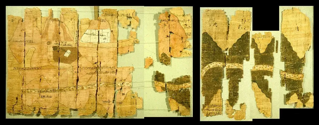
A 3,000-year-old papyrus contains a map to vast mineral wealth in Egypt’s desolate eastern desert, and the Turin Papyrus renders such detail of the Wadi Hammamat valley that it’s considered the world’s first geological map. Fragments were pieced together in the early 1800s after being found in a tomb, and experts date the scroll to the mid-12th century BC, around the reign of Ramesses IV.
What separates this from decorative ancient art is function. Modern archaeologists have used the ancient map to identify actual quarry sites, confirming it as a working tool rather than just artistic decoration. The map even includes something like a legend, distinguishing gold mines from stone quarries using symbols still readable thousands of years later. Modern prospecting firms have reportedly cross-referenced it while searching the same desert. A very different kind of genius was about to flip the map upside down – literally.
Worth Knowing
- Dated to roughly 1160 BC, during the reign of Ramesses IV.
- Widely regarded as the oldest surviving topographical map from the ancient world.
- Charts the Wadi Hammamat region, marking gold-bearing mountains, quarry roads, and worker settlements.
- Its scattered fragments weren’t reassembled into a coherent whole until the early 1800s.
#13 – Tabula Rogeriana’s Upside-Down Accuracy
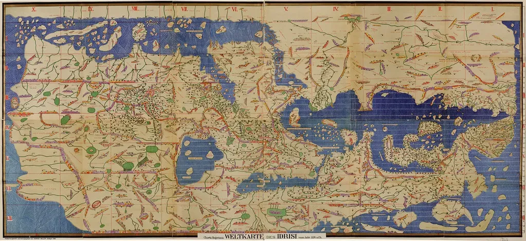
Commissioned by a Christian king and drawn by a Muslim scholar, the Tabula Rogeriana is one of history’s great cross-cultural collaborations. Created by Muhammad al-Idrisi and commissioned by the Norman King Roger II of Sicily, it remains a remarkable example of medieval Islamic cartography showing the Eurasian continent and parts of North Africa.
The map is oriented with south at the top, which throws off modern viewers expecting a north-up layout, but that orientation reflects Islamic cartographic convention rather than error. Al-Idrisi combined rigorous geographical knowledge with detailed regional descriptions, producing a document unmatched in accuracy and comprehensiveness for centuries. It stayed the gold standard of world cartography for roughly 300 years after its completion in 1154 – an almost unheard-of shelf life for any scientific document from that era. Half a world away, a Chinese emperor was about to see something that shouldn’t have existed yet.
#12 – The Chinese Map That Shouldn’t Have Known the Americas
![#12 - The Chinese Map That Shouldn't Have Known the Americas (Image Database of the Kano Collection, Tohoku University Library[1], Public domain)](https://nvmwebsites-budwg5g9avh3epea.z03.azurefd.net/dws/e1356c338d41bcde2649fca391027a7e.webp)
The Kunyu Wanguo Quantu was created by Jesuit missionary Matteo Ricci working with Chinese collaborators, and it remains a landmark in cross-cultural cartography. It’s the earliest known Chinese world map based on European cartography, printed for the Wanli Emperor in Beijing in 1602 as a massive woodcut, and it’s the first map in Chinese to show the Americas.
For Chinese scholars steeped in a worldview that placed their empire at the center of everything, this map was a genuine paradigm shift, introducing them to the idea of a spherical Earth and global geography. Copies spread to Korea and Japan almost immediately, quietly reshaping how three separate empires understood their place on the globe. It’s been nicknamed the “Impossible Black Tulip of Cartography” for its rarity today. Not every geographic myth got corrected so fast – one island refused to disappear for over a century.
#11 – The Island of California That Refused to Die
![#11 - The Island of California That Refused to Die (Library of Congress[1], Public domain)](https://nvmwebsites-budwg5g9avh3epea.z03.azurefd.net/dws/56ca0499bba5e71da8cd0fb9c2bd84bf.webp)
One of the most persistent cartographic mistakes shows California as a massive island off the west coast of North America for over a century. Despite explorers proving it was part of the mainland, the island version persisted on maps from multiple countries, copied and re-copied by cartographers who’d never set foot near the Gulf of California.
What’s genuinely strange is the staying power. Corrected surveys existed. Firsthand explorer accounts existed. And still, engravers kept stamping out island-California maps well into the 1700s, likely because customers wanted maps that matched the ones they already owned. Some historians genuinely wonder if an early, garbled explorer’s report of a strait or inlet got permanently baked into the commercial map industry, turning a single mistake into cartography’s longest-running group hallucination. An Ottoman mapmaker was about to draw something even stranger up north.
#10 – The Ottoman Map That Drew a Bridge to America
Drawn by the Ottoman cartographer Hadji Ahmed in 1559, this world map depicts something modern geologists would later confirm existed thousands of years earlier during the last Ice Age: a land stripe about 1,600 kilometers wide joining Alaska and Siberia, a natural bridge later swallowed by rising seas as the glacial period ended.
Mainstream historians generally treat this as artistic simplification rather than lost ancient knowledge, since 16th-century mapmakers routinely connected poorly-understood northern landmasses with speculative guesswork. Still, the coincidence between Hadji Ahmed’s sketch and the actual geological history of the Bering Strait region is hard to wave away entirely. Whether it reflects real indigenous or Siberian trade-route knowledge passed to Ottoman geographers, or simple luck, remains unresolved. Portugal, meanwhile, was trying very hard to make sure nobody saw a map like this at all.
#9 – The Secret Portuguese Map That Leaked State Secrets
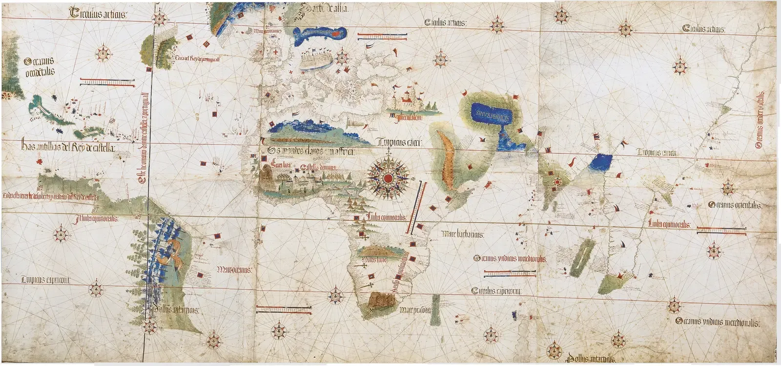
The Cantino Planisphere is named after Alberto Cantino, an Italian agent who allegedly bribed a Portuguese mapmaker to secretly copy state charts and smuggle them to Italy in 1502. It’s considered one of the earliest surviving records of the Brazilian coastline, made shortly after Portuguese ships officially reached it, yet the level of detail suggests access to naval intelligence well beyond public knowledge.
The map also includes phantom territory that fascinated explorers for generations: a cluster of islands known as Antillia, said to be a refuge for exiled explorers and widely believed to exist. An entire archipelago, confidently drawn onto an official-looking chart, simply doesn’t exist anywhere on Earth. Whether Antillia was myth, mistake, or a misidentified reef system, it fooled European sailors for over a century. The next island mystery took researchers centuries to actually solve.
#8 – The Zeno Map’s Island That Wasn’t Where It Said
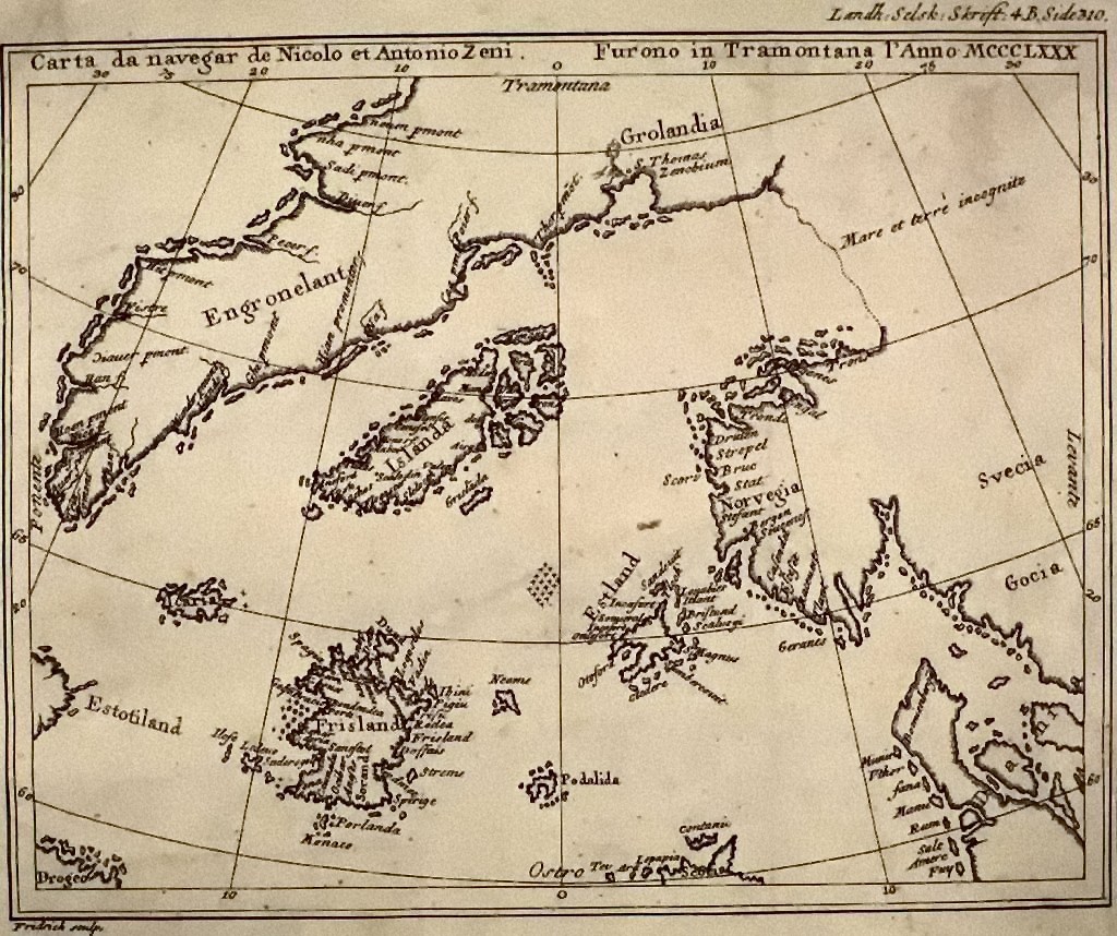
Published by the Zeno family and claiming to document a 14th-century Venetian voyage, this 1558 map shows a substantial landmass south of Iceland called Frisland that never appeared on any later, more accurate chart. For hundreds of years, mapmakers copied Frisland onto their own world maps without ever confirming it firsthand.
The mystery finally cracked when researchers compared Frisland’s coastal features against another archipelago entirely. French geographer Philippe Buache concluded, after reexamining Frisland’s coordinates, that it was actually the Faroe Islands, and place names support the theory – the small isolated island called “Ledeve” on Zeno’s map echoes the Faroese “Little Dimen.” A supposedly fictional island turned out to be a real archipelago, just badly mislabeled and misplaced by hundreds of miles. Not every map mystery ends with a real place, though – some end in outright fraud.
#7 – The Viking Map That Fooled Yale for Sixty Years
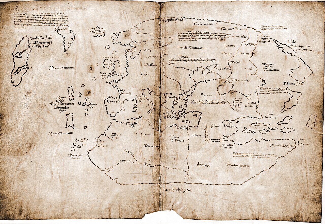
The Vinland Map purported to be a 15th-century world map containing unique information about Norse exploration of North America, depicting a landmass southwest of Greenland labeled as Vinland. It became famous after a publicity campaign introduced it to the public as a “genuine” pre-Columbian map in 1965.
For decades it was treated as a landmark historical document, cited in books and museum exhibits worldwide. Then the science advanced. Chemical analyses identified one of the ink’s key ingredients as a 20th-century artificial pigment, and in 2018 Yale specialists declared the map a conclusive modern forgery. The map that supposedly proved Vikings reached America first turned out to prove nothing except how convincingly a 20th-century forger could fake old parchment. The next map has the opposite problem – it’s completely genuine, and still hard to explain.
Quick Compare
- The claim: a genuine 15th-century map proving pre-Columbian Norse exploration, unveiled to the public in 1965.
- The tell: its ink contains anatase, a titanium dioxide pigment not manufactured until the 1920s.
- The parchment: genuinely old, radiocarbon-dated to around 1434, meaning a forger used real antique material.
- The verdict: Yale’s 2018 testing found the same modern compound across the whole map, closing the debate.
#6 – The Map That Named America Before Anyone Fully Explored It
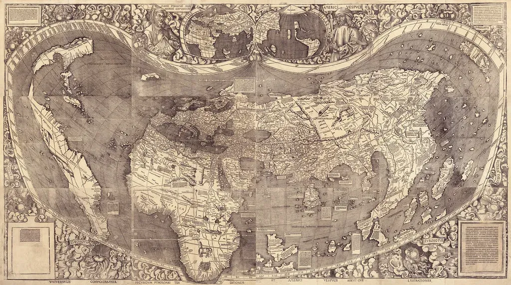
Created in 1507, Martin Waldseemüller’s map is the first known document to name the newly discovered lands “America,” and it renders South America in surprising detail even though European explorers had barely begun mapping the continent. Waldseemüller named the continent after explorer Amerigo Vespucci, whose published travel accounts convinced him the new lands were a separate continent rather than part of Asia.
What continues to baffle historians is the coastline’s western edge. Some copies hint at ocean on the far side of the Americas years before any European explorer had officially confirmed the Pacific from that vantage point. A map naming an entire hemisphere existed before most of that hemisphere had actually been charted by the people who named it. Only one original copy survives today, purchased by the U.S. Library of Congress for millions of dollars. Compare that to a landmass that maps kept drawing green when it should have been frozen solid.
#5 – Greenland’s Missing Ice Age on Old Charts
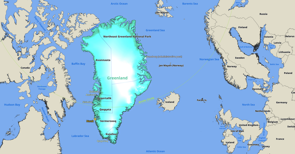
Ancient maps often depict Greenland not as the ice-covered mass we know today, but as a land of rivers, forests, and mountains – details that suggest either wild speculation or an oddly specific glimpse of the land before it froze over. This isn’t a single anomaly; it’s a recurring pattern across independent map traditions spanning different centuries and cartographers.
The more mundane explanation ties back to naming history: Norse settlers reportedly called it “Greenland” partly as marketing to attract colonists, and early mapmakers extended that branding logic into their illustrations rather than relying on firsthand surveys. Separately, other maps show Greenland as two separated islands, later confirmed by a polar French expedition that found an ice cap joining what are actually two land masses. That detail – Greenland being two landmasses fused by ice rather than one solid continent – wasn’t scientifically confirmed until modern radar surveys. Down at the opposite end of the planet, one Frenchman was drawing something almost as strange.
#4 – The French Map That Split Antarctica in Two
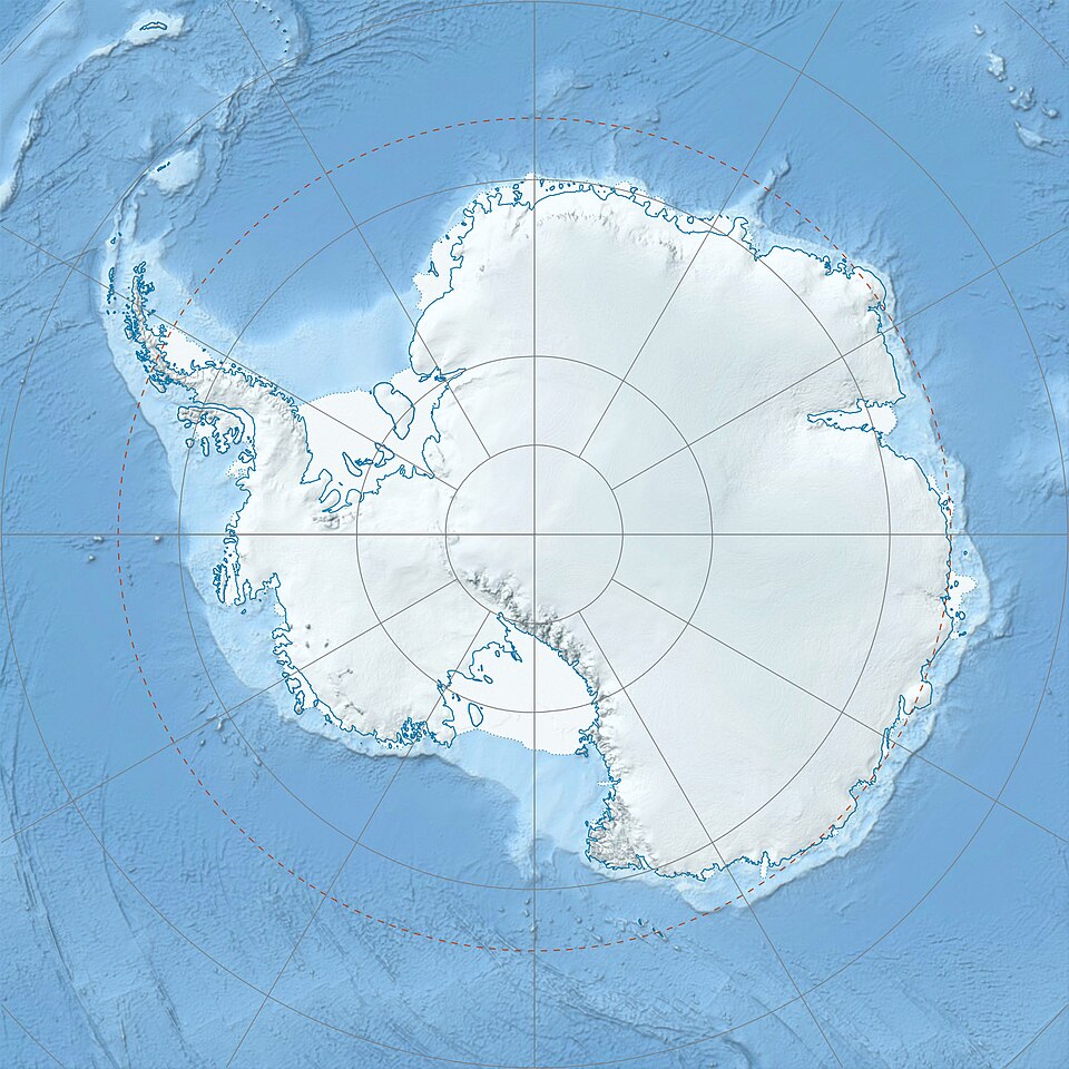
Philippe Buache prepared his map in 1739, showing two southern continents separated by an interior polar sea with two straits on either end. At face value, this looks like uncanny foresight, since modern satellite and seismic surveys eventually confirmed Antarctica does sit on bedrock split into distinct eastern and western landmasses.
But the real story is less mysterious and more impressive in a different way. The sea shown in the center of Antarctica didn’t come from ancient maps – it came from a hypothesis Buache developed over years, published as a theory about the Antarctic region and the frozen sea it was supposed to contain. He compiled the map from seafarers’ sightings and his own theory about glacier origins. He guessed correctly using physics and iceberg reports, not ancient charts – arguably more impressive than blind copying. One more southern-continent map raises the same question, minus the tidy explanation.
#3 – The 1531 Map That Keeps Getting Compared to Radar Scans
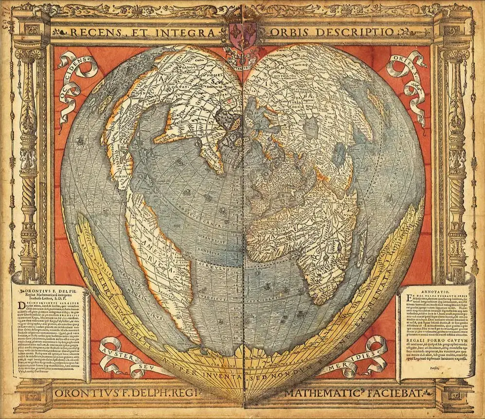
Published in 1531, this Renaissance-era world map appears to depict Antarctica three centuries before its official discovery – not as the frozen wasteland we know today, but as a landmass with rivers, mountain ranges, and ice-free coastlines. Its creator, Oronce Finé, wasn’t a fringe figure; he was a mathematician, astronomer, and cartographer who held the chair of mathematics at the Collège Royale in Paris.
Critics have pushed back hard on the “impossible knowledge” framing. His Terra Australis is roughly two-and-a-half times the actual size of Antarctica, in places almost reaching the Tropic of Capricorn – a massive scale error for a document supposedly copied from a precise ancient survey. The size mismatch alone should end the debate, yet the map still gets cited constantly as evidence of forgotten cartographic genius. Make of that what you will. Before Antarctica was even confirmed, an entire imaginary continent was already famous.
Why It Stands Out
- Printed in 1531 using a double heart-shaped (cordiform) projection, a striking departure from standard world maps of the time.
- Finé wasn’t an anonymous copyist – he held the mathematics chair at the Collège Royale in Paris.
- His Terra Australis stretches far beyond Antarctica’s real boundaries, reaching toward the Tropic of Capricorn in places.
- No confirmed pre-modern survey source has ever been found to explain the coastline’s origin.
#2 – The Continent Everyone Believed Existed Before Anyone Found It
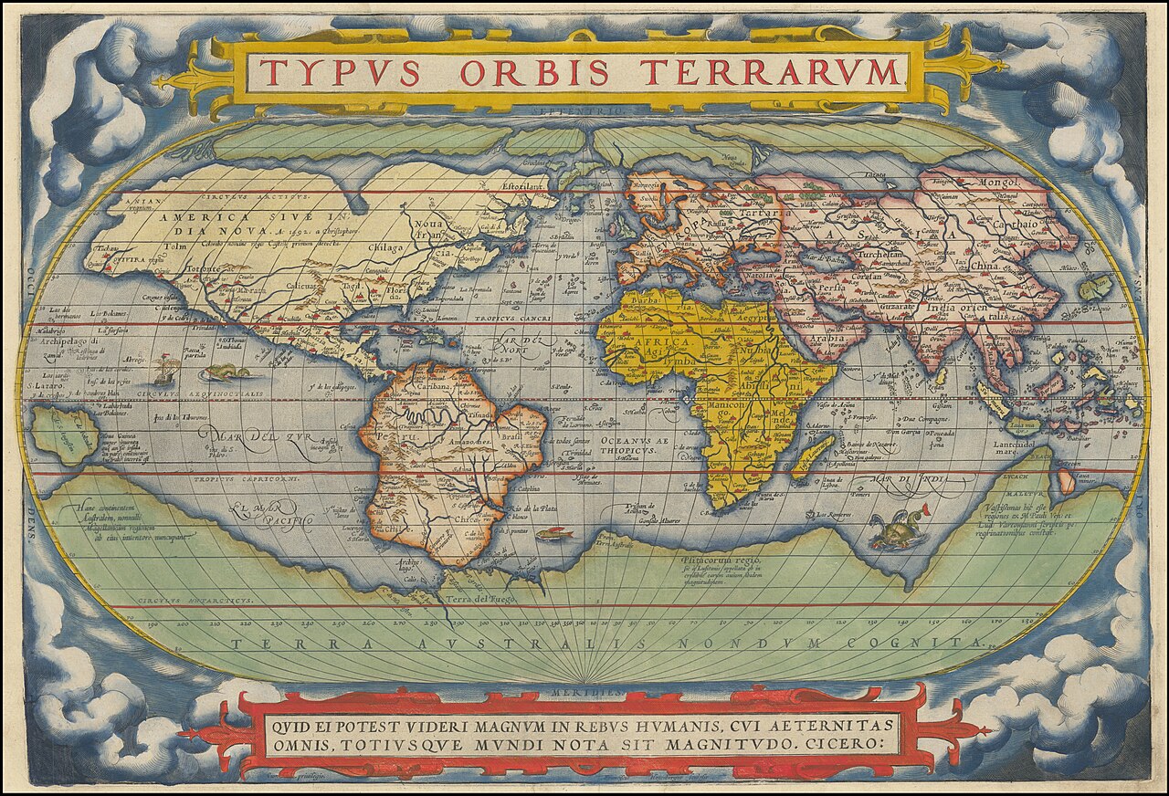
Terra Australis Incognita – “the unknown southern land” – appeared on maps by Ortelius, Mercator, and dozens of other Renaissance cartographers, often sprawling across the entire bottom third of world maps. The reasoning wasn’t mystical; it was philosophical. Classical geographers assumed the Northern Hemisphere’s landmasses needed a giant southern counterweight to keep the globe balanced, so mapmakers kept drawing one in, decade after decade, without a shred of firsthand evidence.
What’s remarkable is how long this purely theoretical continent survived actual exploration. Ships sailed past its supposed coordinates repeatedly, found open ocean, and cartographers simply redrew the imaginary coastline further south rather than deleting it. An entire continent existed on official European maps for two centuries based on nothing but classical symmetry theory – and it took Captain Cook’s voyages in the 1770s to finally shrink it down to the real, comparatively small Antarctica. Which brings us to the single most argued-over map on this entire list.
#1 – The Piri Reis Map and Antarctica’s Ice-Free Ghost Coastline
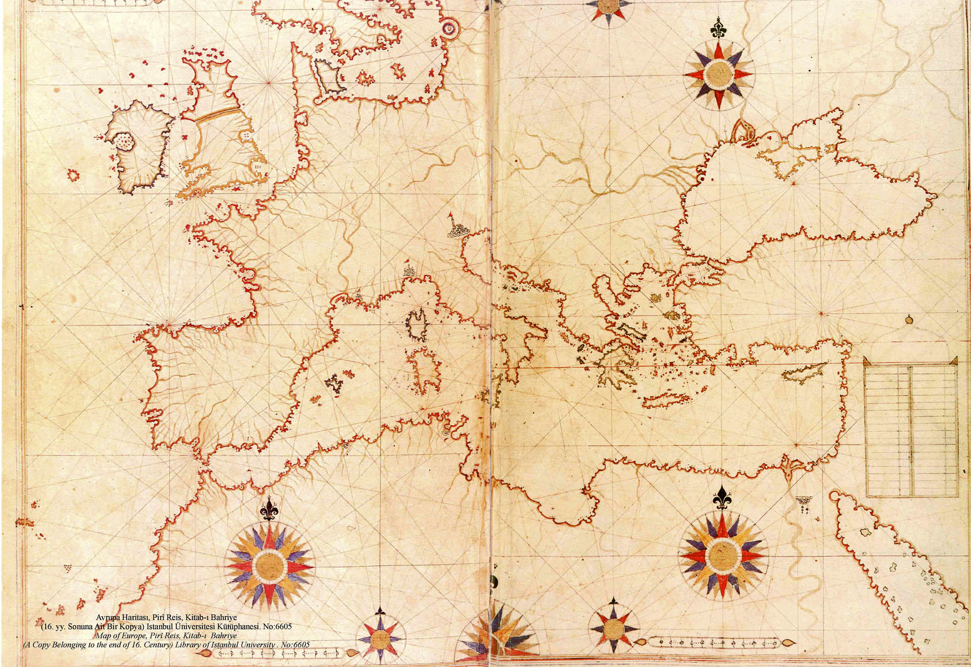
The Piri Reis map is a world map created by Ottoman-Turkish cartographer Ahmed Muhiddin Piri in 1513, and it has drawn attention for decades because it appears to show an ice-free Antarctic coastline. If that reading is correct, someone mapped Antarctica centuries before its reported discovery. The surviving fragment was found in 1929 when Director Halil Edhem searched the basement of a Turkish palace for old maps and turned up a small chart inked onto animal skin.
Charles Hapgood’s 1965 investigation only deepened the mystery for believers. The Piri Reis map appears to use a projection method allowing more accurate curvature when translating the globe onto paper – but European cartographers didn’t formalize this technique until 1569, decades after Piri Reis died. Skeptics counter hard: Hapgood claimed the landmass curving out from the bottom of South America matched Queen Maud Land, Antarctica, with shocking accuracy, but critics argue it’s simply a distorted rendering of the Patagonian coastline, bent eastward. Piri Reis himself claimed he compiled the chart from roughly 20 older source maps, including some attributed to Christopher Columbus – none of which survive today. Whichever explanation is correct, no single map on this list has generated more genuine scholarly disagreement in the last sixty years.
There is no trace of cultivation in this country… big snakes are said to be there.
Piri Reis, marginal note on the 1513 map
The Bottom Line
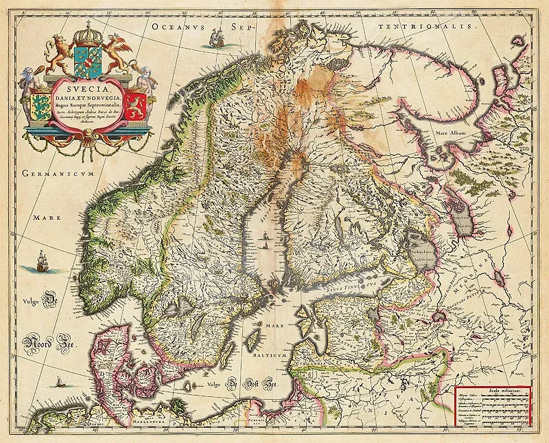
Here’s the uncomfortable truth: most of these maps aren’t proof of a lost super-civilization. They’re proof that human observation, guesswork, and stolen intelligence were far sharper centuries ago than we give them credit for.
The Vinland Map shows people will forge history if the payoff is big enough. The Buache and Oronce Finé maps show confident theorizing can accidentally resemble reality. And Piri Reis shows how a genuinely lost source document can turn a real cartographer into a centuries-long mystery.
The real story here isn’t ancient aliens. It’s how much knowledge simply got lost, stolen, or misfiled along the way – and how often we mistake a lucky guess for a secret. Which map do you think holds up best under scrutiny? Drop your pick in the comments.