We like to pretend science is all about neat answers and clean numbers. You measure, I measure, everyone measures, and if we’re doing it right, we should all land on the same result. But reality is messier, stranger, and honestly way more interesting. There are some measurements that simply will not calm down, no matter how many times experts repeat the experiment with better tools and bigger budgets.
These stubborn numbers sit at the edge of what we know about the universe, the planet, and even our own bodies. They jump around by just enough to make scientists uneasy, yet not enough to throw everything out the window. They are like that one slightly off note in a song that you cannot un-hear once you notice it.
In this article, we’ll explore fourteen of the most fascinating measurements that refuse to settle. Some of them are shaking the foundations of modern physics, others are quietly undermining the way we talk about health, climate, and risk. Along the way, you’ll see a pattern: when a number refuses to behave, it’s often a clue that something deeper is going on beneath the surface.
#1 The Hubble Constant: How Fast Is the Universe Expanding?
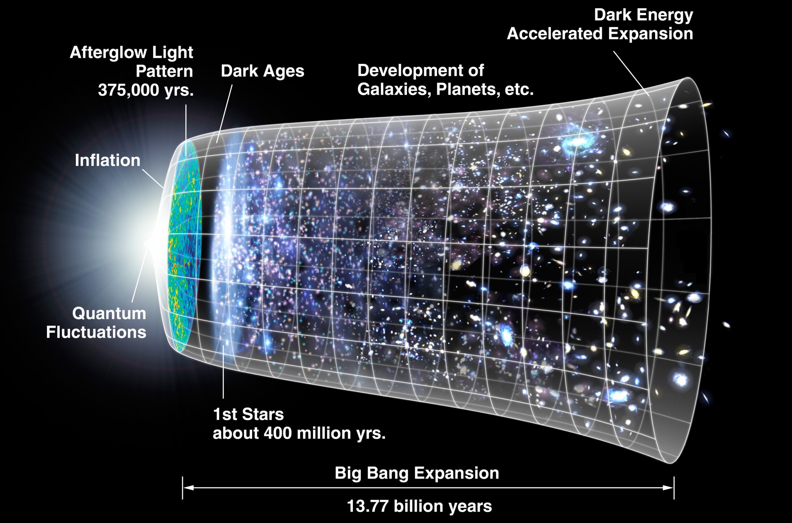
Imagine two equally serious groups of scientists measuring the same thing and landing on different answers that both seem internally flawless. That is the headache behind the Hubble constant, the number describing how fast the universe is expanding. One method looks at the nearby universe using supernovae and variable stars; another uses the cosmic microwave background, a faint glow left over from the Big Bang. Both are rock-solid methods, both have been refined for years, and yet they disagree.
The “late universe” measurements using stars and galaxies tend to give a higher expansion rate, while the “early universe” methods based on the cosmic microwave background deliver a lower one. The difference is not massive in everyday terms, but it is large enough that it refuses to be explained away as a simple mistake or random noise. Every time someone tightens the error bars with better data, the disagreement stubbornly remains.
What makes this so unsettling is that the Hubble constant is not just another number; it sits at the heart of our model of the cosmos. If the two camps are both correct within their methods, it could mean that our current picture of dark matter, dark energy, or the very shape of the universe is missing a crucial twist. In other words, this “tension” might not be a bug, but a sign of new physics hiding in plain sight.
#2 The Proton Radius Puzzle: How Big Is a Proton Really?
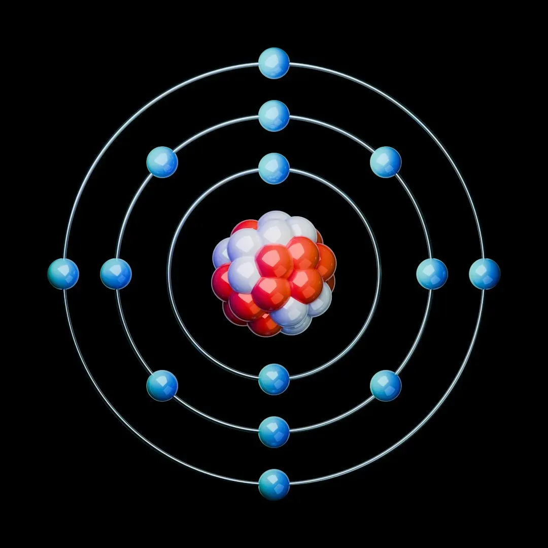
You might think that by 2026, we would at least agree on the size of a proton, one of the basic building blocks of atoms. Strangely, we do not. For years, experiments using electrons to probe protons gave one value for the proton’s radius. Then came ultra-precise measurements using exotic atoms where a muon, a heavier cousin of the electron, orbits a proton. Those experiments suggested the proton is noticeably smaller than we thought.
The difference might seem tiny, but in the realm of quantum physics, even a small mismatch can be a blaring siren. Multiple labs repeated the experiments, and the “muonic” measurements kept pointing to a smaller proton. Meanwhile, other more traditional methods were reluctant to fully line up with that shift, though some more recent work has started to close the gap slightly.
There are a few possibilities: perhaps there is a subtle bias in one of the methods, or maybe muons and electrons do not interact with protons in quite the same way as our theories say they should. Either way, this is not just about the radius of a subatomic particle. It is a stress test of quantum electrodynamics, one of the most precisely confirmed theories in physics. When something this fundamental looks fuzzy, it forces scientists to rethink what else might be sitting on shaky ground.
#3 The Fine-Structure Constant: Is This “Constant” Really Constant?
The fine-structure constant is a dimensionless number that tells you how strongly light and matter interact. Physicists sometimes talk about it with a weird mix of awe and frustration because it seems fundamental, but nobody really knows why it has the value it does. Even more intriguingly, there have been hints that it might not be absolutely constant across space and time.
Some observations of light from distant quasars suggest that, billions of years ago and in certain directions in the sky, the fine-structure constant may have been slightly different from what we measure on Earth today. These results are controversial, and other groups using different telescopes have not always seen the same pattern. Still, the possibility that such a basic quantity might slowly drift or vary is too important to ignore.
In the lab, high-precision atomic clocks are used to track whether the constant is changing over time here and now. So far, the variations, if they exist at all, are incredibly small. But the fact that multiple independent efforts keep pushing at this question shows how nervous the community is about taking the word “constant” for granted. If this number truly varies, it would rewrite our understanding of symmetry and stability in the laws of physics.
#4 The Muon g‑2 Anomaly: A Tiny Magnetic Mismatch
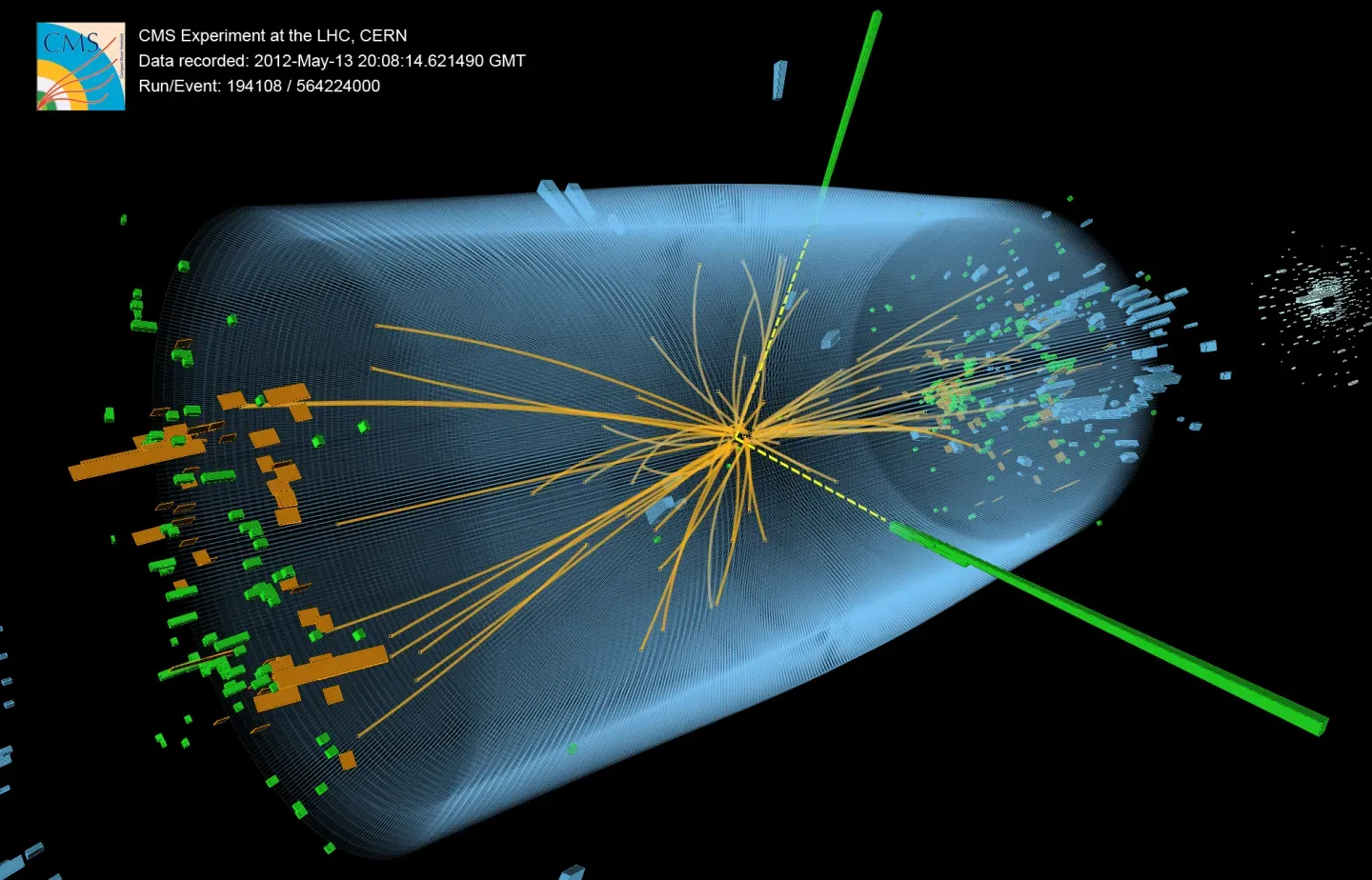
The muon is like a heavier sibling of the electron, and it spins like a tiny magnet. The strength of that magnet, called g‑2, can be calculated in excruciating detail using the standard model of particle physics. We are talking about a series expansion with contributions from virtual particles popping in and out of existence, the kind of brutal math only supercomputers and specialists love. The wild part is that we can also measure g‑2 in the lab with incredible precision.
For years, measurements of muon g‑2 have shown a small but persistent deviation from the standard model’s prediction. New experiments have confirmed that difference with higher precision, though theorists themselves debate exactly how large the predicted value should be because it depends on tricky contributions from strong interactions. Still, that discrepancy refuses to fully vanish, no matter who recalculates or remeasures.
To a non-physicist, this might look like academic nitpicking. But in particle physics, a stable mismatch between theory and experiment, even at parts per billion, is exactly how big breakthroughs are born. If the muon g‑2 anomaly survives further scrutiny, it could hint at undiscovered particles or forces that subtly tug on the muon’s magnetic field, signaling physics beyond the standard model.
#5 The True Value of G: Gravity’s Slippery Constant
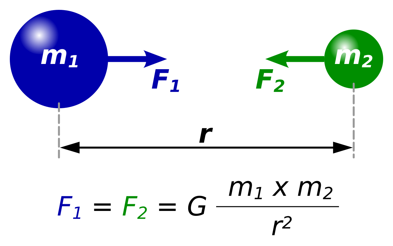
Newton’s gravitational constant, usually written as G, is supposed to define the strength of gravity in our equations. It shows up in everything from the motion of planets to models of stars. You might assume that by now, G is nailed down better than almost anything. Ironically, it is one of the least precisely known of the fundamental constants, and measurements of it notoriously disagree.
Different labs around the world use clever setups involving torsion balances, pendulums, or atom interferometry to measure G. Each technique comes with its own set of tiny systematic errors, and those errors seem to point in slightly different directions. Some experiments consistently get values that are a bit higher, others a bit lower, and the scatter between them is larger than what the official uncertainties would suggest.
Researchers have tried blind analysis, cross-comparisons, and new apparatus designs, yet the spread refuses to disappear. This has led to uneasy questions: are we underestimating how tricky gravity is to test in a noisy, vibrating, imperfect world? Or is there an overlooked effect, perhaps something subtle about how gravity behaves at different scales or in different environments? For now, G remains a frustrating reminder that even seemingly simple concepts can become stubborn when you push for too much precision.
#6 Sea Level Rise: A Moving Target in a Warming World

At first glance, measuring global sea level sounds straightforward: put tide gauges on coasts, add satellite data, and average everything. In reality, sea level is one of the most complex and politically loaded measurements on Earth. It is rising, that part is clear, but exactly how fast, and how that rate is changing, depends heavily on what you look at and how you correct for local factors.
Different datasets track different time periods, rely on different reference frames, and correct for things like land rising or sinking, local currents, and changes in Earth’s gravity field as ice melts. As a result, you get a family of curves rather than a single simple line. Some analyses emphasize an acceleration in recent decades, while others highlight the uncertainties in how we combine older tide records with modern satellite altimetry.
Here is the messy reality in simpler terms:
- Sea level is undoubtedly rising on average worldwide.
- The exact rate and acceleration differ slightly depending on methods and time windows.
- Local experiences can be better or worse than the global mean because land and water both move.
When people ask for a single, definitive number, scientists often end up giving a range instead. That frustrates policymakers and the public, but it is honest. The refusal of sea level to be pinned down to one neat figure does not mean the risk is uncertain; it means the details matter more than a single headline number can capture.
#7 Global Mean Temperature: One Planet, Many Thermometers

“How much has the planet warmed?” sounds like a question with a clear answer, but it hides a lot of complexity. Different research groups maintain global temperature records using overlapping but not identical blends of weather stations, ocean measurements, satellite data, and statistical corrections. They all tell the same broad story of warming, yet the exact numbers differ slightly from one dataset to another.
Some records adjust more aggressively for issues like urban heat island effects or gaps in polar observations. Others handle sea surface temperatures differently, especially in older eras where measurements came from ships with changing practices over time. When you zoom in on specific years, different groups may rank the “hottest year on record” differently, even though they all agree the recent decades are unusually warm by historical standards.
A quick way to think about it is:
- All reputable datasets show a clear long-term warming trend.
- The precise value of “how many degrees” depends on methodological choices.
- Short-term rankings (which year is number one) are more sensitive to those choices than the long-term trend.
The fact that global mean temperature never collapses into a single universally accepted number can fuel confusion or denial in public debates. Yet from a scientific perspective, the overlap between independent datasets is what matters most. The variations are relatively small compared with the overall upward climb.
#8 The Lifetime Risk of Cancer: Statistics That Feel Personal

When headlines claim that “about one in two people” will face cancer at some point in life, it sounds like a solid, terrifying statistic. But that lifetime risk is not a fixed number carved into reality. It shifts with changing lifestyles, medical advances, screening practices, and demographics. Different organizations calculate it using different models and assumptions, which means the number can vary across countries and time.
On top of that, how you present the risk makes a big difference. Are we talking about being diagnosed at any stage, dying from cancer, or experiencing a serious cancer that requires treatment? Early detection through screening can increase the number of diagnosed cases without necessarily increasing the number of deaths, which can make raw incidence numbers look scarier than they really are.
For individuals, these averages can feel almost meaningless. Your personal risk depends on factors like age, genetics, environment, and behavior, and even then, probabilities are not guarantees. This is one of those measurements where the more you dig into the methodology, the more you realize how much simplification goes into those seemingly simple “one in X” claims. The number refuses to fully settle because both the world and our medical tools are constantly changing.
#9 The “Real” Number of Earthquakes: Shaky Statistics
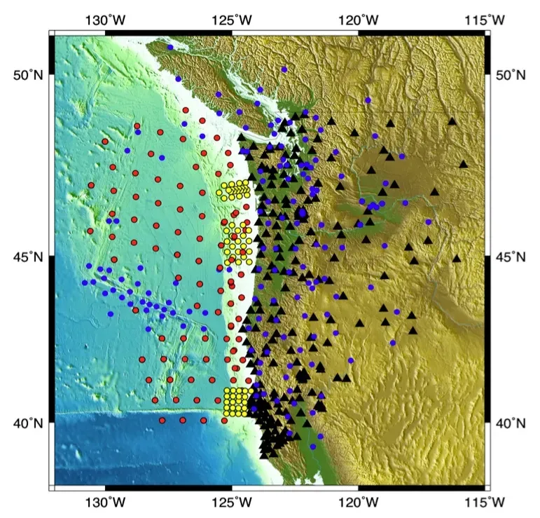
We hear about major earthquakes when they hit populated areas, but every day, many quakes rumble quietly under the radar. The total number of earthquakes on Earth in any year is not a simple, fixed value. It depends on how sensitive your instruments are, how many seismometers you have, and where you place them. As our networks improve, we detect more small events, which makes it look as if earthquake counts are rising even when tectonic processes have not changed.
Even the magnitude of a specific earthquake is not perfectly settled. Initial estimates are often revised as more data comes in. Different magnitude scales – like local magnitude, moment magnitude, or older Richter-style measures – can give slightly different impressions, especially for very large or very deep quakes. Agencies sometimes publish slightly different magnitudes for the same event because they use somewhat different methods or datasets.
Some key nuances are worth keeping in mind:
- The vast majority of earthquakes are tiny and only detected by instruments.
- As detection improves, reported counts go up, even if the underlying tectonic behavior is steady.
- Big, damaging quakes are rare but dominate public memory and headlines.
All of this means that asking, “How many earthquakes happen each year?” is less like asking the population of a city and more like asking how many raindrops fell during a storm. The answer depends on how fine-grained your counting really is.
#10 Intelligence Scores and IQ: Measuring Minds with a Wobbly Ruler

IQ tests promise to reduce the complexity of human intelligence to a single number, but this number is one of the slipperiest measurements in psychology. Scores vary with test design, cultural context, education, motivation, and even familiarity with test-taking itself. Two different standardized tests can give slightly different results for the same person, and repeated testing can lead to score changes simply from practice.
On a population level, average IQ scores can shift over time, a phenomenon sometimes called the Flynn effect, where scores rose across much of the twentieth century and then, in some regions, have leveled off or even reversed slightly. Interpreting these changes is hotly debated: are we really getting “smarter,” or just better at taking tests that reflect specific types of problem-solving?
Personally, I have taken a few of these tests across the years and watched my score drift enough to make me wary of treating any single result as my true “number.” It feels a bit like sizing up a person’s entire personality based on one selfie. IQ can capture some useful aspects of cognitive ability, especially in structured settings, but treating it as a fixed, perfectly reliable measurement is asking far more of it than it can honestly deliver.
#11 Blood Pressure: A Health Metric That Won’t Sit Still

If you have ever had your blood pressure checked multiple times in a doctor’s office, you know how jumpy this number can be. One reading might be borderline high, the next one a few minutes later looks normal, and a home monitor tells yet another story. Blood pressure naturally fluctuates throughout the day depending on posture, stress, hydration, and even what you were thinking about a few moments earlier.
On top of this natural variability, there are measurement issues: the size of the cuff, the position of your arm, whether you just climbed some stairs, or even whether you tense up around medical staff. That last one is so common there is a term for it: “white coat” hypertension. Automated devices can help standardize readings, but even they are not immune to calibration and placement errors.
When guidelines draw strict lines – this number is normal, that number is pre-hypertension, the next is high – they are simplifying a very noisy reality. Doctors increasingly rely on repeated readings over time, including at-home measurements, rather than one-off snapshots. The fact that blood pressure refuses to settle into a precise, repeatable number for any given person is not a flaw in you; it is a reminder that our bodies are dynamic systems, not static machines.
#12 The Number of Species on Earth: Counting the Unknown

How many species live on Earth? It sounds like the kind of thing scientists should at least roughly agree on by now, but estimates still range widely. We have formally described a few million species, but many experts believe the true total could be several times higher, especially when it comes to insects, fungi, and microscopic life. Every year brings new discoveries from remote forests, deep oceans, and even urban environments.
Part of the problem is that “species” is itself a fuzzy concept. Biologists use different definitions depending on whether organisms reproduce sexually, asexually, or form complex symbiotic relationships. Genetic methods sometimes split what used to be one species into many, while in other cases, creatures once thought distinct turn out to be variations within a single species.
Some helpful ways to frame this uncertainty:
- We have a reasonably good handle on large, charismatic animals like birds and mammals.
- Smaller, less conspicuous life forms are vastly undercounted.
- New tools like DNA barcoding reveal hidden diversity that older methods missed.
So when you see a headline claiming a specific total number of species, treat it as a rough landmark, not a precise census. The living world is still largely uncounted, and that moving target reflects both our ignorance and the sheer richness of life.
#13 The Global Wealth Gap: Money That Moves in the Shadows

We often hear statistics about how a small fraction of people controls a large share of global wealth. These broad patterns are real, but the exact numbers are surprisingly hard to pin down. Different organizations publish their own estimates using household surveys, tax records, financial market data, and modeling. Each approach has blind spots, especially when it comes to the very rich and to wealth hidden in opaque financial structures.
Surveys can undercount the wealthy because high-net-worth individuals are less likely to respond or to disclose fully. Tax data can be distorted by legal loopholes, offshore accounts, and differences in reporting rules across countries. Asset values themselves fluctuate with markets, which means that the distribution of wealth can change rapidly even without any big policy shift.
As a result, the headline figures for how much wealth the top slice of the population holds are inherently wobbly. What is not in doubt is the direction: wealth is heavily concentrated, and has tended to become more so in many regions over recent decades. The refusal of the exact measurements to settle is less about whether inequality exists, and more about how precisely we can map the peaks and valleys on that economic landscape.
#14 The Age of the Universe: Refining the Cosmic Clock
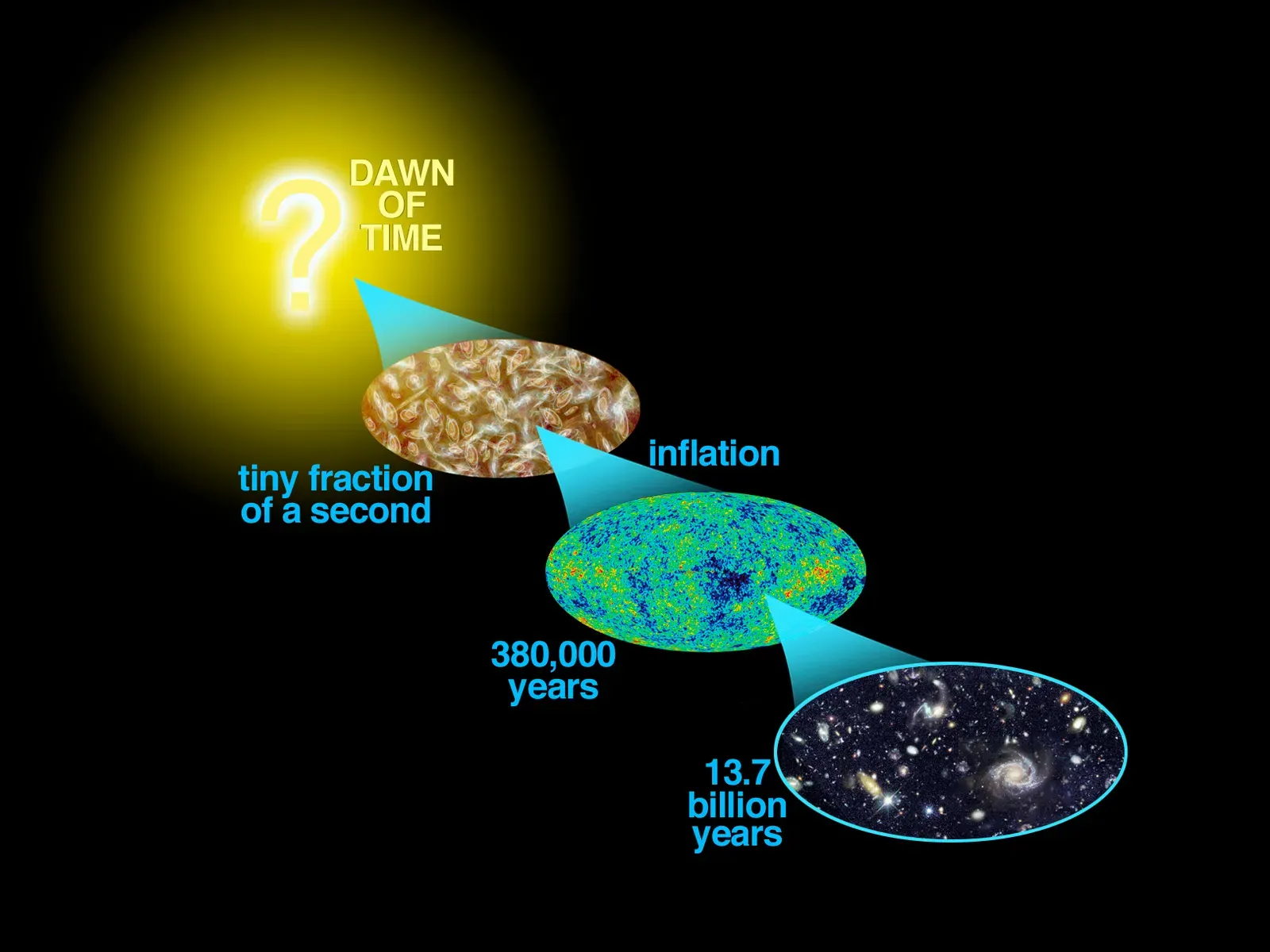
Asking the age of the universe feels like the ultimate big question, and modern cosmology does give a fairly tight range. But the exact figure, down to the hundred million years, depends on the same ingredients that drive the Hubble constant: how fast the universe expands, the mix of dark matter and dark energy, and the details of the cosmic microwave background. When those inputs shift slightly, the estimated age shifts with them.
Different methods provide cross-checks. Observations of ancient star clusters can set a minimum age, because the universe must be at least as old as its oldest stars. Measurements of radiation left from the early universe, and the distribution of galaxies, provide another angle. While these methods generally agree that the universe is on the order of thirteen to fourteen billion years old, the exact decimal keeps getting nudged as new data rolls in.
In practice, this means our cosmic age estimate is not a single fixed number for all time, but a living summary of what we currently think about the universe’s content and history. As we refine those inputs – especially if we finally reconcile the Hubble constant tension – that age will likely shift a little again. It is humbling to realize that even something as monumental as the universe’s birthday is, in some sense, still a work in progress.
Conclusion: When Wobbly Numbers Point to Deeper Truths
At first, these unsettled measurements might sound like failures: our expansion rate does not match, our constants wobble, our health metrics jump around, and even counts of species and earthquakes keep moving. But the more you look at them, the more they resemble the cracks in the surface that let us peek into a deeper structure underneath. Stable contradictions are often where science grows the most.
Personally, I find it strangely comforting that some of our most cherished numbers refuse to sit still. It means the world is richer than our tidy equations and tidy narratives. Each stubborn measurement is like a loose thread in a sweater; if you tug gently and carefully enough, you might unravel something big, revealing hidden patterns woven through the fabric of reality.
In an age that craves instant certainty and simple answers, these wobbly values are a quiet reminder that honest knowledge often comes with error bars, revisions, and even flat-out disagreements. The point is not to worship the first number we see, but to stay curious about why it moves when we look at it more closely. Next time you hear a single, precise statistic about something vast and complex, will you wonder what hidden uncertainty is still waiting to be explored?