
Most people assume medieval sailors were basically guessing the moment they lost sight of Europe. But scattered across museum vaults and forgotten library shelves are maps that seem to show coastlines nobody in their own era was supposed to know existed yet – some drawn with eerie precision, others with mistakes so strange they almost feel like memories of a lost, older geography.
Skeptics call them distorted guesswork. Alternative-history fans call them smoking guns. The real answer sits in an uncomfortable middle ground you probably haven’t heard before – and by the time you reach the last map on this list, you’ll understand why historians still argue about what these lines on old vellum actually prove.
#14 – The Piri Reis Map (1513): South America Before Anyone Should Know It
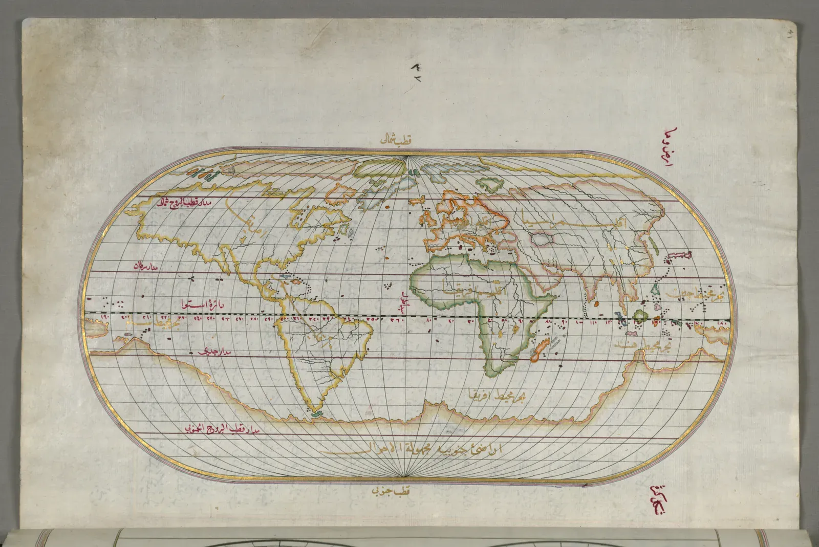
Historians agree on one thing: the Piri Reis map is not a hoax. It’s the real working chart of an Ottoman admiral who spent decades commanding ships across the Mediterranean. In 1513, Piri Reis compiled a world map on gazelle skin showing the Atlantic in detail – western Europe, northwest Africa, and a long, confident sweep of Brazil, just two decades after Columbus first crossed the ocean.
The real controversy starts below Brazil, where Piri sketches a sprawling southern landmass. Fringe writers insist it’s Antarctica, mapped somehow before anyone could have seen it ice-free. Mainstream cartographers push back hard: the shapes line up with a distorted, over-extended South American coastline caused by projection errors and shaky source material, not a secret polar survey.
Fast Facts
- Compiled in 1513 from roughly twenty older source maps, including one drawn by Columbus himself.
- Only about one-third of the original chart survives today; the rest was lost long ago.
- Rediscovered in 1929 inside the library of Topkapi Palace in Istanbul.
- Piri Reis commanded the Ottoman fleet before he was executed in 1553 after a naval defeat.
#13 – Oronce Fine’s 1531 Heart-Shaped World Map and Its Recently Discovered South
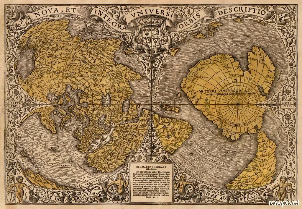
At first glance, Oronce Fine’s 1531 double-cordiform world map looks like pure Renaissance flair – two elegant heart shapes stitched into a globe. Then your eyes drift south, where a vast “Terra Australis” wraps around the bottom of the world in a way that some viewers swear resembles Antarctica. Fine even labeled it as “recently discovered but not yet completely explored,” a line modern mystery hunters love to quote out of context.
Here’s the less thrilling truth: Terra Australis was a theoretical balancing continent, borrowed straight from ancient Greek cosmology, not a record of a secret Antarctic expedition. Fine was stitching together Magellan’s brief glimpse of Tierra del Fuego with an imagined southern landmass – an educated guess dressed up as geography. Strip away the wishful thinking, and the rivers, coastlines, and mountains simply don’t match the real Antarctic map underneath the ice.
#12 – Philippe Buache’s 1737 Antarctica: Conjectured Coasts That Seem Too Good
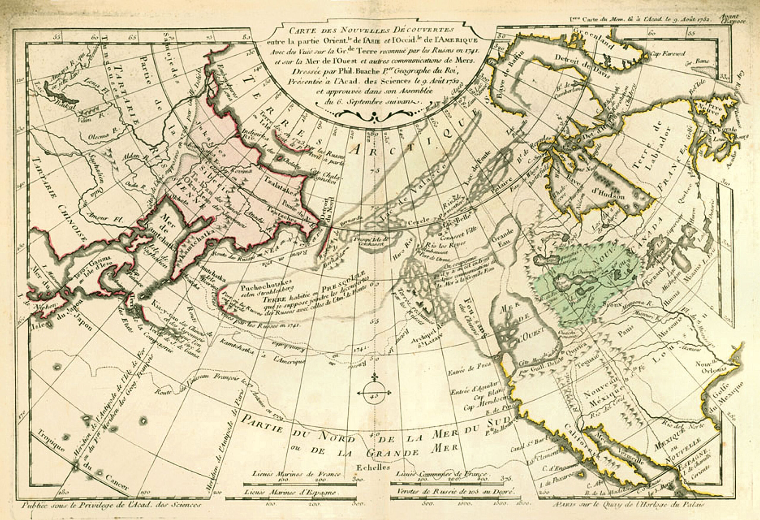
On Philippe Buache’s 1730s maps, Antarctica appears split into two landmasses with a sea running between them. Decades later, 20th-century seismic surveys revealed deep subglacial basins that do, broadly, divide East and West Antarctica. Alternative researchers seized on the coincidence and hailed Buache as proof of a lost ancient survey.
But read Buache’s own notes and the romance fades fast. He openly labels parts of his southern continent as “conjectured,” admitting he’s extrapolating from a handful of real discoveries – like Bouvet Island – layered onto the old Terra Australis tradition. The broad shape lines up loosely with modern Antarctica, but the details diverge sharply once you look closer. It’s less a lost secret and more proof of how boldly 18th-century geographers turned scraps of data into entire coastlines.
#11 – Gerardus Mercator’s Arctic and the Vanishing Four-Island North
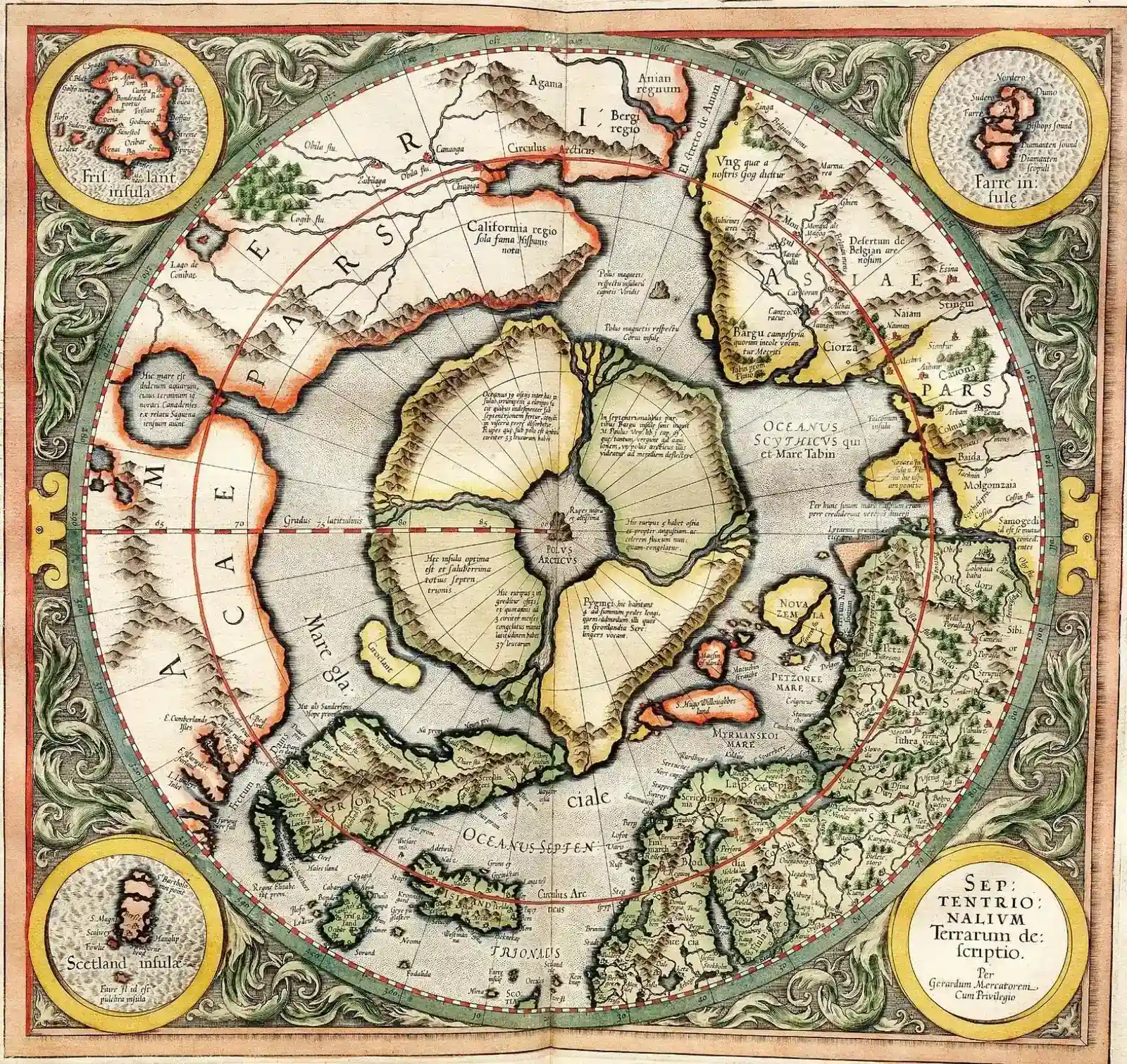
Mercator’s name is stamped on the world projection sailors still curse today, but his 16th-century Arctic is where things get genuinely strange. In some editions, the North Pole is ringed by four large islands, complete with fierce whirlpools and a mysterious central rock – details he claimed came from older sources and travelers’ tales. To modern eyes, it looks like a ghost cartography of islands that never existed.
Fringe writers argue Mercator preserved memory of a different, warmer Arctic, maybe even knowledge from a lost civilization. Historians see something more human: a mapmaker trying to reconcile fragmentary ice reports, garbled pack-channel sightings, and half-understood Norse lore into one tidy, almost mystical layout. The fact that later, better-surveyed maps quietly erased these islands tells you everything you need to know – but the sheer confidence Mercator inked them with still says a lot about how fast rumor could harden into “fact.”
#10 – The Zeno Map (c. 1558): Phantom Islands and a Pre-Columbian North America
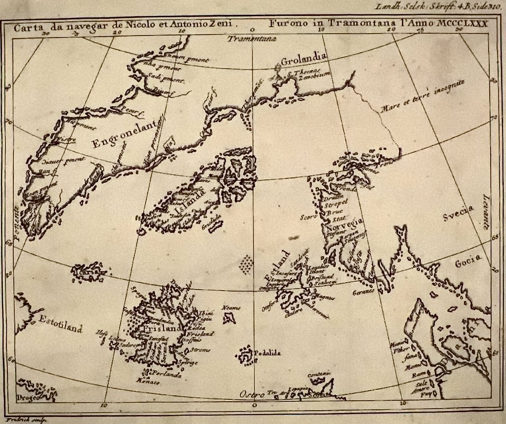
The Zeno map, published in 1558, claims to be based on 14th-century voyages by two Venetian brothers into the far North Atlantic. It shows Greenland, shapes resembling Labrador or Newfoundland, and a strange menagerie of islands – including Frisland, a huge landmass that simply doesn’t exist. Believers point to it as proof Europeans charted North American coasts long before Columbus ever set sail.
Serious scholarship isn’t kind to it. Many historians think the Zeno narrative was at least partly fabricated, with the map reworked using 16th-century knowledge and then backdated for prestige. Frisland and its phantom neighbors haunted European charts for generations before repeated voyages failed to find them and mapmakers finally scrubbed them out. The real lesson of the Zeno map isn’t secret discovery – it’s how a convincing story stitched to half-accurate coastlines can quietly infect the historical record.
#9 – The Vinland Map: A First America That Probably Isn’t
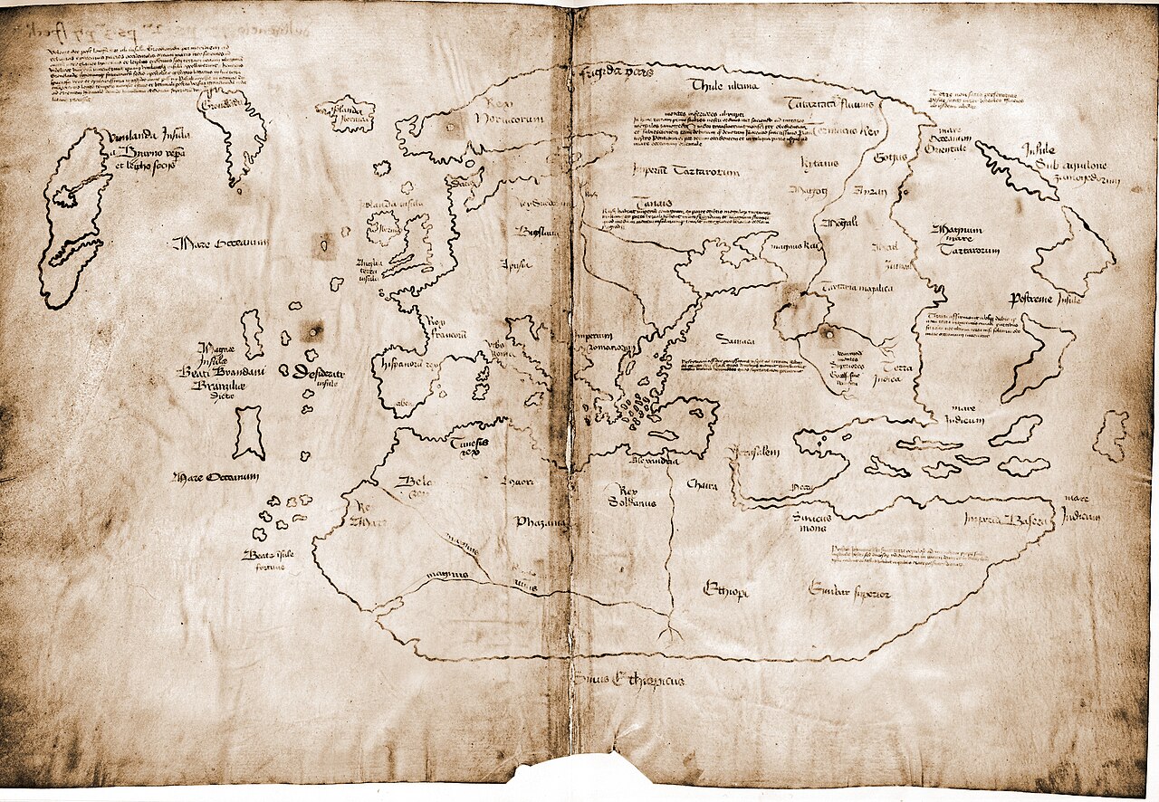
When the Vinland Map surfaced in the 20th century, it looked like dynamite – a supposed 15th-century world map showing a large island labeled “Vinland” west of Greenland, implying Europeans knew about North America long before Columbus. It was instant catnip for anyone hoping to dethrone 1492.
But ink analysis, parchment dating, and stylistic criticism have piled up against it. Multiple technical studies suggest the ink contains modern compounds, and major institutions now cautiously treat it as almost certainly a 20th-century forgery drawn on genuinely old parchment. The irony stings: we already have solid archaeological proof of Viking presence in Newfoundland at L’Anse aux Meadows. Nobody needed a shaky map to prove the Norse reached North America – which is exactly why so many historians see the Vinland Map as someone trying way too hard to manufacture evidence that already existed.
#8 – Portolan Charts (13th–15th Century): Hyper-Accurate Coasts From Nowhere
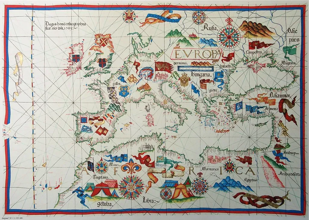
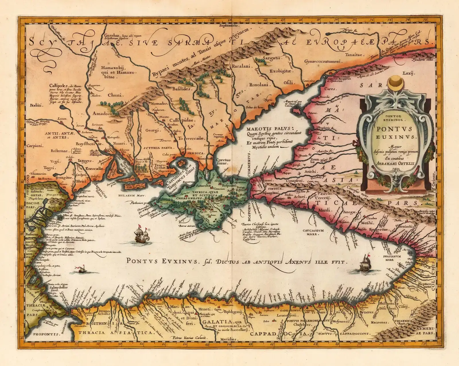
Portolan charts appeared in the Mediterranean in the 1200s like a fully formed technology, seemingly out of nowhere. These nautical maps display astonishingly precise coastlines for the Mediterranean and Black Sea – harbors, hazards, and headlands – long before formal latitude and longitude systems existed. To skeptics, that sudden leap in sophistication looks suspiciously like proof of an older, lost survey tradition.
Most scholars see something less mystical but arguably just as impressive: generations of hard-won seamanship, quietly codified into ink. Portolans were built from countless compass bearings and distance estimates by sailors who knew every rock that could sink them. The real mystery isn’t that they show “impossible” coasts – it’s that we can’t trace their early development because the rougher drafts simply didn’t survive. And their accuracy falls apart fast the moment you sail beyond home waters, which is the biggest clue there’s no secret global grid hiding underneath.
Worth Knowing
- The oldest surviving portolan, the Carte Pisane, dates to around 1290 and appears to have no known ancestor charts.
- Portolans relied on compass bearings and estimated sailing distances rather than latitude and longitude.
- They were drawn on durable animal-skin vellum, which helped a handful survive for over 700 years.
- Accuracy dropped sharply outside the Mediterranean and Black Sea, exposing the limits of firsthand sailor knowledge.
#7 – Fra Mauro’s World Map (c. 1450): An Indian Ocean No European Had Sailed
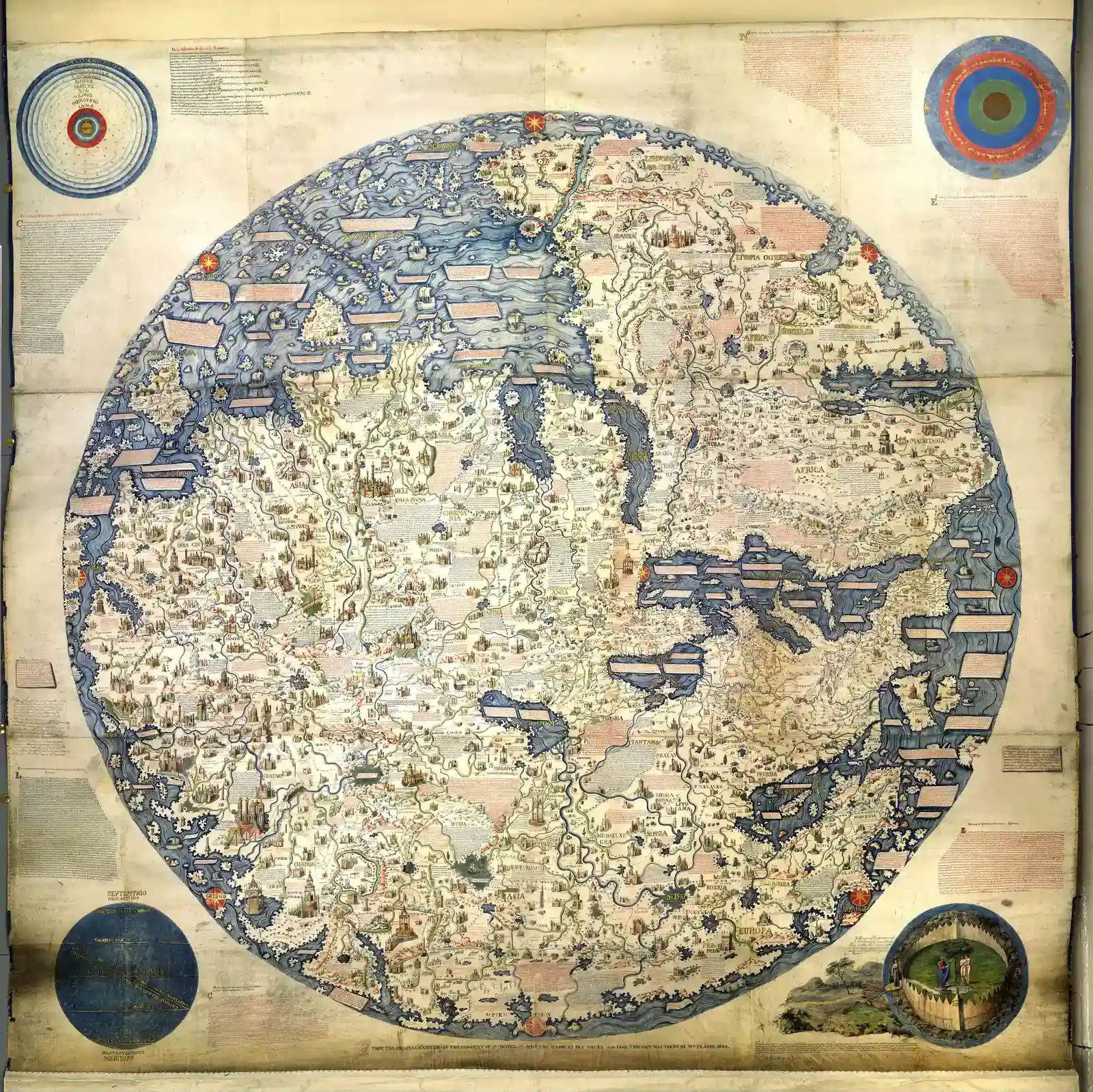
Fra Mauro’s enormous circular world map, created around 1450 in Venice, does something genuinely radical – it depicts the Indian Ocean as an open sea with a southern passage, tossing out the landlocked basin Ptolemy had insisted on for over a thousand years. For European audiences, that alone counts as charting a coastline nobody back home had actually sailed.
This wasn’t a lucky guess. Fra Mauro leaned heavily on Arab and possibly Chinese geographic reports flowing through Venetian trading networks, even noting that travelers had sailed from the Indian Ocean around Africa and into the Atlantic – decades before da Gama would prove it. Most Europeans wouldn’t complete that route until the late 1400s, yet Fra Mauro’s map folded non-European knowledge into a coherent coastline well ahead of direct Portuguese experience. It’s a blunt reminder that “Western discovery” often just meant finally believing what other cultures had known for a long time.
#6 – Kangnido (1402): Africa’s Shape on a Korean Map
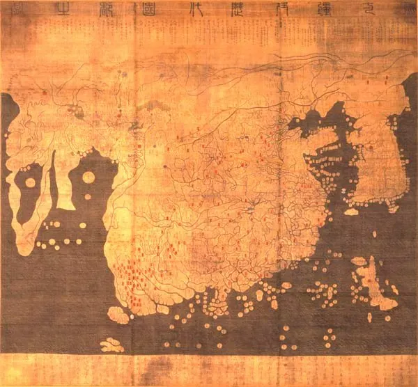
The Kangnido world map, created in Korea in 1402, quietly drops a bombshell: a recognizable Africa with a surprisingly correct east-west span and hints of its southern coastline, almost a century before Europeans ever rounded the Cape. That’s jarring if you’ve been taught that Portugal single-handedly “revealed” the African coast to the world.
Historians explain it through information flow, not lost civilizations. Kangnido was synthesized from Chinese maps that had already absorbed Islamic geographic knowledge, built by Muslim scholars operating trade routes across the Indian Ocean and deep into Africa. That knowledge traveled east into Korean hands long before it traveled north into European ones. No Korean ship ever needed to reach the Cape for its outline to show up on a map – they just had to listen to the right foreigners.
#5 – The Tabula Rogeriana (1154): An African Coastline Centuries Ahead
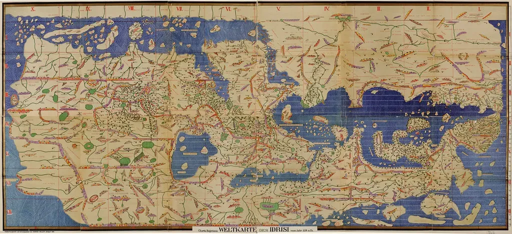
Commissioned by Norman King Roger II of Sicily and drawn by Arab geographer al-Idrisi in 1154, the Tabula Rogeriana flips south to the top of the map but nails something Europeans were still fumbling with three centuries later: large sections of the African coastline, from the Mediterranean deep into the Indian Ocean, shown with coherent shape and linked trade cities.
Al-Idrisi didn’t need satellites – he had Muslim merchant networks and centuries of travel accounts to draw from. He cross-checked routes, river descriptions, sailing times, and caravan itineraries, then translated all of it into coastal outlines that later European explorers would only end up confirming. European scholars later borrowed his text and maps, often without credit, which is exactly how some “mysteriously accurate” coastlines quietly sneak into Latin works. When an early European map looks impossibly good around Africa or the Indian Ocean, odds are you’re looking at al-Idrisi’s legacy wearing someone else’s name.
At a Glance
- Commissioned around 1138 by King Roger II of Sicily; completed in 1154 after 15 years of research.
- The original map was engraved onto a silver planisphere weighing roughly 300 pounds, now long lost.
- Al-Idrisi calculated Earth’s circumference at about 23,000 miles, remarkably close to the real figure.
- Ten manuscript copies of his accompanying geographic text still survive today.
#4 – Medieval Mappae Mundi: Myth, Monsters, and Real Edges of the World
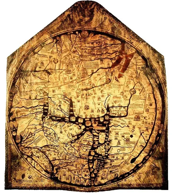
The big medieval world maps – think Hereford or Ebstorf – look like pure fantasy at first: Jerusalem sitting at the center, dragons prowling the margins, sea serpents lurking off the coasts. It’s tempting to write them off as religious art with no navigational value at all. But dig into their DNA and you find something quietly fascinating: real coastal knowledge, pushed to the fringes and buried under symbolism.
Scribes borrowed portolan-style outlines for parts of the Mediterranean, grafted in roughly correct British and Iberian coasts, then wrapped everything east and south in Biblical geography and classical myth. To a 13th-century viewer, the edge of the mapped world wasn’t just cartographic – it was theological. Whenever traders brought back better information about, say, the Red Sea or the Persian Gulf, some of it seeped into these maps anyway, which is why you can occasionally trace a surprisingly realistic gulf or peninsula buried under layers of allegory. In a strange way, they accidentally preserved real coastlines long before anyone prioritized geographical accuracy.
#3 – The Ice-Free Antarctica Myth: Maps That Don’t Actually Match Antarctica
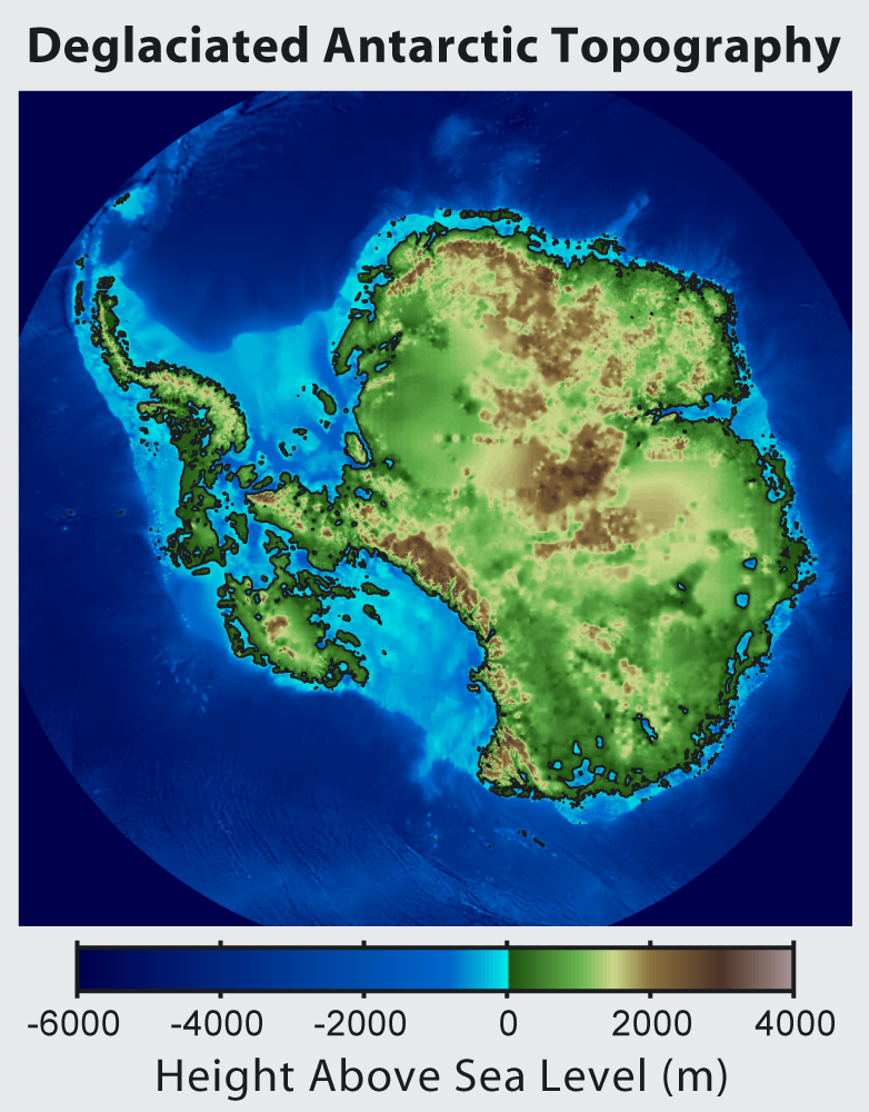
If you’ve ever seen a meme claiming Piri Reis, Oronce Fine, or Buache “perfectly mapped an ice-free Antarctica,” you’ve run into one of the most persistent myths in all of cartography. The claim usually goes like this: their southern landmasses line up so well with the real Antarctic coast or sub-ice bedrock that the mapmakers must have been copying a survey tens of thousands of years old.
The math simply doesn’t hold up. When geographers overlay these old maps on modern projections, the supposed coastlines drift, twist, and scale badly – rivers don’t match, mountain ranges land in the wrong places, and many features clearly echo South America or generic Terra Australis guesswork rather than the real polar continent. Charles Hapgood’s 1960s bestseller “Maps of the Ancient Sea Kings” popularized the idea of a lost advanced civilization behind it all, but his cherry-picked comparisons fall apart under rigorous scrutiny. That doesn’t make the old maps boring – it just makes the modern myth-making around them the far more interesting mystery.
Quick Compare
- Claim: The Piri Reis map shows ice-free Antarctic bedrock. Reality: Cartographic historian Gregory McIntosh concludes the shape is South America’s coastline, bent to fit the sheet.
- Claim: An advanced ancient civilization surveyed the poles. Reality: Hapgood’s theory doesn’t hold up once the maps are compared rigorously against real Antarctic geography.
- Claim: Buache’s split continent proves lost survey data. Reality: Buache himself labeled the shape “conjectured,” built from scraps like Bouvet Island.
#2 – Lost Source Charts: The Real Ancient Maps Behind the Legends
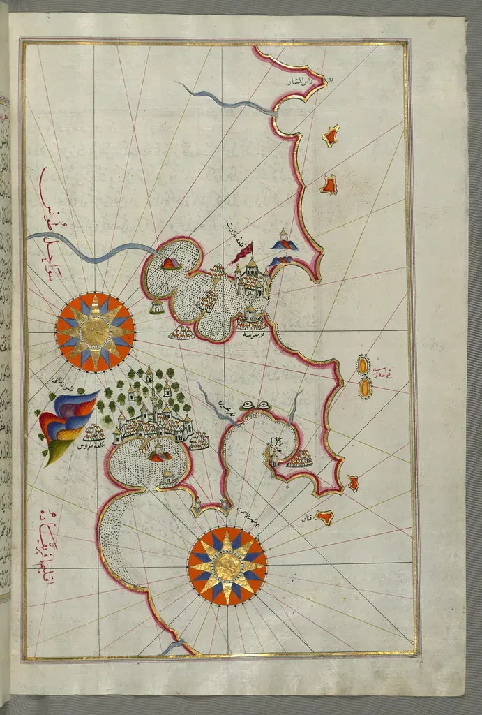
Here’s an uncomfortable fact most viral posts conveniently skip: Piri Reis openly admitted he used about twenty source maps to build his 1513 chart – including Greek, Arab, and at least one made by Columbus himself – and several of those originals are now lost forever. That means a real chunk of the Atlantic world’s early coastline record has genuinely vanished, not because of a cover-up, but because paper and vellum simply don’t survive five centuries very well.
The same is true for countless portolans, Chinese pilot books, and Islamic sea charts referenced in old texts but never recovered. Alternative researchers love to leap from “lost charts existed” straight to “those charts must have been hyper-accurate global surveys from a forgotten civilization.” The evidence never actually demands that leap. It’s far more plausible that many of the maps we still have are second- or third-generation composites of regionally solid, globally patchy sources – meaning yes, there really were maps behind the maps. They just don’t need Atlantis to explain them.
#1 – The Biggest Secret: How Easy It Is to See Patterns That Aren’t There
The most revealing “ancient map” on this entire list isn’t a specific piece of parchment – it’s the way we look at all of them. Humans are pattern-machines. Show us a smudged southern coastline on a 16th-century chart, and we’ll happily rotate it, stretch it, and mentally reshape it until it “clearly” matches Antarctica, then build an entire lost-civilization story on top of that feeling.
Serious cartographic historians work in the opposite direction. They start with what’s actually known about the mapmaker, his sources, and the measurement tools available in his era, then ask how far that evidence could realistically stretch. Do that consistently, and the “impossible” coastlines mostly collapse into a short, unglamorous list:
- Reasonable extrapolations from partial exploration.
- Borrowed knowledge quietly passed between cultures.
- Honest mistakes that got repeated until they looked like fact.
The wild part is that even after you strip away every myth, these maps are still shockingly ambitious. They show exactly how far curiosity, trade, and stubborn trial-and-error could push human knowledge long before satellites existed – and how eager we still are, centuries later, to read our favorite stories into a few old lines of ink.
The Bottom Line
Look closely, and the real drama here was never about an ice-free Antarctica or an Atlantean survey of Earth. The actual drama is better: ordinary people, armed with bad instruments and half-finished information, still sketched coastlines far beyond their own horizons – and then stitched those guesses into world pictures bold enough to haunt us five hundred years later.
Piri Reis leaning on lost Portuguese charts. Fra Mauro trusting Arab sailors over Ptolemy. Korean cartographers drawing Africa from secondhand Islamic reports. That’s real, it’s traceable, and it’s already astonishing without a single conspiracy attached to it.
My honest take? Most “impossible” maps fall apart the second you compare them rigorously to real geography – but the ordinary human achievement hiding underneath them is more impressive than any lost-civilization story could ever be. If anything, we’ve been underestimating how fast knowledge actually traveled between cultures, and how quickly a good rumor could harden into permanent “fact” the moment ink hit vellum. Think one of these maps really does show a coastline nobody could have known? Make your case in the comments – with specifics.