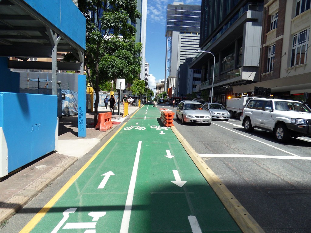
Stand in a crowded city square for a moment and pay attention. Without touching anything, without moving a single object, you can often tell exactly where to walk, where to look, even where to feel safe – just by following what your eyes naturally line up with. That invisible choreography is all about sightlines.
I still remember standing in a new office once, utterly confused about where to go. No signs, no receptionist, nothing. Then I noticed: every doorway, every light, every main desk was perfectly aligned in one long visual corridor. The second I stepped into that line, the space suddenly made sense. It felt like the building was quietly saying, “This way.”
This is the hidden power of alignment through sightlines. No arrows. No labels. No instructions. Just the careful arrangement of what you can see from where you stand. In this article, we’ll walk through 11 different kinds of alignment you can achieve with sightlines alone – in architecture, interiors, UX, branding, and even daily life. Once you start noticing them, you won’t be able to unsee them.
#1 Visual Alignment: When The Eye Becomes The Ruler

Ask a designer how they know something “feels right” and you’ll often hear them talk about visual alignment long before they pull out grids or measuring tools. Visual alignment happens when elements line up cleanly along imaginary axes that the eye can trace from one object to another. You do not need rulers to feel it; your brain is constantly, subconsciously checking those lines.
In a living room, for example, the top of the sofa might line up with the bottom of a window frame, the artwork above it sits centered on that same vertical axis, and a floor lamp sits just off that axis to keep things from feeling too rigid. Nothing is technically connected, but the eye flows through the space as if there were an invisible string holding it all together.
What makes this powerful is that visual alignment works even when nothing is physically touching. The human visual system is wired to complete lines and patterns; when it sees two objects that could form a straight edge, it mentally “snaps” them into a group. That means you can create a sense of order, hierarchy, and calm purely by how objects share a sightline, even across distance.
- Your brain constantly searches for straight lines and continuous paths.
- Objects that align visually feel related, even if they are far apart.
- Minor misalignments are surprisingly distracting and can create unease.
#2 Spatial Alignment: Making Rooms Make Sense Instantly

Have you ever walked into a building and just intuitively known where to go? That is spatial alignment at work. Architects and interior designers use sightlines to align doorways, corridors, windows, and focal points so that movement feels obvious, even without signs or staff directing you. A good layout almost “pulls” you forward along clear visual routes.
Think of a hotel lobby where, as soon as you enter, you can see straight ahead to the reception desk, beyond that to a large window, and maybe through to the pool area. Each of those points sits on a continuous visual axis. You do not need any explanation. The space is telling a story in a straight line: arrive, check in, relax.
On the other hand, when spatial alignment is ignored, buildings become confusing mazes. If major sightlines are blocked by random walls, oversized furniture, or decorative elements, people hesitate and lose confidence. They stop in the middle of the space, looking for orientation. What changed? The eyes no longer have a clear, stable line to follow.
- Aligned doorways act like “portals” pulling people through spaces.
- Long, clear views create a sense of openness and psychological safety.
- Broken or cluttered sightlines often lead to confusion and bottlenecks.
#3 Functional Alignment: Guiding Behavior Without Saying A Word

Sightlines do more than make things look neat; they actually shape what people do. Functional alignment is when sightlines intentionally connect people with the things they are supposed to use: exits, controls, buttons, service points, and key tools. In other words, what you need is where your eyes naturally land.
Hospitals and airports lean heavily on this idea. From key decision points – a corridor intersection, the top of a staircase, a lobby entrance – critical destinations are placed in direct line of sight. A nurse station visible at the end of a hall, a security checkpoint straight ahead from the main doors, or restrooms lined up with a main pathway all exploit this alignment to reduce stress and errors.
Even in digital products, we borrow this logic. On many websites, the main call-to-action button lines up with a user’s natural reading path, often anchored visually with headings or images that draw the eye along a predictable line. Users are not consciously aware of that alignment, but they follow it anyway, like water following the slope of a hill.
#4 Emotional Alignment: Using Sightlines To Shape Feelings

It might sound strange, but sightlines can be emotionally loaded. Emotional alignment is about using what people see from certain positions to tune how they feel: safe, exposed, inspired, humbled, powerful, or at ease. The same person, standing in a different line of sight, can experience a completely different emotional reality.
Imagine sitting at a restaurant. From one table, you see the kitchen door, servers rushing around, and the restroom corridor. From another table, your main sightline is the softly lit bar, warm wood textures, and a framed view out to the city. Same restaurant, entirely different feeling. That is emotional alignment: curating what each seat “feels” by managing what each seat sees.
Architects use this knowingly. A long, narrow approach to a cathedral that opens suddenly into a soaring nave uses sightlines to create a sense of awe. A therapist’s office that aligns a guest chair with a calming view of trees rather than a busy street aims for comfort and regulation. You can think of it like composing a film shot, except you live inside it.
- Calming views usually include depth, natural elements, and soft movement.
- Anxiety often increases when you cannot see exits or what lies around corners.
- Powerful spaces often place you on an elevated or central line of sight.
#5 Cognitive Alignment: Helping The Brain Build A Clear Mental Map

Humans build mental maps faster when what they see fits into simple structures. Cognitive alignment uses sightlines to reduce mental effort: lines that reinforce an underlying grid, axes that repeat from room to room, and consistent views that act like visual “anchors.” The less you have to think about where you are, the more attention you have for what you are doing.
A classic example is a university campus with a central spine – a main walkway you can always find again – that lines up with important buildings at key nodes. Every time you look up, you can see either the main library tower or a recognizable landmark along that same axis. Your internal compass locks onto those repeating sightlines, so you stop getting lost.
In interfaces and information design, we do something similar. Headings, icons, and calls to action line up vertically and horizontally across pages. When you navigate from one screen to another, your brain recognizes the familiar alignment of key elements: navigation at the top, key action to the right, supportive text in a predictable column. The continuity of sightlines is what makes this mental map stable.
- Repeating visual axes become reference points, like a North Star for navigation.
- Consistent alignment reduces the cognitive load of “re-learning” each new space or screen.
- Misaligned layouts force the brain to work harder, even when users cannot say why.
#6 Social Alignment: Shaping How People Relate In A Space

Social alignment is about how sightlines arrange people relative to each other. The direction of faces, the angle of chairs, what you see of other people’s bodies – all of that controls whether a space encourages connection or isolation. Change the sightlines, and you change the social script, without ever saying a word.
Think about a café where tables are lined up side by side, all facing the same way toward a window. You share a view with strangers but barely face them. That is a quiet, parallel social alignment that suits solo work and subtle people-watching. Compare that to a circular seating setup in a living room, where everyone’s sightlines intersect at the center. Conversation almost becomes inevitable.
In offices, this plays out in how meeting rooms, desks, and collaboration corners are arranged. Direct face-to-face sightlines tend to feel confrontational in high-stakes contexts but connected in informal ones. Angled seating, where people’s sightlines overlap partially rather than fully, often produces more relaxed dialogue. By aligning or misaligning how eyes meet, you are effectively tuning the social temperature of the space.
#7 Brand Alignment: Letting Sightlines Carry The Story

You can align a brand just as much as a building. Brand alignment through sightlines happens when visual elements – logos, color fields, imagery, taglines, even product displays – are placed along consistent axes in both physical and digital environments. Over time, those repeated alignments make the brand feel cohesive, even when content changes.
Walk into a well-designed retail store and you can often trace a clear line from the front signage to a main display, then to a hero product wall. Those focal points are rarely random. They are lined up so that the moment you cross the threshold, you get a narrative in a straight visual line: who the brand is, what it values, what it wants you to notice first.
Online, the same principle holds. A brand might center its logo top-left, keep navigation flush along that line, and align images and headlines to that same invisible column across landing pages, blogs, and product pages. You do not consciously think, “Ah, yes, everything is properly aligned,” but you do feel that it is the same brand speaking with one clear voice instead of many scattered ones.
- Stable sightlines become part of a brand’s “feel,” not just its look.
- Aligning key visuals across touchpoints builds a subtle sense of trust.
- Random placement of elements weakens the perception of identity and reliability.
#8 Safety Alignment: Keeping Danger In (Or Out Of) Your Line Of Sight
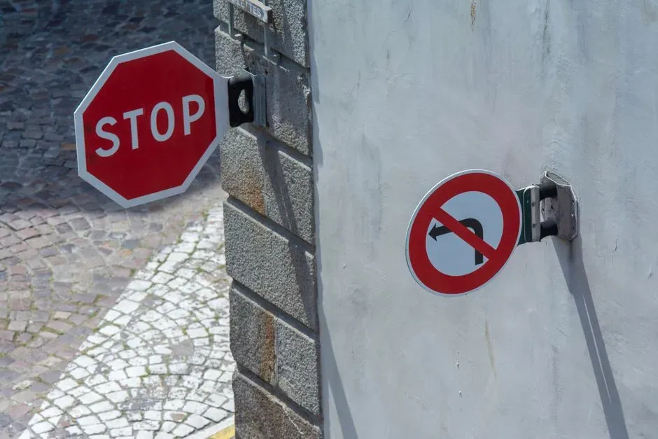
Safety is not just about rules and equipment; it is also about what people can actually see when they need to make quick decisions. Safety alignment uses sightlines to ensure exits, hazards, and safe zones are visually obvious from the right locations. When something goes wrong, eyes seek clarity first. If sightlines are bad, precious seconds are lost.
In factories or workshops, aligning pathways so that emergency exits and first-aid stations are visible from common work positions reduces reliance on memory alone. It also allows supervisors to oversee activity without constantly walking the floor. The line of sight itself becomes a safety system, complementing alarms and signage.
Public spaces like car parks, parks, and transport hubs use this logic too. Clear sightlines across large areas tend to reduce the sense of threat. When you can see and be seen, you are less likely to feel exposed or trapped. Conversely, blind corners, dark recesses, and broken lines of visibility can make a space feel unsafe even if crime statistics are objectively low. The emotional sense of risk tracks very closely to what the eyes can or cannot align with.
#9 UX Alignment: Designing Interfaces That “Just Feel Right”
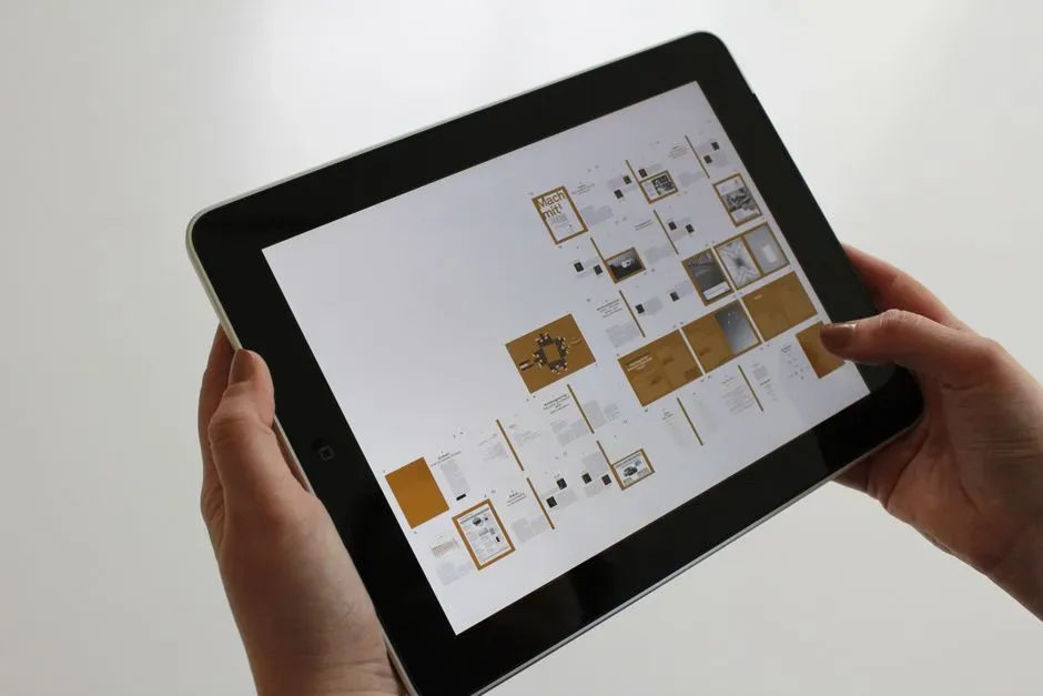
Open any app on your phone and pay attention to where your eye goes first. If the interface is well designed, the most important element is probably sitting neatly on a strong visual line: horizontally with a key heading, vertically under a focal image, or anchored to an edge your vision gravitates toward. That is UX alignment through sightlines in action.
Designers talk about “visual hierarchy,” but beneath that is something simpler: the path your eyes naturally trace across a screen, often in predictable patterns (like left-to-right and top-to-bottom in Western languages). By aligning key actions, links, and controls along that path, interfaces become easier to use without detailed instructions. Users feel like they are discovering the logic of the app on their own.
When UX alignment breaks, friction explodes. Misaligned buttons, scattered labels, or inconsistent placement between screens forces people to re-orient constantly. They hesitate, mis-tap, and eventually give up. This is why even small changes in alignment – a button moved a few millimeters off a known axis – can trigger frustration. The eyes still look along the old line, but nothing useful is there anymore.
- Users scan in patterns; aligning key elements to those patterns enhances usability.
- Consistent alignment across screens builds muscle memory and confidence.
- Visual clutter often results from too many competing sightlines pulling the eye.
#10 Narrative Alignment: Telling A Story In Straight Lines

We do not only align objects; we align ideas. Narrative alignment is about how sightlines can carry a story from one moment to the next. Exhibitions, museums, showrooms, and even social media feeds use sightlines to put ideas in sequence, not just in space. Stand here, look there, understand this; take two steps, see the next chapter.
A museum might place artifacts in a line that leads your gaze from an early, primitive object to a refined modern version. Even before you read any label, your brain understands the story of progress because the sightline is chronological. Turn a corner, and another line might connect a human portrait to an environmental display, telling a story of cause and effect without a single word.
In digital spaces, this can look like a vertically aligned series of images and headlines that tell one coherent story as you scroll. Each screenful of content lines up key visuals and text blocks so that your eye never has to hunt for what comes next. When done well, you feel “pulled” down the page, as if the story has momentum built into the layout itself.
#11 Temporal Alignment: Sightlines That Sync With Time

The most subtle form of alignment through sightlines is temporal alignment – connecting what you see now with where you are in time. This is less about static composition and more about synchronizing visibility with moments: what appears as you approach, what lines up morning versus evening, what becomes visible only when you move.
Think of a house designed so that the sunrise lines up perfectly with a kitchen window, casting a beam of light along a breakfast table. At a certain time each day, the sightline between sun, glass, and furniture aligns, creating a ritual feeling. Or consider a building where, at sunset, a particular corridor suddenly frames a view of the horizon that goes unnoticed the rest of the day. Time and vision click into place for a few minutes, then drift apart again.
In more everyday terms, temporal alignment appears in how we arrange screens, clocks, and information displays in relation to routine. A train departure board aligned directly with the path from the ticket gate means the moment you walk through at boarding time, the critical information is in your primary line of sight. Lighting can also play a role: at night, illuminated signs and paths create new sightlines that did not exist in daylight, realigning the way we move through the same physical space.
- Certain alignments only “exist” at specific times, triggered by light and movement.
- Designing for routines means placing key visuals where eyes will be at those times.
- Temporal sightlines can turn everyday moments into small rituals people grow attached to.
Conclusion: Seeing The Lines That Quietly Run Your Life
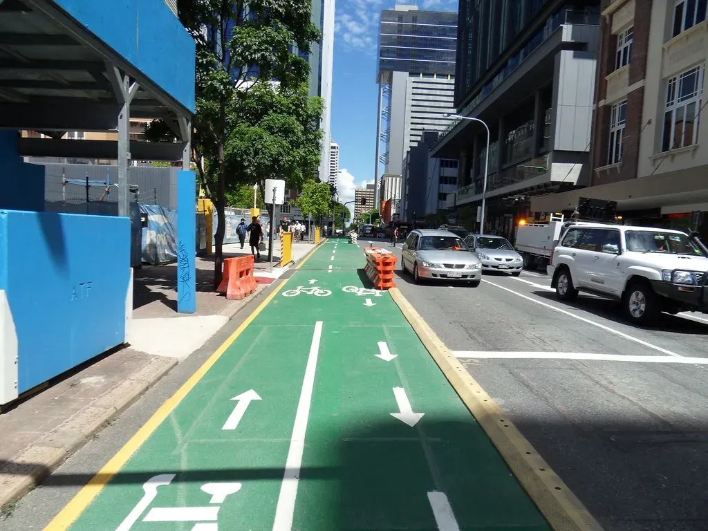
Once you start noticing these 11 alignments – visual, spatial, functional, emotional, cognitive, social, brand, safety, UX, narrative, and temporal – it is hard not to feel slightly cheated. For years, spaces, screens, and cities have been guiding you, nudging you, even calming or agitating you, using nothing but carefully managed sightlines. It can feel almost like discovering the trick behind a magic show you have been watching your whole life.
Personally, I find this both empowering and a little unsettling. Empowering, because you can now design your own environments more intentionally: arranging your workspace so important tools sit on strong sightlines, tweaking your home so views support the moods you want, even noticing when a product or place is manipulating your attention more than you are comfortable with. Unsettling, because you realize how rarely we question why our eyes go where they do.
In the end, the idea that alignment can be achieved with sightlines and almost nothing else is a reminder of how visual and suggestible we are as humans. We follow lines, we complete patterns, we obey the gentle tug of what we see long before we process words or rules. If you start treating sightlines as the quiet architecture behind your choices, you might design your world – and your attention – very differently. Now that you see the lines, what will you choose to line up next?