
Most people write off old maps as quaint, hand-drawn guesses from a world without satellites – charming, but basically useless. Then you look closer at a handful of them, and something breaks. Coastlines drawn centuries “too early.” Mountain ranges sketched in spots nobody should have surveyed yet. Landmasses that appear on parchment, vanish from later charts, then quietly resurface in modern satellite data.
These aren’t internet hoaxes pulled out of nowhere – they’re real documents sitting in real archives, and even cautious historians admit a few of them raise questions nobody has fully answered. Here are 13 maps that seem to know more than they possibly should, and what the actual evidence says about each one.
#13 – The Piri Reis Map That “Shouldn’t” Know South America’s Shape
This 1513 map has launched more YouTube rabbit holes than almost any other artifact on Earth. Drawn by an Ottoman admiral compiling older sources, it shows a shockingly recognizable eastern South American coastline at a time when Europeans had barely charted it. Even conservative scholars admit the outline is far more coherent than most early 16th-century attempts.
What really bothers cartographers is the detail – the bulge of Brazil, the taper toward Argentina, the angle of the coast. It’s good enough that some historians suspect lost, pre-Columbian charts fed into Piri Reis’s compilation, though he openly credited advanced Portuguese sailing data. Some interpreters even claim the map hints at an ice-free Antarctica further south. Overhyped or not, one thing holds up: this map knew more about the Atlantic than almost anything else we can document from 1513.
Fast Facts
- Only about one-third of the original map has survived, drawn on gazelle skin rather than paper.
- Piri Reis claimed roughly 20 source charts, including a now-lost world map credited to Christopher Columbus himself.
- The fragment sat forgotten for centuries until it resurfaced in 1929 inside Istanbul’s Topkapı Palace Library.
- It’s widely considered the earliest surviving map to record details from Columbus’s own voyages.
#12 – The Oronteus Finaeus Map and Its “Ice-Free Antarctica” Obsession
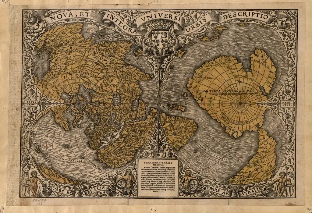
If you’ve seen a meme about “Antarctica before the ice,” it probably traces back to this 1531 world map. A large southern continent appears in roughly the right place, with a ragged coastline that looks eerily close to modern Antarctica’s outline at first glance. That resemblance has fueled decades of claims about surveyors mapping the continent long before Captain Cook ever sailed that far south.
The skeptical explanation is simple: Finaeus was just following the old medieval belief in a massive southern “balancing” landmass called Terra Australis. But the drawn coastline sits closer to the real Antarctic shape than a random guess should land, complete with hints of bays and peninsulas that roughly track modern charts. Most glaciologists insist there’s zero evidence of any civilization capable of detailed Antarctic surveying – yet the map’s unsettling near-miss accuracy keeps showing up in both academic footnotes and fringe books alike.
#11 – The Buache Map’s Hidden Under-Ice Antarctic Features
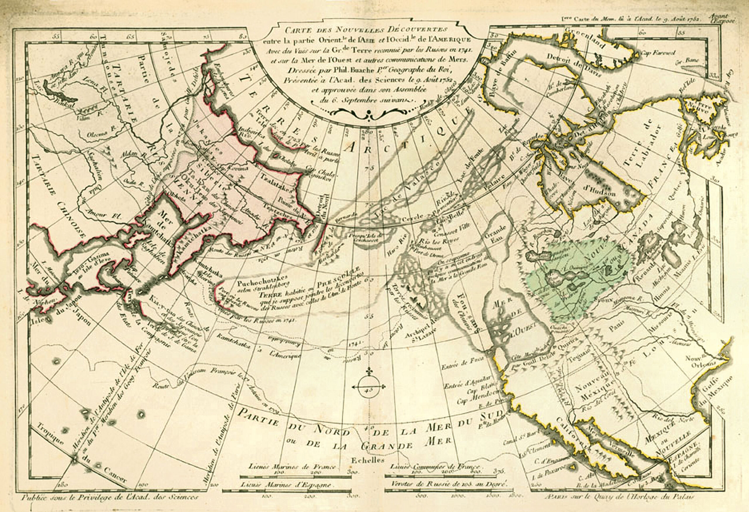
French geographer Philippe Buache’s 1739 map looks at first like just another Enlightenment-era stab at Terra Australis. Then you notice he split his version of Antarctica into two landmasses separated by a central sea – an idea that sounded absurd until 20th-century seismic surveys revealed a deep basin under the ice, one that genuinely divides East and West Antarctica.
The mainstream explanation is that Buache was extrapolating from known ocean currents and the era’s obsession with a hidden polar sea, and simply guessed close to right. No one has produced a credible mechanism for anyone surveying sub-ice topography in the 18th century, let alone earlier. Still, it’s hard not to feel a small chill knowing his speculative layout loosely lines up with features we only confirmed with radar equipment centuries later.
#10 – The Zeno Map That Puts Europeans in the North Atlantic Too Early
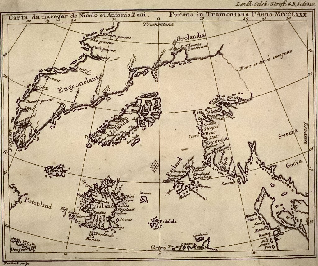
Published in 1558 but allegedly based on 14th-century voyages, the Zeno map fills the North Atlantic with islands – some real, some entirely invented. The strange part is how well it nails several features of the Faroe Islands, Iceland, and parts of Greenland, with a sophistication that suggests long-term European familiarity well before Columbus’s “age of discovery.”
Some historians shrug this off – Norse sailors were hitting these waters centuries earlier, and that’s not controversial. Others point out that while the Zeno narrative itself is almost certainly embellished, the cartography hints at more systematic exploration than the written record admits, including phantom islands like Frisland that echo across maps for centuries. Most scholars reject any grand cover-up theory, but the northern coastlines here read more like a working sailing chart than a fantasy sketch.
#9 – The Vinland Map That Refused to Stay Debunked (Then Kind Of Did)
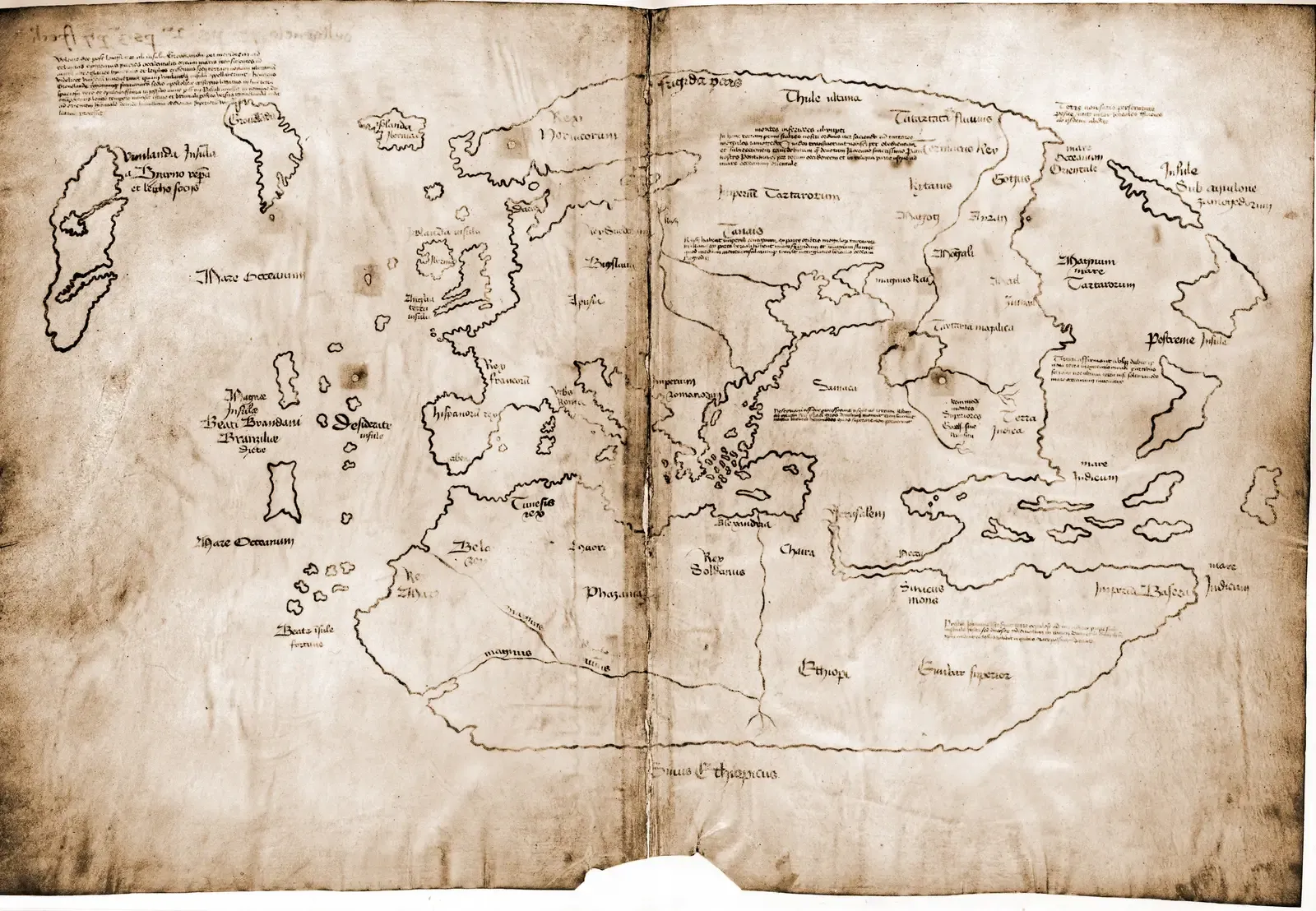
If one document epitomizes “nobody should’ve known this,” it’s the Vinland Map. Publicized in the 1960s, it appears to show a pre-Columbian depiction of North America labeled “Vinland,” attached to Greenland – implying Old World awareness of America long before Columbus. That would line up neatly with the real archaeology at L’Anse aux Meadows in Newfoundland.
For decades the map bounced between “sensational proof” and “obvious fake.” Ink analyses, parchment dating, and stylistic comparisons eventually leaned hard toward forgery, and most experts now treat it as a clever 20th-century fabrication riding on real Norse voyages. The paradox is what makes it stick: the underlying history is true, the Norse really did reach America, but the map itself is almost certainly a lie dressed up to look like proof.
There is no reasonable doubt here. This new analysis should put the matter to rest.
Raymond Clemens, curator, Yale’s Beinecke Rare Book & Manuscript Library
#8 – The Cantino Planisphere’s Shockingly Accurate Brazil
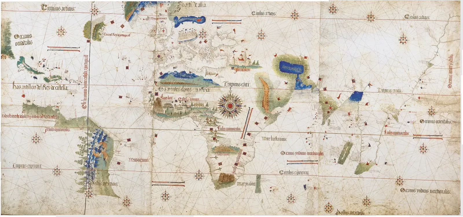
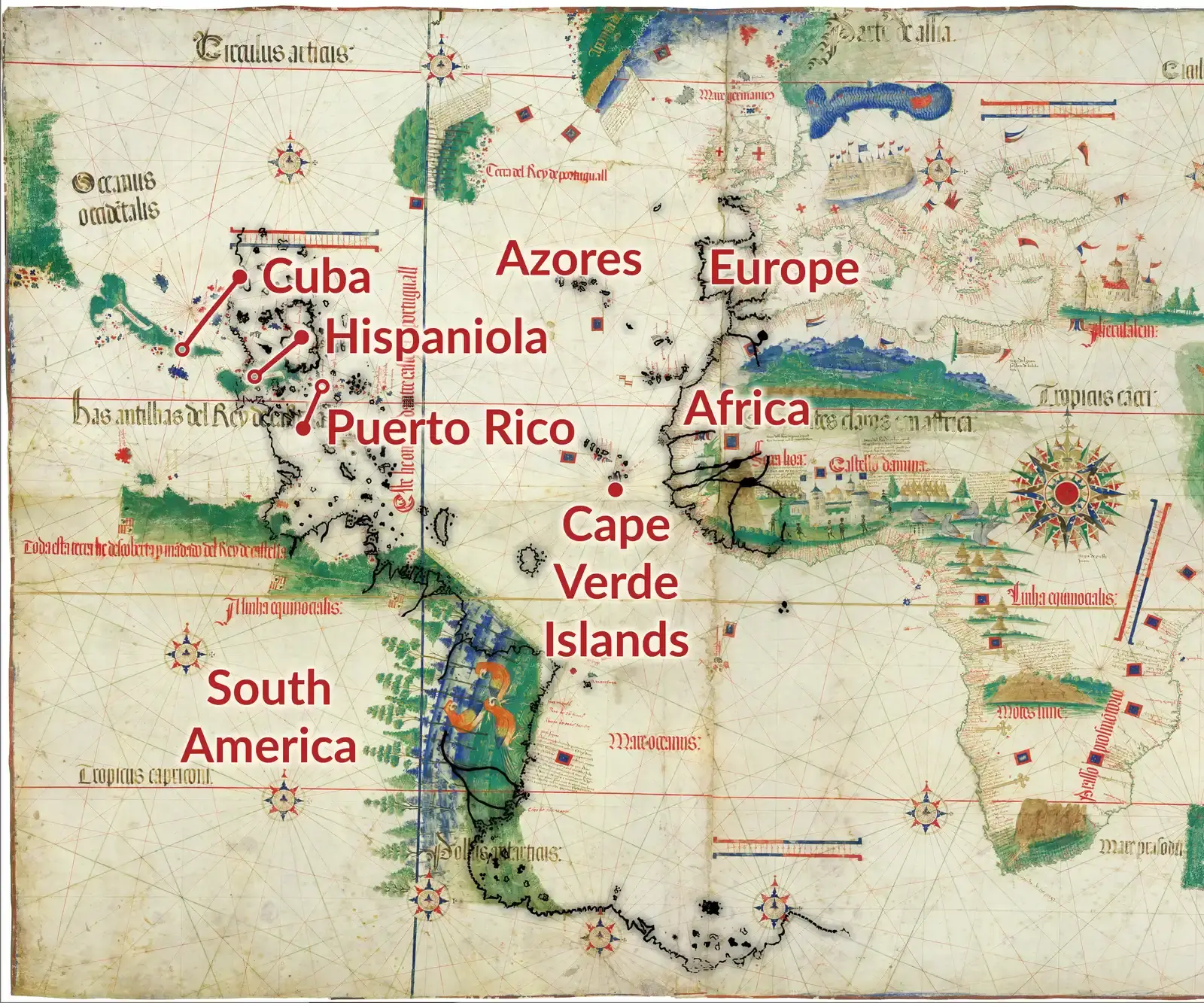
Smuggled out of Portugal in 1502, the Cantino Planisphere shouldn’t be mysterious – the Portuguese were elite navigators. Yet just a few years after Cabral’s official landfall, it already shows a long sweep of Brazil’s coast in the right place, at roughly the right shape and orientation, as if charted by multiple expeditions we have zero surviving records of.
The official story is that Portugal guarded its geographic data jealously, and this map reflects a hidden, aggressive push to chart new coastline fast. Some historians go further, arguing the level of detail implies even earlier reconnaissance along South America than the textbooks allow. It’s probably not proof of a mystery voyager – it’s proof of how much a state can erase simply by keeping its archives locked.
#7 – The Waldseemüller Map That Names “America” Before It Should Exist
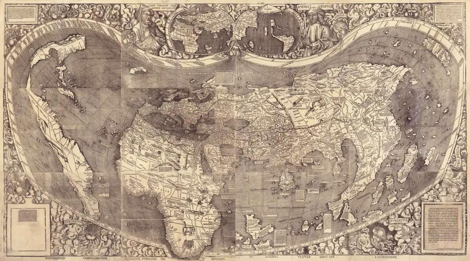
In 1507, German cartographer Martin Waldseemüller published a map that should have been wildly speculative. Instead, it’s the first known map to label a separate western continent “America,” and it does so with a confidence that suggests access to more than Columbus’s muddled reports about the “outskirts of Asia.”
Most people don’t realize how radical that split was – the mainstream European view still tried to jam the new lands into an Asian framework. Waldseemüller cleanly separated the two and named the continent after Amerigo Vespucci, based on data likely pulled from Portuguese and Spanish sources that already treated the New World as its own thing. He later walked the name back under political pressure, but the 1507 map remains a snapshot of insiders realizing “this isn’t Asia” long before the rest of Europe caught up.
#6 – The “Impossible” Chinese Coastlines on Medieval Portolan Charts
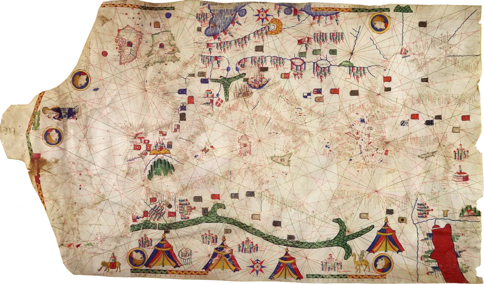
Medieval portolan charts get praised for their tight Mediterranean precision, but look further east on some later ones and you’ll spot surprisingly recognizable coastlines of South China, Indochina, and the East Indies – mapped at a time when official European contact was supposedly thin and secondhand.
Critics chalk this up to slow data diffusion through Arab intermediaries and overland trade routes, which is a fair explanation. But a minority of researchers suspect unrecorded voyages by Mediterranean trading networks translated Chinese or Arab sailing knowledge directly into European-style charts. The real mystery isn’t that these coastlines show up at all – it’s how closely they align with reality relative to how little contact the surviving texts admit to.
#5 – The Fra Mauro Map’s Hints of Pre-Portuguese Ocean Voyages
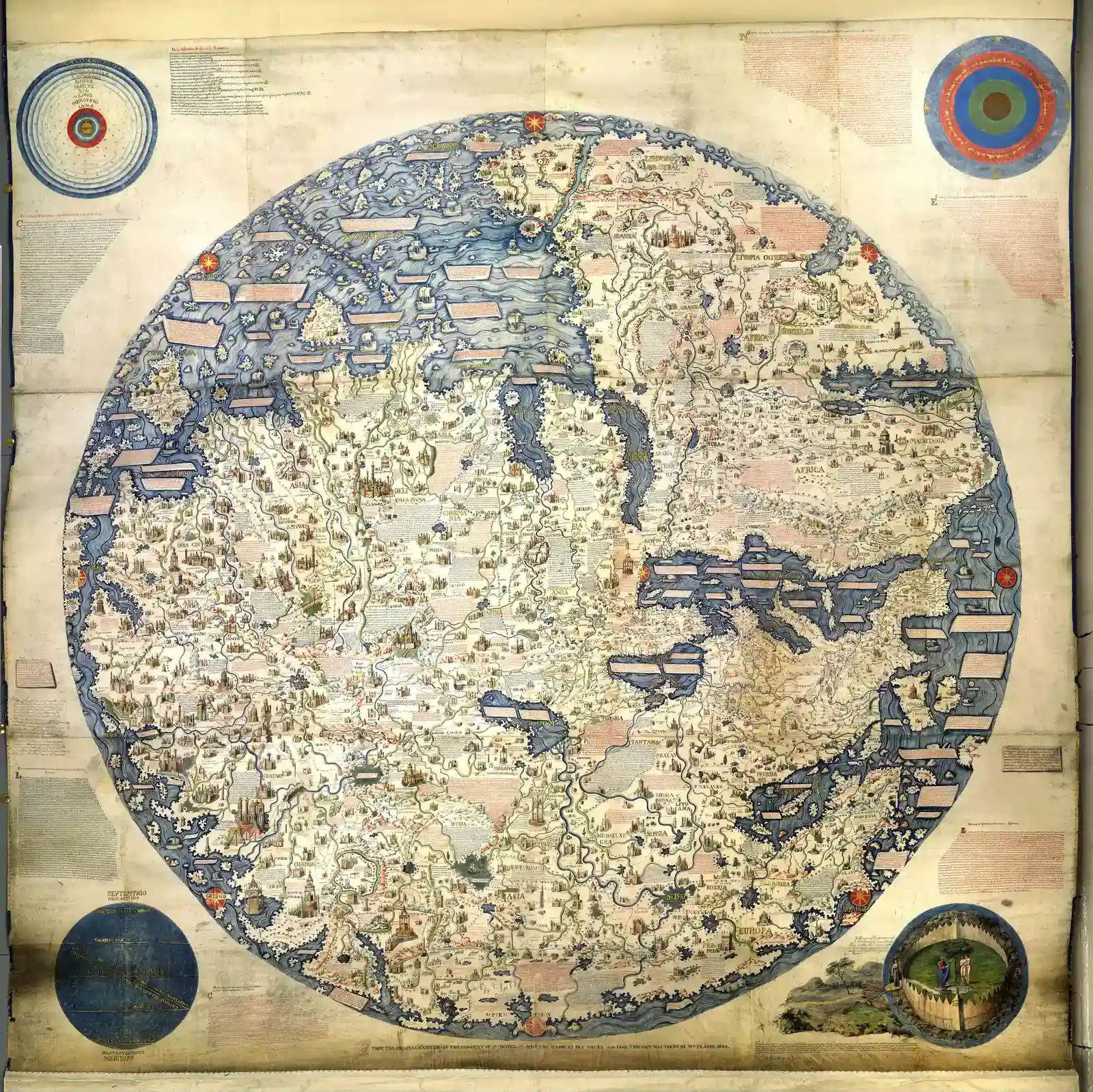
Drawn around 1450 by a Venetian monk, the Fra Mauro map gets praised mostly for its artistry. It should be hopelessly outdated. Instead, it shows Indian Ocean coastlines and routes that eerily anticipate later Portuguese discoveries, including a strikingly accurate understanding that you could sail all the way around Africa.
Venice was deeply plugged into Arab and Indian Ocean trade, so some knowledge transfer is expected. What’s harder to dismiss is Fra Mauro’s note describing a “ship from India” that allegedly rounded the Cape of Good Hope and pushed into the Atlantic – decades before Bartolomeu Dias supposedly did it first. Whether that’s literal history or garbled legend, the map quietly undercuts the myth that Europeans invented blue-water navigation from scratch.
Worth Knowing
- Fra Mauro drew the map around 1450 at a Camaldolese monastery just outside Venice.
- Unlike most modern maps, it’s oriented with south at the top, so Africa sits above Europe.
- Its annotation about an Indian ship rounding Africa predates Bartolomeu Dias’s officially recorded 1488 voyage by decades.
- Much of its Indian Ocean detail draws on Marco Polo’s travel accounts and Arab trading networks.
#4 – The Tabula Peutingeriana’s Odd Glimpses of Far-Off Lands
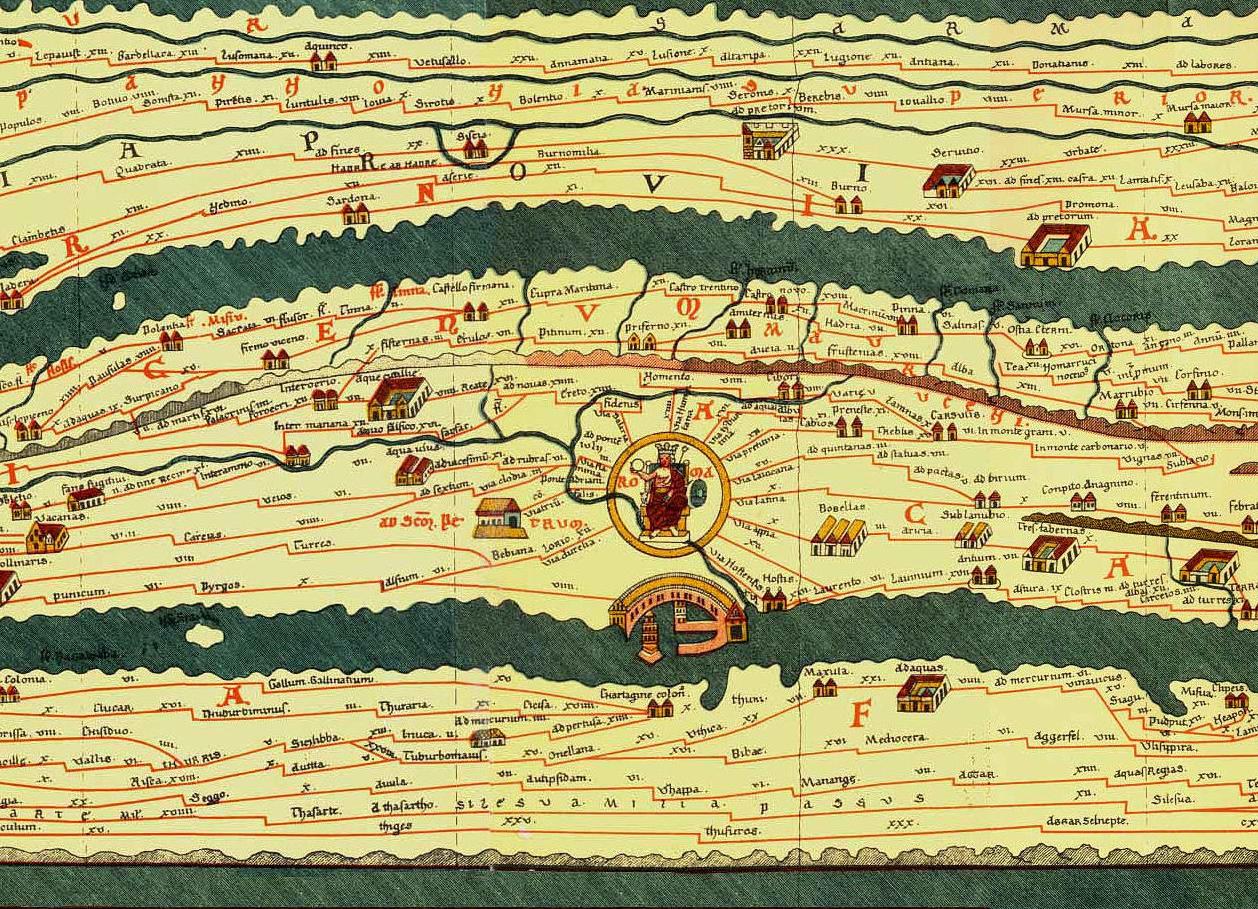
The Tabula Peutingeriana is a Roman road map on steroids – a long, skinny parchment stretching the empire’s routes across Europe, North Africa, and Asia. It’s schematic, not meant to be geographically precise. Yet tucked into that stretched drawing are surprisingly plausible hints of India, Sri Lanka, and far-eastern trading points that suggest Rome knew more than the usual “Mediterranean bubble” narrative gives it credit for.
Roman writers usually sound vague and half-mythical about distant lands, but the map’s layout suggests someone turned scattered travelers’ reports into a semi-coherent directional framework. It doesn’t prove Rome secretly mapped places we never suspected – it proves something quieter and stranger: they knew more about relative positions and trade routes than their surviving literature admits, and then that deeper knowledge simply got lost.
#3 – The Kangnido Map’s Oversized Africa and “Too Early” Worldview
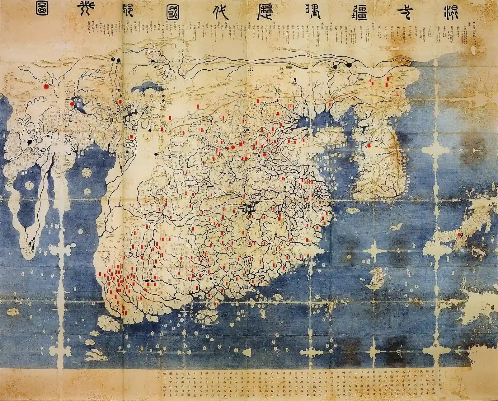
Created in Korea in 1402, the Kangnido map is a genuine jaw-dropper if you’ve only studied Eurocentric history. It shows Africa, the Middle East, India, and Europe in a single, integrated layout, more than half a century before European “Age of Discovery” maps reach similar global coherence. Africa is oversized and distorted, but unmistakably there.
Korean mapmakers pulled this off by synthesizing Chinese geographic compilations, Islamic maps, travelers’ reports, and court intelligence into a world picture that looks shockingly modern in scope. While Europeans were still trying to reconcile Bible geography with Ptolemy, East Asian cartographers had already stitched together an Afro-Eurasian map with themselves at the center. It doesn’t show the Americas, but it proves an advanced, semi-global worldview existed outside Europe long before Columbus ever set sail.
#2 – Medieval “Here Be Dragons” Maps That Accidentally Got Things Right
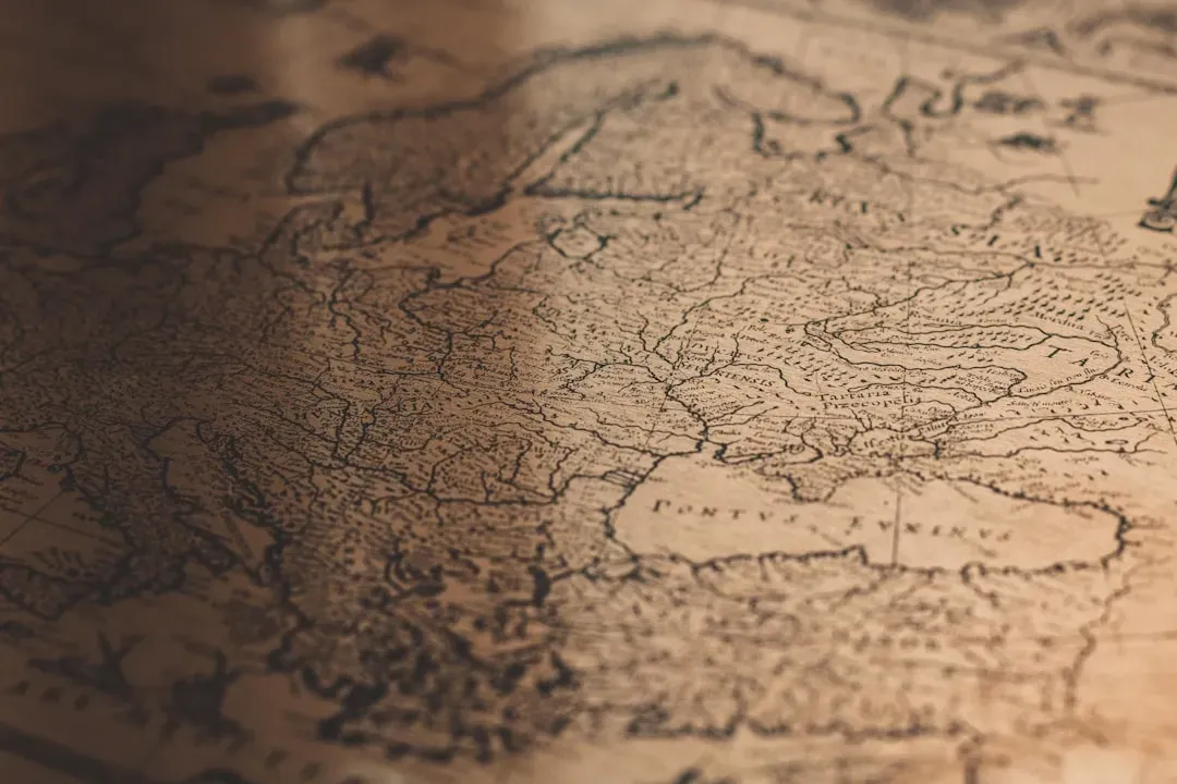
It’s easy to laugh at medieval T-O maps crowded with monsters and moral symbolism. But buried under the theology and guesswork are accidentally correct placements of certain islands, currents, and climatic zones that suggest real sea lore was quietly feeding into even the most “wrong”-looking charts.
Sailors didn’t understand the physics, but they read winds, birds, and floating debris as clues to unseen land – and some of those clues landed roughly where we now know there are seamounts or current convergence zones. That’s not secret knowledge of hidden continents, but it’s not pure fantasy either. Some of the most ridiculed maps in history may be preserving distorted echoes of real observations that nobody could properly explain until instruments caught up centuries later.
#1 – Ptolemy’s Geographia: Wrong in Detail, Disturbingly Right in Ambition
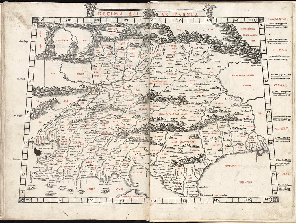
Claudius Ptolemy’s 2nd-century Geographia is the granddaddy of “knowing too much, too early.” On the surface it’s riddled with errors – Africa nearly seals off the Indian Ocean, latitudes and longitudes drift wildly, and entire places are misplaced or invented outright. And yet the underlying framework – coordinates, a spherical Earth projected onto flat pages, a global grid – is uncannily modern.
Ptolemy wasn’t just cataloguing cities; he was asserting that the entire world could, in theory, be measured and mapped with consistent math. Explorers centuries later used that conceptual scaffolding to imagine lands beyond their reach, and his mistakes ended up fueling the very voyages that filled in the blanks. He didn’t know the places he mapped – but he built the toolset that let everyone after him go looking.
At a Glance
- Written around 150 CE in Alexandria, Egypt, by the astronomer and geographer Claudius Ptolemy.
- Catalogued roughly 8,000 place names, each assigned a latitude and longitude coordinate.
- Lost to Western Europe for centuries; Byzantine copies resurfaced and were translated into Latin in the early 1400s, sparking a wave of Renaissance mapmaking.
- Its flawed calculations of the globe’s size are often cited as part of what convinced Columbus a westward route to Asia was short enough to attempt.
The Bottom Line: These Maps Aren’t Magic, They’re Missing Paperwork
Stripped of the hype, none of these 13 maps prove lost super-civilizations or ancient satellites. What they actually reveal is more uncomfortable, and honestly more interesting: over and over, we’re looking at hints of erased voyages, guarded state secrets, lucky guesses, and partial knowledge that never made it into the official record.
Sometimes a coastline is too accurate for the sources we have. Sometimes a “mythical” land lines up suspiciously well with real geography. Sometimes a forger builds a fake that accidentally underlines a true story we’d already dug up ourselves.
My honest take? The real mystery here isn’t ancient astronauts – it’s how much of human history gets quietly deleted by fires, jealous kings, and archives nobody bothered to protect. That’s a less thrilling headline than “lost civilization,” but it’s the one the evidence actually supports. Which map on this list do you think earns the mystery, and which one is just a good story that got out of hand?