
You’d think the most carefully checked documents on the planet would be museum catalogues. Every date footnoted, every sentence peer-reviewed, every claim triple-checked by someone with a PhD and a grudge against sloppiness. That’s the myth, anyway.
The reality is stranger: flip through enough catalogues and you start finding sentences that just die. No ellipsis, no “continued on page 42,” no polite trailing off. A thought simply stops, mid-clause, like someone yanked the page out from under the writer. Once you start noticing it, you can’t stop – and the reasons behind it are far messier than any hidden-message conspiracy could ever be.
#10 – The Artist Biography That Dies Right Before the Scandal

The most common half-finished entry is the artist biography that builds momentum through the early struggles and the breakthrough masterpiece – and then simply refuses to land the ending. You get the rise. You never get the fall.
The final years – the breakdown, the exile, the scandal that actually made the artist famous – often vanish into a dangling comma. That’s rarely mystery. It’s usually a rushed layout swap: an editor trims 40% of an essay for space, a designer reshuffles the spread at the last minute, and a once-tidy paragraph gets sliced in half rather than reflowed. In blockbuster shows, deadlines beat storytelling every time. If the proof comes back late, a life story gets frozen mid-sentence forever.
#9 – The Provenance Trail That Vanishes at the Worst Possible Moment
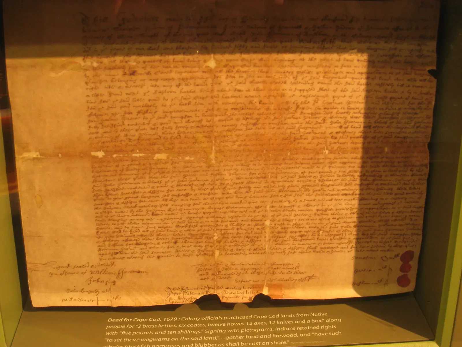
Provenance entries are supposed to read like forensic reports – hard dates, named collectors, clean transfers of ownership. Then, without warning, the text runs confidently through the early decades and stops cold: “Acquired from the dealer shortly after the war, the work may have…” And then nothing.
That missing half-sentence is often exactly where the most legally sensitive information should be. Not every gap here is accidental. Lawyers tell curators to strike a line, and a rushed edit leaves a literal fragment behind. Other gaps are placeholders meant to be filled once an archive confirmed a detail – confirmation that never arrived. Restitution researchers and heirs read these gaps like tea leaves. Most visitors skip right past them.
Worth Knowing
- Provenance gaps cluster suspiciously often around wartime-era ownership records, a period notorious for incomplete paperwork.
- Restitution claims can hinge on a single missing sentence, which is why researchers treat these fragments as leads, not typos.
- Legal review teams sometimes edit provenance text after curators sign off, without ever circling back to smooth the prose.
- Phrases like “further research pending” are industry shorthand for ownership questions nobody has closed out yet.
#8 – The Conservation Report That Ends Mid-Diagnosis
Conservation notes can read like crime scene reports: “Microscopic examination reveals…” followed by dense, clinical language. Then, right as the paragraph builds toward an actual finding, it trails off after an unfinished subordinate clause – and the finding never shows up.
Readers get the question the scientists asked. They never get the answer. Full conservation reports run dozens of pages; the catalogue squeezes that into maybe 150 words, often trimmed by someone who isn’t a conservator. A line like “Preliminary analysis suggests X, pending further tests” gets clipped right after “suggests.” Worse, testing schedules slip past the print deadline, so someone yanks the speculative half of the sentence and forgets to rebuild what’s left.
#7 – The Wall Text That Grew Up and Forgot Its Point
Many catalogue entries start life as a tight 120-word wall label. Then someone decides, “let’s expand this into a full essay,” and it grows – historical framing, quotes, comparative images – until marketing wants more room for pictures and the text box shrinks right back down.
You end up with an entry that raises a genuine debate and then never tells you the museum’s actual position. You’ll see something like “This painting challenges traditional narratives of…” and then the very next line is the credit line. No how, no why, no conclusion. It’s a tug-of-war between designers who want big images and curators who want arguments, settled at 2 a.m. before the printer runs. Most visitors assume that’s just vague academic hedging. It isn’t – it’s a real idea, cut in half by a layout deadline.
#6 – The Footnote That Swallowed the Last Paragraph
Serious catalogues live and die by their footnotes. Scholars chase those tiny superscript numbers the way detectives chase leads. But in more than a few volumes, a paragraph ends abruptly right after a footnote marker, as if the rest of the sentence fell straight into the page gutter.
Often the missing ending genuinely does exist – it’s just in a note that got detached or never typeset correctly. Footnotes are brutal to manage in design software. Move a note from page 134 to 135, and the pointer can stay behind. An editor, assuming the note covers the gap, cuts the “redundant” closing sentence from the main text – and then the note itself gets orphaned or merged elsewhere. What’s left in print is something like “This shift in attribution fundamentally chang” followed by a caption. Scholars recognize the wreckage instantly. Everyone else just feels vaguely unsatisfied.
Fast Facts
- Footnotes are typeset separately from body copy in most catalogue design software, creating a built-in failure point.
- Moving a single note between pages can leave a “widow” sentence with no visible ending anywhere in the book.
- Editors often assume the footnote completes the thought, so they trim the main text without double-checking.
- Scholars treat an abrupt ending near a footnote marker as a signal to go dig through the notes section itself.
#5 – The Translation That Gives Up Halfway Through
Bilingual catalogues are a minefield for this exact problem. Read the French or German paragraph and it’s fully coherent start to finish. Flip to the English version of the same entry, and it quietly gives up two-thirds of the way through what was clearly meant to be a longer argument.
Entire arguments disappear because the translated version hit a character limit, or because the translator was never sent the final draft. Curators keep revising the original text right up to the deadline – adding new research, new controversies, new context. The translation, meanwhile, is often built from a Word file that’s two versions behind. Some languages also expand in length during translation, so design teams impose stricter character counts on that side, and the last third of the thought simply gets dropped with nobody assigned to smooth over the ending.
#4 – The Catalogue Raisonne’s Ghost Volume That Never Arrived
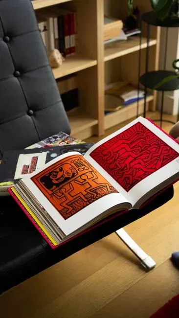
Catalogue raisonnes – the massive, supposedly definitive inventories of everything an artist ever made – are built on the promise of totality. So it’s unsettling when an entry ends with “Further details to follow in the forthcoming volume on works from…” and that volume simply never shows up, sometimes for decades.
The promise of future clarity is frozen in time the moment funding, sales, or leadership quietly kills the next volume. Multi-volume raisonnes are staggeringly expensive to produce, and publishers abandon later installments more often than anyone likes to admit. Editors hand off the hardest questions – disputed dates, competing attributions, missing sketches – to that mythical future volume. When it evaporates, all that’s left is a sentence fragment pointing at a book that doesn’t exist. Scholars know to hunt down later journal articles instead. General readers are just left staring at a promise nobody kept.
Quick Compare
- Single-volume catalogue: one deadline, one budget, and a lower risk that unfinished questions get abandoned entirely.
- Multi-volume raisonne: years or decades can pass between installments, raising the odds that funding or leadership changes mid-project.
- Single-volume: unresolved questions usually just get cut for space.
- Multi-volume: unresolved questions get punted to a “forthcoming” volume that may never actually appear.
#3 – The Exhibition Essay That Got Quietly Cut Off at the Knees

Every so often, a catalogue essay hits what feels like an invisible wall. The author starts cautiously criticizing the museum’s own collecting history, or a major donor’s role in it, and then the prose lurches to a different topic mid-sentence and never comes back.
This kind of half-entry often marks exactly where institutional politics overrode the scholar’s original draft. Museum review processes pull in legal, development, and communications staff, all scanning for anything too blunt – looted origins stated plainly, a patron criticized by name, a gap in representation called out directly. When there’s no time left for a proper rewrite, the fastest fix is a blunt one: slice from the middle of a sentence straight through to the end of the paragraph. Critics sometimes romanticize these gaps as “subversive silences.” Mostly, they’re just evidence of last-minute institutional nerve loss.
#2 – The Object Label That Collides With the Page Edge

Basic object entries – dimensions, materials, a plain description – should be the least dramatic real estate in any catalogue. And yet this is exactly where a sentence will stop two words before the line break and simply never resume on the next page.
This is almost always a text-box overflow problem, not a mystery – and nobody caught it on the print proof. A curator types into a database field capped at, say, 255 characters. Export that to a design template, and anything past the limit gets silently dropped. A sentence that once read “likely produced by a workshop assistant rather than the master himself, based on pigment analysis” can lose its entire final clause, leaving a watered-down half-claim behind. Unit conversions get caught in the same trap – a sentence starts comparing inches to centimeters and simply stops, mid-comparison, with no room left in the box.
At a Glance
- Museum database fields often cap description text at a fixed character limit set years before anyone wrote the final entry.
- Text that exceeds the export limit can be silently truncated the moment it flows into a design template.
- Unit conversions between inches and centimeters are common casualties of these last-minute cutoffs.
- Print proofs are supposed to catch overflow like this, but tight production schedules mean proofing sometimes gets skipped entirely.
#1 – The “Scholarly Debate” That Never Actually Tells You Who Won
The single most frustrating category of half-finished entry is the one that teases a genuine controversy and then refuses to resolve it. You’ll read something like “Recent research has dramatically challenged the long-accepted attribution of this painting to…” and then the entry jumps straight to a list of citations.
The verdict – who believes what now, and why – never actually gets written down. This happens because editors are terrified of printing a firm position that looks wrong in two years; attributions and dating can flip fast once new scholarship lands. So committees strip out the actual conclusion and leave a vague nod to “ongoing debate” instead. For casual readers, it feels like an unintentional cliffhanger. For scholars, it’s a tell – the institution is hedging in public while quietly deciding, behind closed doors, what it’s actually willing to endorse.
The Bottom Line
Museum catalogues are built to project total authority, and the half-finished entries are exactly where that performance cracks. Most of these gaps aren’t romantic secrets waiting to be solved. They’re the fingerprints of deadlines, legal nerves, database limits, and multi-volume projects that quietly died somewhere in a budget meeting.
Here’s my honest take: institutions should own these gaps instead of letting them sit there looking mysterious. A single line – “text abridged for space” or “see forthcoming research” – would cost nothing and fix everything. Until museums start doing that, treat every dangling sentence as exactly what it is: a red flag to question, cross-check, and never mistake for the final word.