You open your phone, glance at the little rain cloud icon, and trust it without a second thought. That number feels almost scientific-clean, precise, beyond question. But the truth is messier than anyone tells you: forecasts are built on raw readings from thermometers bolted at random heights, gauges quietly missing rain in the wind, and clocks that got reset decades ago in ways that still bend today’s data.
Meteorologists have known this for years, but it rarely makes headlines because it isn’t dramatic – it’s plumbing. Behind every “high of 89°” and “70% chance of rain” sits a chain of small, almost invisible decisions about height, timing, and placement. Here are 14 quiet details buried inside weather records that are shaping the forecast on your screen right now, and a few of them might make you distrust your backyard thermometer for good.
#1 – The Height of the Thermometer Changes Everything
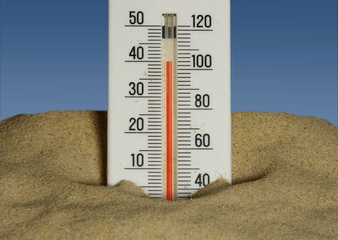
A thermometer sitting six inches off the ground and one sitting six feet off the ground will report two completely different realities, even in the exact same backyard. Air temperature changes fastest in the first couple of meters above the surface, which is why official observations standardize on roughly head height over open ground.
The recommended height for temperature and humidity sensors is 1.25 to 2 meters, or about 4 to 6.5 feet, above ground level. Drop below that window and the sensor stops reading true air temperature and starts reading surface heat instead.
Fast Facts
- Standard temperature sensor height: 1.25–2 meters (about 4–6.5 feet) over open ground
- Agricultural networks often measure at 1.5–2.0 meters
- Some wind and climate networks measure as high as 10 meters
- Readings taken too low reflect surface heat, not true air temperature
Most people don’t realize weather services and backyard hobbyists aren’t even measuring at the same height as each other. Agricultural stations often collect data at 1.5 to 2.0 meters, while some networks measure at 10 meters. That mismatch alone can explain why your phone’s forecast doesn’t match your porch thermometer on a still, sunny afternoon.
Forecast models ingest thousands of these station readings to build their starting picture of the atmosphere. If the height metadata is wrong or inconsistent, the model quietly absorbs a small error at the very first step, before a single calculation of wind or pressure even begins.
#2 – What Time the Reading Was Taken Secretly Shifts the Whole Trend
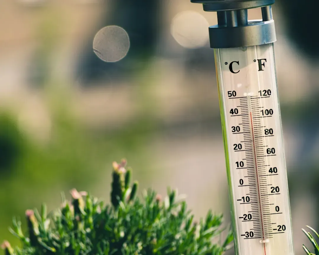
Turns out the clock matters almost as much as the thermometer itself. For most of the 20th century, U.S. volunteer observers reset their thermometers whenever it suited them, often in the late afternoon, which baked a slight warm bias into the early climate record.
A slow shift toward morning observation times during the second half of the century introduced the opposite problem: a broad, nonclimatic cooling effect layered right on top of real temperature trends. When observation time moves from afternoon to morning, minimum, maximum, and mean temperatures all drop in a way that has nothing to do with actual weather.
Scientists have even put a number on it. Shifting observation times from 5 p.m. to 7 a.m. across roughly half of U.S. stations introduces a cooling bias of about 0.5°C into the record. That single habit, changed decades ago by people who never imagined climate scientists poring over their notebooks, still echoes through today’s baseline data.
The surprising part is how large this correction really is. Time-of-observation adjustments account for slightly more than half of all technical corrections applied to the U.S. climate record. One clock, reset at the wrong hour, outweighs almost every other adjustment combined.
#3 – The Ground Underneath the Sensor Isn’t Neutral
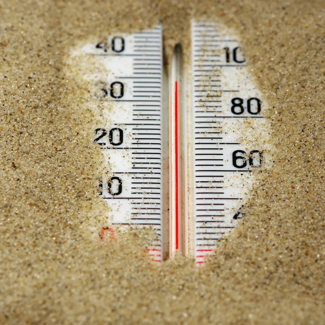
Most people assume a thermometer just measures “the air.” It doesn’t. It measures the air that has been baking over whatever surface sits directly beneath it, which is why siting guidance is so strict about what’s underfoot.
Black surfaces like asphalt and dark shingles run measurably warmer than lighter surfaces like gravel or pale roofing. That’s exactly why guidance insists a weather station sit about 5 feet over short grass or low shrubs, never over concrete, rooftops, or driveways.
Here’s the mistake almost nobody catches until they compare years of data side by side: a temperature trace that spikes above nearby stations every sunny afternoon usually points straight to pavement or a nearby wall. A station quietly moved ten feet closer to a parking lot can start running a full degree or two warmer without a single instrument ever being touched.
This isn’t a hypothetical embarrassment. It’s baked into how forecasters interpret “record highs” for a region, since a station over a black rooftop technically can’t be compared apples-to-apples with one over an open grass field, even in the same city.
#4 – Station Relocations Quietly Break Decades of History
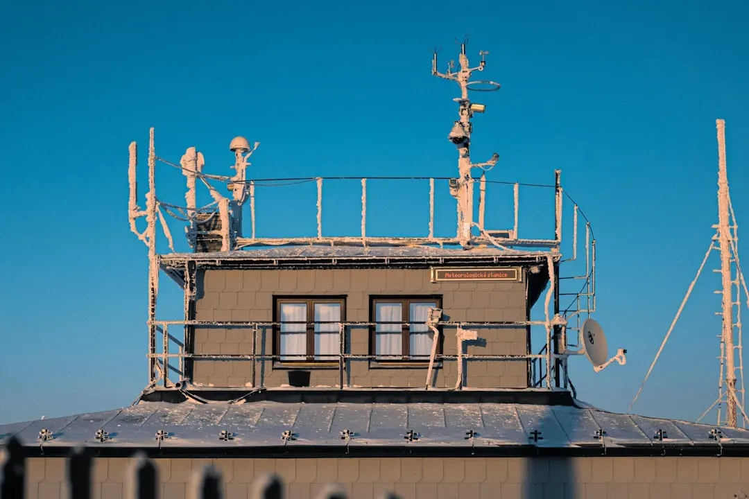
Weather stations move. Airports expand, volunteers retire, buildings get demolished, and every single move can introduce a jump in the record that has nothing to do with actual climate change.
Scientists call these sudden jumps “inhomogeneities,” and they’re everywhere in century-long records. Correcting for them means identifying artificial breaks caused by station moves, instrument swaps, or shifts in observation time, then mathematically smoothing them out of the historical timeline.
Most people assume a “100-year weather record” comes from one continuous, unmoved instrument. It almost never does. Climate agencies now run automated detection systems, like the Pairwise Homogenization Algorithm, built specifically to catch hidden breakpoints caused by moves, instrument changes, or creeping urban heat.
Without that correction, a single station relocation to a slightly cooler or warmer spot could be mistaken for genuine long-term climate change. It’s one of the least glamorous, most important corrections in the entire forecasting pipeline.
#5 – Cities Are Quietly Cooking Their Own Weather Stations

Most people assume “the weather” is uniform across a metro area. Forecasters increasingly disagree, arguing that a station’s exact zip code inside a city matters almost as much as the season.
Urban heat islands form because cities have fewer natural landscapes and far more asphalt, concrete, and rooftops that absorb and retain heat long after sunset. A downtown sensor and a rural sensor twenty miles away can post wildly different overnight lows during the exact same weather pattern.
The gap can be bigger than most people expect. One Chicago heatwave study found rural temperatures climbed roughly 4°C during the event while urban Chicago rose a smaller 2 to 3°C, yet nighttime urban heat island intensity still ranged from about 1.44 to 2.83°C. Urban cores don’t always spike hotter during extreme heat; they just refuse to cool off at night, which is arguably worse for public health.
This is exactly why forecasters increasingly distrust a single “official” city station for hyper-local forecasts, leaning instead on dense networks of sensors scattered across neighborhoods.
#6 – Wind Speed Depends Entirely on How Long You Averaged It
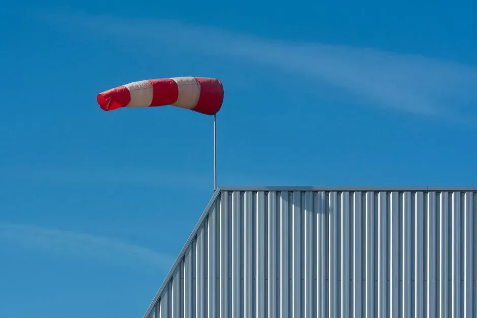
Here’s a controversial opinion gaining traction among meteorologists: the “wind speed” on your app is almost meaningless without knowing the averaging window sitting behind it.
A 2-minute average, a 10-minute average, and a 3-second gust can all describe the exact same gust of wind completely differently. A squall that hits 60 mph for four seconds might average out to a tame 25 mph over ten minutes, and both numbers are technically correct at the same time.
Quick Compare
- 3-second gust: captures a fleeting burst, often the most dramatic number reported
- 2-minute average: common on many U.S. surface reports, smooths short spikes
- 10-minute average: the international standard for “sustained wind,” flattens gusts even further
- Example: a 60 mph squall lasting four seconds can average out to just 25 mph over ten minutes
Most people never realize forecast verification studies actively wrestle with this inconsistency. Recent urban wind research found contrasting bias patterns depending on which averaging convention and observational reference were used, meaning even professional models struggle to reconcile station-to-station differences.
That mismatch matters most during severe weather, when a “gust” from one station and a “sustained wind” from another get compared as if they’re identical, sometimes triggering warnings that don’t quite match what people actually feel outside their front door.
#7 – Anemometers Placed Wrong Make Every Wind Forecast Suspect
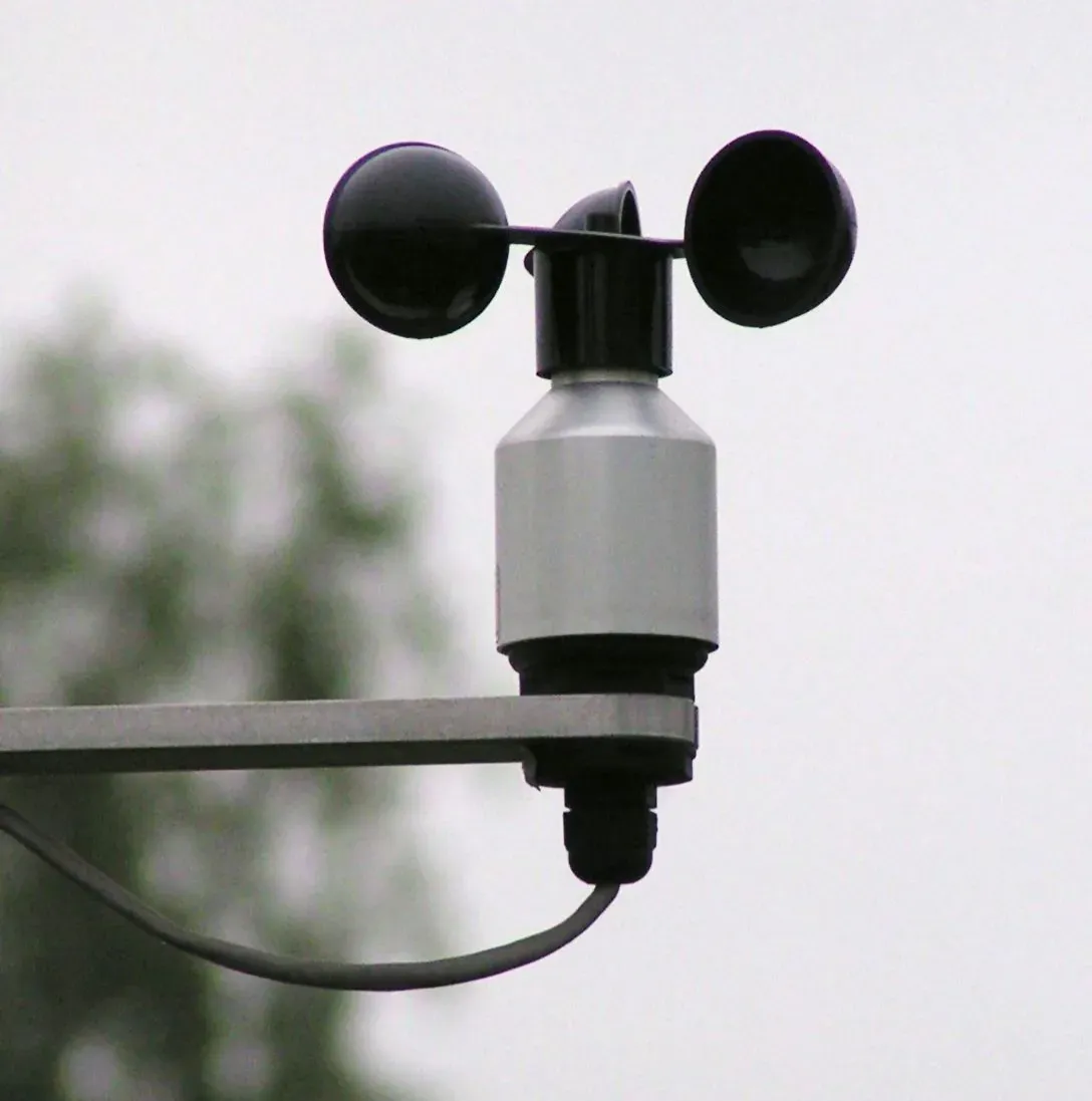
Casual weather watchers assume any rooftop pole works fine for measuring wind. Professionals treat anemometer placement as one of the trickiest siting problems in the entire field.
The recommended height for wind measurement is 10 meters, or about 33 feet, above ground level, because wind speed increases with altitude as surface friction fades away. That standard exists to capture wind representative of the wider area, not the gusts swirling around your hedge.
The frustrating part is that almost no residential setup can actually hit that standard. Guidance simply recommends placing the sensor as high as possible, potentially several meters above the roofline, to avoid the turbulent air churning just above most rooftops.
A wind sensor mounted too low or too close to a building gets contaminated by turbulence that has nothing to do with the true regional wind pattern. A single skewed anemometer feeding into a crowdsourced network can quietly distort local wind forecasts for an entire neighborhood.
#8 – Barometric Pressure Needs a Hidden Math Correction
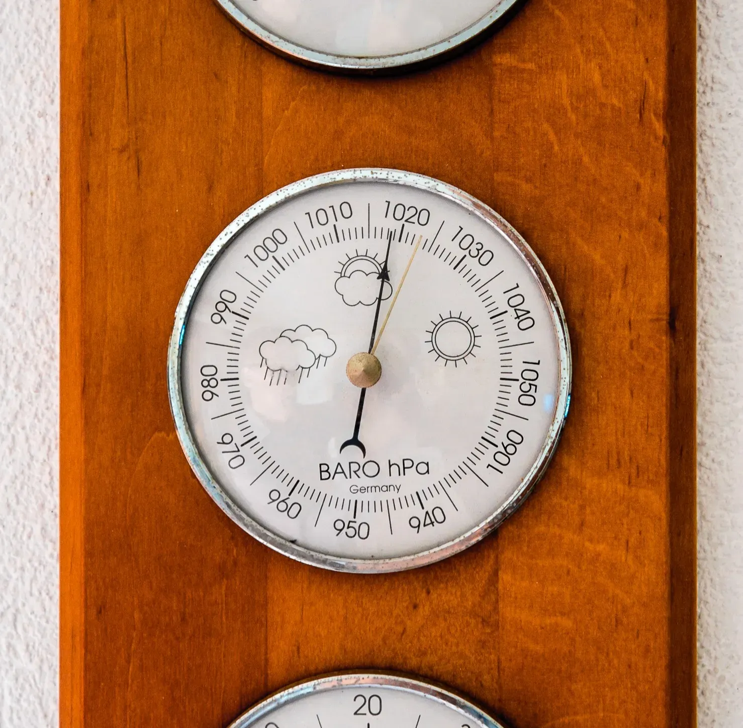
Most people glance at “pressure” on a weather app without realizing that raw number is almost never the actual air pressure at that location. It’s been mathematically altered before you ever see it.
Accurate site elevation has to be recorded and used to standardize every reading to sea level. Without that adjustment, a mountain station would always show “low pressure” and a coastal station would always show “high pressure,” regardless of what the atmosphere is actually doing.
Here’s the surprising precision behind it: corrections follow a strict formula tied to elevation, roughly comparable to the 0.5°C-per-100-meter rule used for temperature. Get a station’s recorded elevation wrong by even a few dozen meters, and the “corrected” pressure reading becomes quietly unreliable.
Incorrect elevation is the single most common metadata error in weather databases, and it causes automated pressure-based quality checks to flag the station. A wrong number typed into a spreadsheet years ago can make an entire station’s pressure trend look suspicious enough to get it excluded from forecast models altogether.
#9 – Humidity Numbers Hide a Sneaky Trick
Most people believe relative humidity tells you how “sticky” the air feels. Forecasters increasingly argue that’s the wrong number to trust, and dew point is the one that actually matters.
Relative humidity is a ratio, so it swings automatically as temperature rises and falls, even when the actual moisture in the air stays exactly the same. A muggy 70°F morning and a scorching 95°F afternoon can post wildly different relative humidity percentages while holding identical amounts of water vapor.
This is why forecasters increasingly lean on dew point instead of humidity percentage to judge real discomfort. Dew point measures the exact temperature at which air becomes saturated, making it a far steadier gauge of how oppressive the air truly feels, no matter what the thermometer says beside it.
The instrumentation matters too. Humidity sensors are typically bundled with the temperature sensor inside a radiation shield, and they need distance from water sources or high-humidity generators like cooling towers. A sensor sitting near a fountain or an irrigation line can throw off both readings at once.
#10 – Sunlight Hitting the Sensor Itself Ruins the Reading
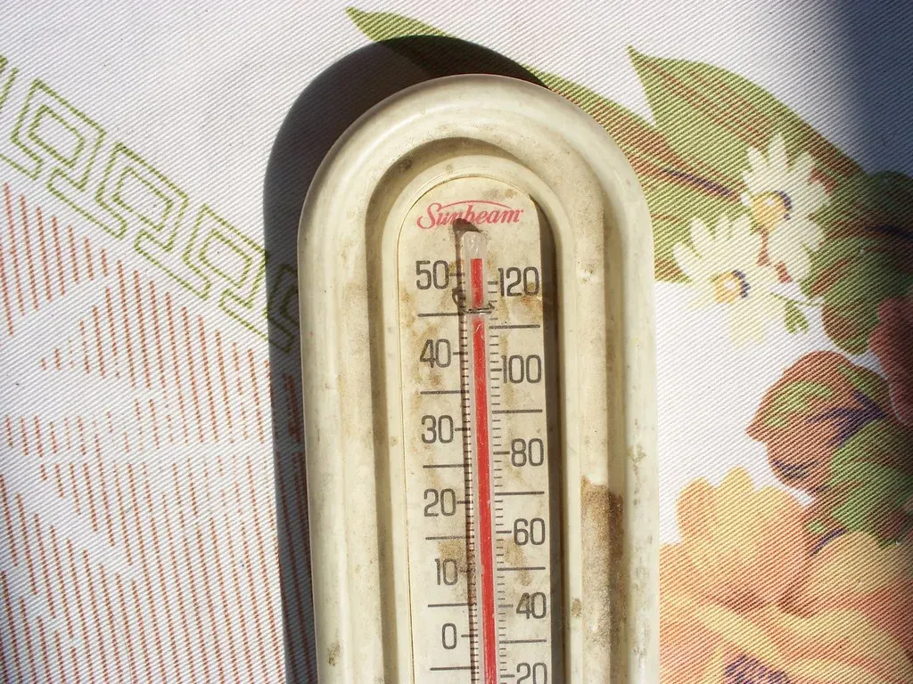
A thermometer sitting in direct sun isn’t measuring air temperature anymore. It’s measuring itself.
That’s exactly why every professional weather station uses a radiation shield, a ventilated housing designed to block direct sunlight while still allowing air to flow across the sensor. Double shielding is considered best practice, paired with small, fast-responding sensors, especially in areas where wind is too weak to naturally flush away trapped heat.
Most backyard weather station owners skip this step entirely, and it shows up in their data almost immediately. Without adequate shielding and airflow, a sensor can bake in direct sun and report temperatures several degrees hotter than the true air around it, especially on calm, cloudless afternoons.
This single flaw is one of the most common reasons personal weather stations get flagged or excluded from crowdsourced networks used to fine-tune hyper-local forecasts. A poorly shielded sensor doesn’t just embarrass its owner; it can quietly corrupt an entire block’s worth of “verified” local data.
#11 – Rain Gauges Undercount More Than Anyone Admits
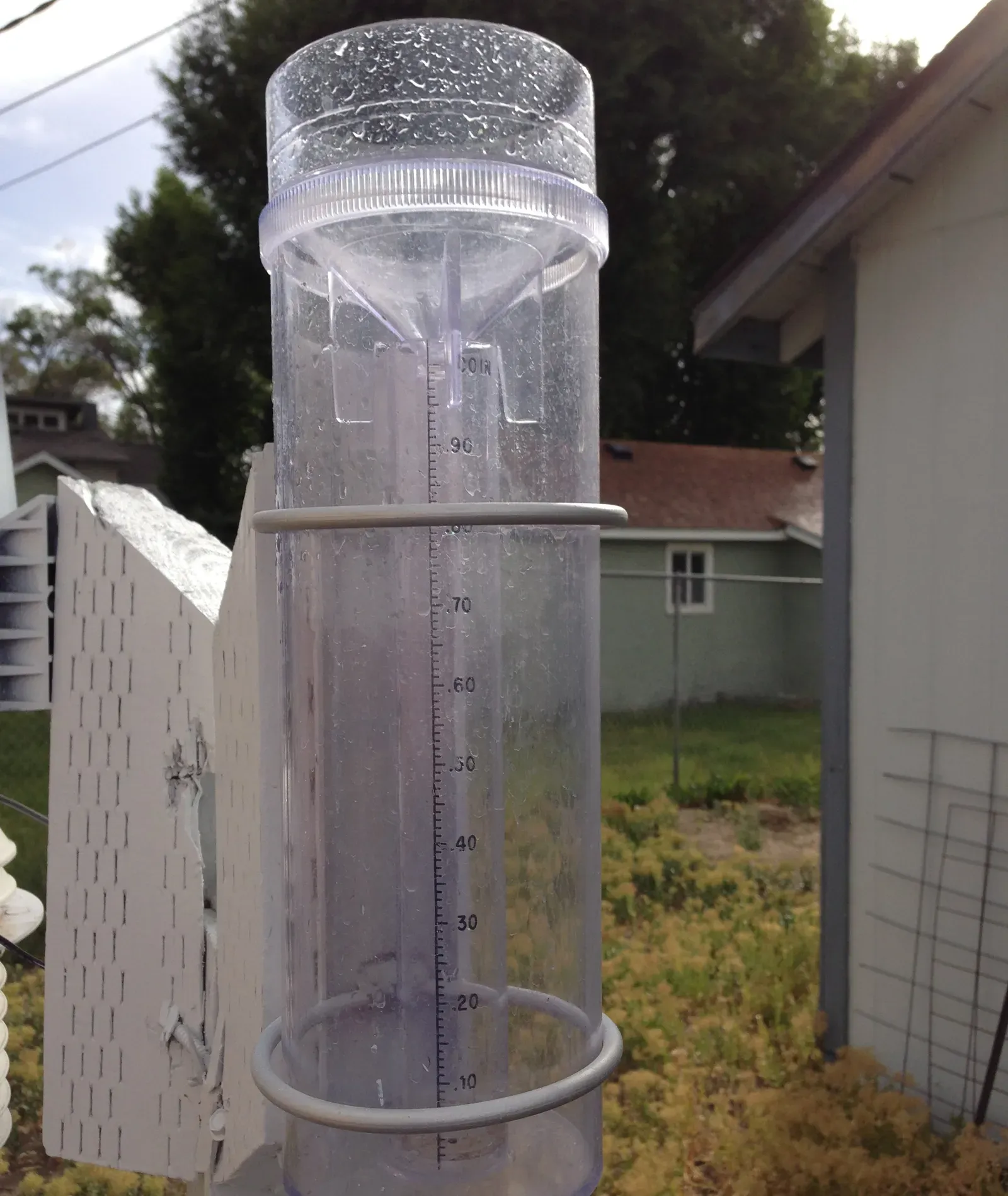
Most people assume a rain gauge simply catches falling water. Meteorologists know wind is constantly sabotaging that number before a single drop even hits the funnel.
Rain gauges need open sky, free of overhanging branches, and some protection from wind-induced under-catch. Wind doesn’t just occasionally miss the gauge, it systematically pushes raindrops sideways, especially lighter drops and snowflakes, meaning the “official” rainfall total is almost always a slight undercount during windy storms.
Worth Knowing
- Wind pushes lighter raindrops and snowflakes sideways, causing systematic under-catch
- Gauges need open sky, clear of overhanging branches or nearby walls
- Gauges placed too close to buildings can be shielded from rain on one side entirely
- Two neighborhoods in the same storm can log different totals purely from gauge exposure
The placement mistakes compound fast. A gauge tucked too close to a building can get shielded from rain entirely on one side, while a gauge sitting exposed in an open, gusty field can lose measurable precipitation to wind deflection. Neither error is obvious just by glancing at the number on a display.
This is a mostly invisible flaw in the public’s understanding of storm totals. Two neighborhoods hit by the exact same storm can report meaningfully different rainfall totals purely because of gauge exposure, not because the storm actually behaved differently overhead.
#12 – Snow Measurements Depend on Timing Almost as Much as Snowfall
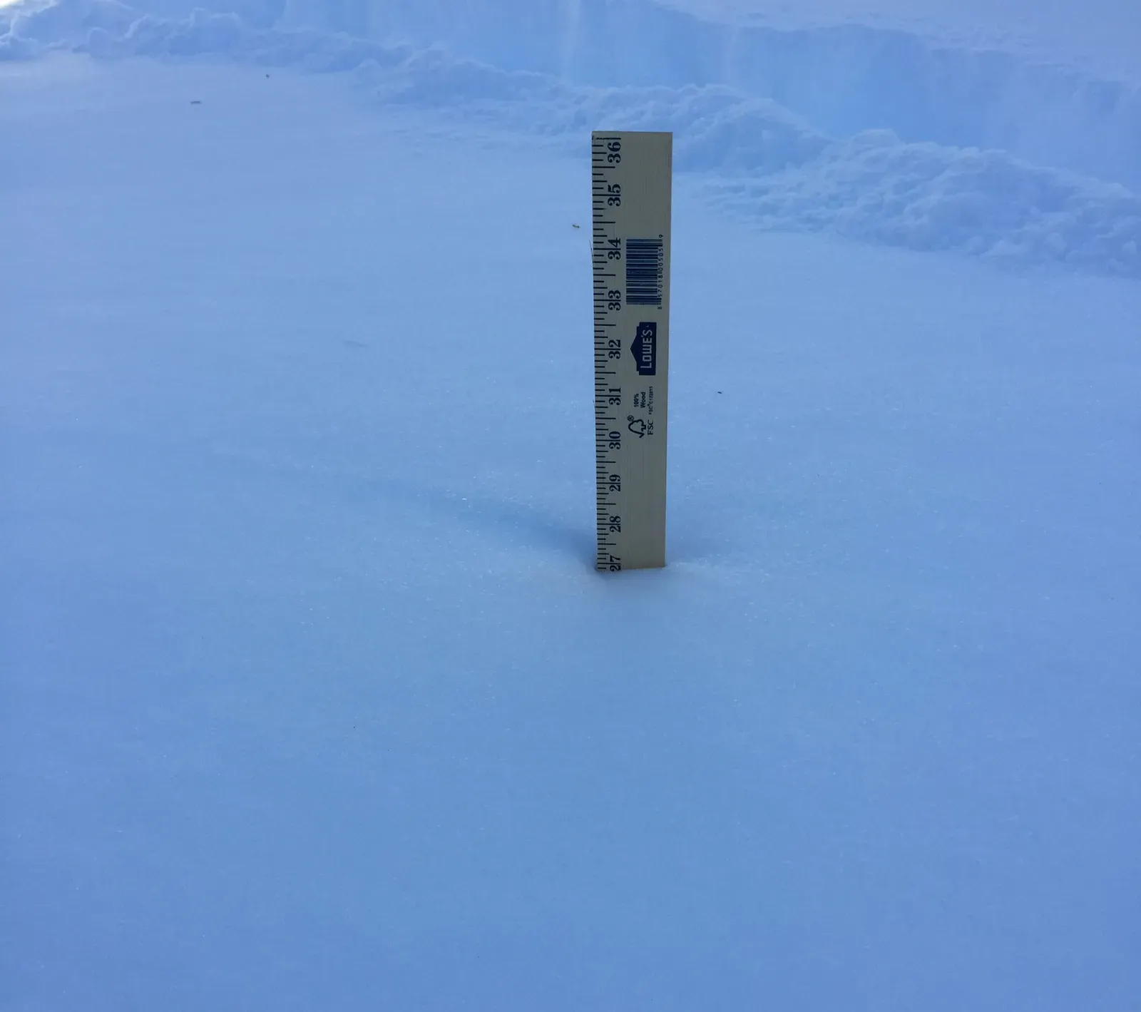
Most people assume “6 inches of snow” is a simple, objective fact. In reality, snow measurement is one of the messiest parts of the entire weather record.
Snow compacts under its own weight almost immediately, so the exact moment a measurement is taken can shift the reported total by inches. Official guidance calls for measuring on a clean, flat surface at set intervals during a storm, then resetting the board, a manual, human-dependent process that varies from observer to observer.
Here’s the part that surprises most casual readers: wind-driven drifting can pile snow several inches deeper in one corner of a yard than just a few feet away. The “official” total for an entire town often comes down to one person’s judgment call about where exactly to stick the ruler.
Add melting, settling, and snow-to-liquid ratios that shift with temperature and crystal structure, and it’s clear why professionals treat snowfall records with far more skepticism than rainfall totals. It may be the least precise measurement still treated as headline news.
#13 – Radar Doesn’t Actually See the Ground
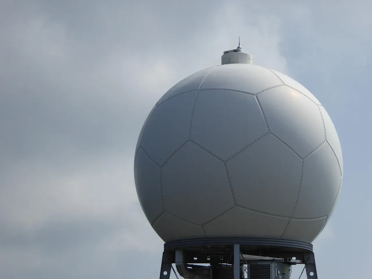
Here’s a fact that surprises almost everyone: weather radar never actually measures rain falling on your head. It measures precipitation high above you, then estimates the rest.
Because the Earth curves and radar beams travel in a straight line, the beam climbs higher and higher above the actual ground the farther it travels from the tower. By the time a beam reaches a location one hundred miles away, it may be sampling precipitation thousands of feet up, sometimes missing shallow rain or snow entirely, or catching virga that evaporates before it ever reaches the surface.
This is why radar-estimated rainfall can be dramatically wrong compared to what a gauge on the ground actually records, especially during light precipitation, shallow cold-season snow, or storms near the radar’s maximum range. Forecasters constantly cross-check radar estimates against real gauge networks precisely because the beam-height problem never fully goes away.
It’s one of the most persistent, purely physics-based limitations in modern forecasting. No software update can fix the curvature of the planet.
#14 – Every One of These Quiet Flaws Feeds the Same Forecast Model
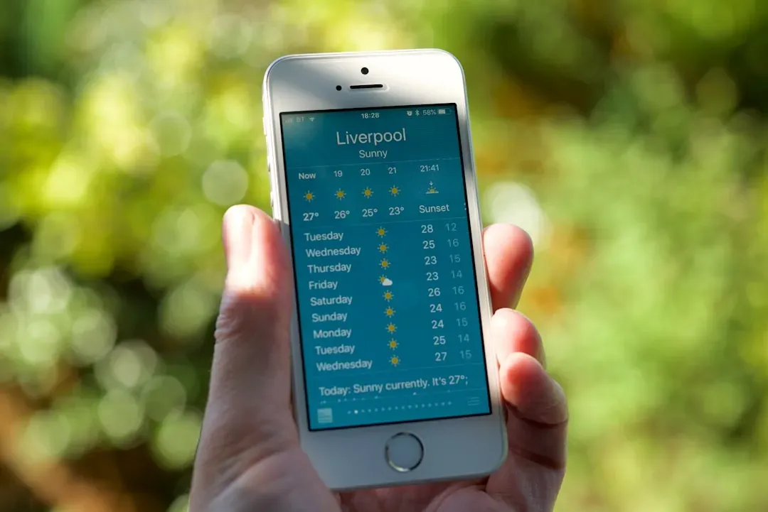
This is the detail almost nobody connects until it’s spelled out plainly: every flaw on this list, height errors, timing shifts, surface bias, urban heat, wind averaging, elevation typos, doesn’t just sit quietly in a historical record. It gets fed directly into the computer models generating tomorrow’s forecast.
Modern numerical weather prediction runs on a process called data assimilation, where raw observations from thousands of imperfect stations get blended together into the model’s starting snapshot of the atmosphere. That blending improves predictive performance, particularly by smoothing extreme values and sharpening the simulated day-night cycle, but only when the underlying observations can actually be trusted.
Does the flap of a butterfly’s wings in Brazil set off a tornado in Texas?
Edward Lorenz
Most people picture forecasting as pure atmospheric physics. In reality, a huge portion of forecast accuracy depends on unglamorous data janitorial work happening long before the physics even starts. Feed a model bad metadata, a wrong sensor height, a wrong elevation, a station secretly baking over asphalt, and the error doesn’t stay local. It ripples forward into the six-day forecast everyone downstream is relying on.
The Bottom Line
The uncomfortable truth is that a forecast is only as honest as the messiest, least glamorous parts of its underlying data: sensor height, observation timing, surface type, and elevation metadata that almost nobody double-checks. Most people assume bad forecasts come from bad models. More often, the data feeding those models is the real culprit.
Meteorologists have quietly built entire correction systems just to compensate for a century of human and instrument error baked into the record. It’s less “black box magic” and more careful, unglamorous bookkeeping, done by people who will never get credit for the six-day forecast quietly working out. Which of these fourteen quirks surprised you the most? Drop it in the comments.