You probably take maps for granted: open an app, zoom in, and there the world is, laid bare. But there are places where that smooth, endless satellite imagery suddenly glitches, blurs, or simply stops, as if the planet itself has something to hide. In more than a few cases, that missing detail isn’t an accident – it traces back to moments when authorities found something, changed a map, then quietly locked the real version away. When you dig into later declassified records, you discover a strange mix of the mundane and the chilling: secret bunkers that everyone “knew” were there, disaster zones whose shapes were scrubbed from public view, and entire regions that officially did not exist. As you walk through these eight examples, you start to see maps less as neutral tools and more as contested ground, where security, fear, and politics can literally redraw reality under your feet.
1. Area 51, Nevada: The Base That Didn’t Officially Exist
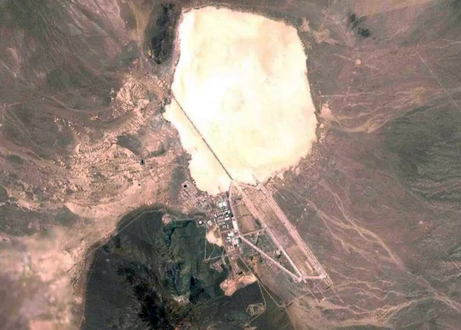
You can still feel how surreal it is that for decades one of the most infamous places on Earth did not appear on official maps. When U.S. military planners chose a dry lakebed in Nevada in the mid‑1950s to test secret aircraft, they did something very simple but very radical: they let the map go blank. Early charts either skipped the Groom Lake region entirely or left it as a vague patch of desert, while internal maps, locked behind classification stamps, showed runways, hangars, and test ranges you were never meant to see. When later documents were released, you could finally read clinical descriptions of what was really there: test corridors for high‑altitude spy planes, radar ranges mapped to the meter, and airspace boundaries drawn like invisible walls in the sky. You also see how, once weird lights and sonic booms started spooking people in nearby towns, officials doubled down, classifying aerial photos and detailed topography so you could not cross‑check your stories with a map. The declassified material quietly confirms the obvious: the secrecy was more about advanced aircraft than aliens, but the deliberate gaps on public maps are exactly what kept your imagination running wild.
2. Soviet Closed Cities: Where Even the Name Vanished
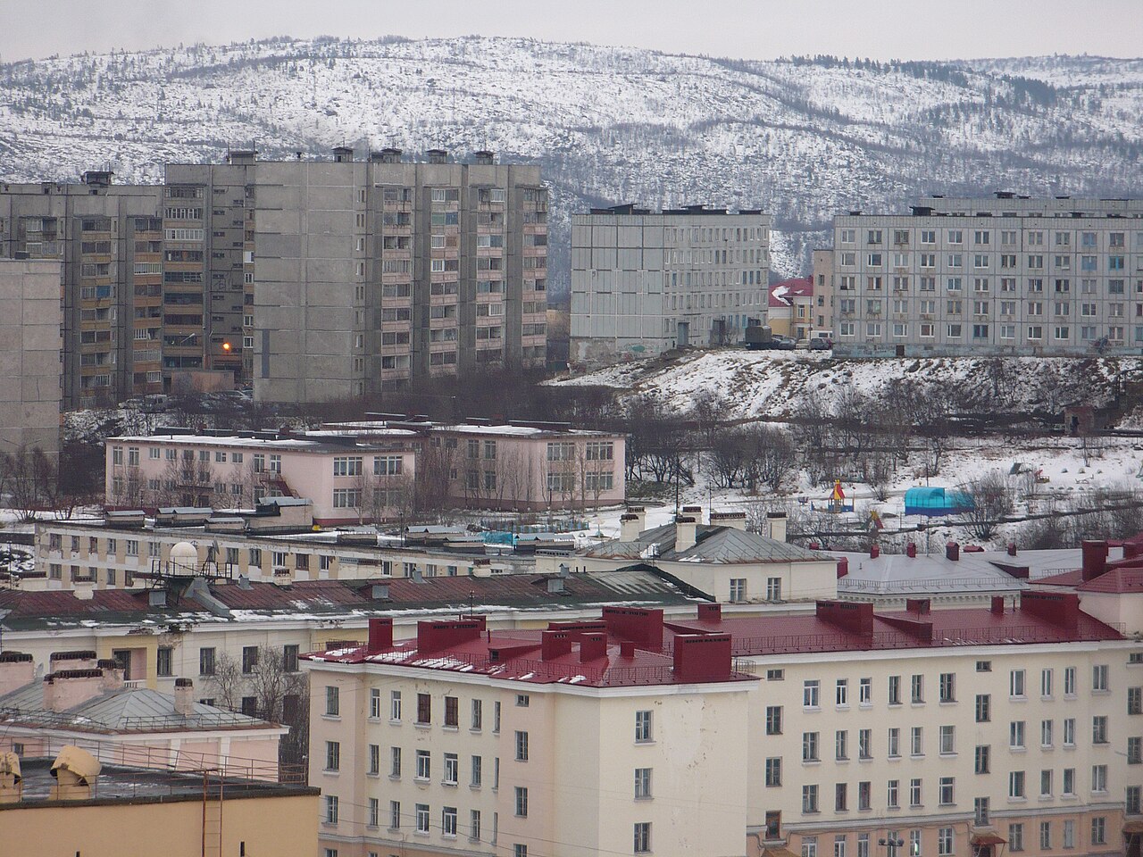
If you had lived in the Soviet Union during the Cold War, there were cities you could not visit, could not write to, and often could not even name. These “closed cities” existed physically but disappeared cartographically: official atlases either omitted them or replaced them with harmless‑sounding industrial towns that did not match reality on the ground. What triggered the classification was usually a strategic discovery – a rich ore deposit, an ideal missile test site, a good harbor for nuclear submarines – that turned an ordinary place into a vital node of the state. Later, when archives opened and some files were declassified, you could finally see how the maps looked inside the system. Internal military charts showed whole urban layouts, rail spurs, power lines, and restricted belts around nuclear facilities, all carefully measured and labeled, while the public maps showed either empty forest or a generic settlement that had the wrong population and the wrong roads. Reading those declassified descriptions, you realize the map itself was treated as a weapon: by stripping you of accurate place‑names and coordinates, the state kept you from fully understanding where key parts of your own country actually were.
3. Pine Gap, Australia: The Station in the Middle of Nowhere
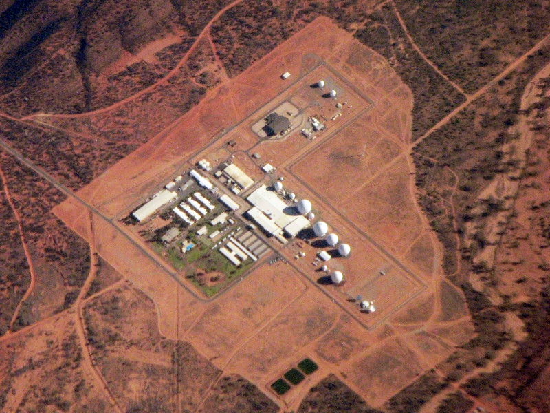
If you zoom into central Australia today, you can clearly see Pine Gap’s radomes and structures, but for many years the heart of that facility was more rumor than map feature. When American and Australian officials agreed in the late 1960s to build a joint signals intelligence base near Alice Springs, they picked a spot whose remoteness made it easy to erase from casual view. Public‑facing maps smoothed the area into anonymous outback, while more detailed survey data was bundled into classified overlays restricted to defense and intelligence staff. Declassified fragments and government acknowledgments that have trickled out over the years describe a place whose exact layout – antenna fields, access roads, underground cables – was mapped in painstaking detail, but only inside secure channels. You also see evidence that after certain satellite interception capabilities were added, authorities tightened control over aerial images and topographic sheets so you, as an outsider, could not infer what the new installations were doing just by tracing their geometry. The contrast between the sanitized maps you were allowed to see and the layered technical diagrams in the declassified files is a stark reminder that “empty” land on a map can be anything but empty.
4. North Korea’s Nuclear Sites: Digital Maps That Don’t Agree
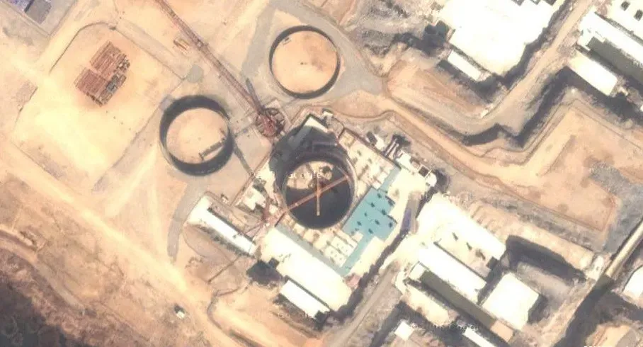
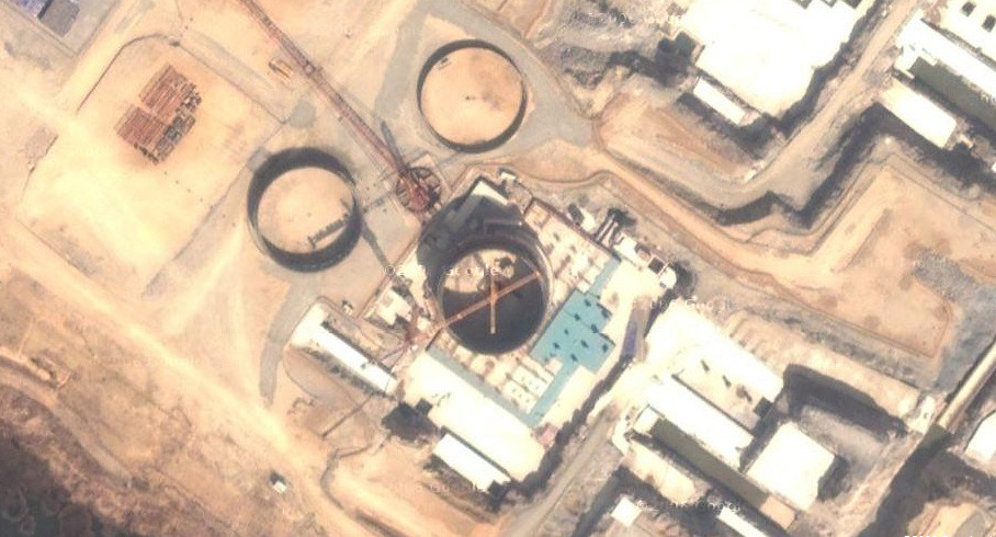
When you look at a commercial map of North Korea, you’re really seeing a puzzle where several crucial pieces have been blurred, fudged, or only guessed at. Many of the country’s nuclear‑related sites first came to wider attention not through official maps but through grainy satellite photos and defector reports, prompting governments to quietly classify their own, far more detailed mapping. Public maps stayed vague, while internal products used by intelligence services highlighted terrain features, tunnel entrances, and transport routes around facilities like Yongbyon. Over time, some international reports and satellite analyses have pulled back the curtain a bit, describing what those restricted maps show in terms you can follow: building footprints measured down to a few meters, suspected reactor halls carefully outlined, and nearby villages and hills annotated to help track movement and potential fallout paths. But you still feel the absence: where a normal map would give you contour lines and precise place‑names, you often get generalized shading or out‑of‑date imagery. The declassified and semi‑official descriptions make it clear that the cartographic gaps are rarely accidental – they were introduced after strategic activity was observed, as a way to stop you from connecting dots too easily.
5. U.S. Continuity‑of‑Government Bunkers in the Appalachians
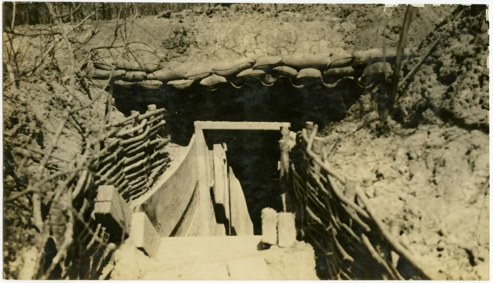
If you hike the Appalachian region, you might walk right over some of the most carefully mapped and then deliberately obscured facilities in American history. During the Cold War, once planners identified specific mountains and valleys as perfect for underground bunkers to keep the government functioning after a nuclear strike, the maps began to change. Public topographic sheets still showed ridgelines and streams, but entrances, service roads, and ventilation shafts were either mis‑drawn, omitted, or folded into generic woodland symbols that told you nothing about what lay beneath. Years later, as programs were wound down and portions of the story became public, declassified documents described the hidden cartography that guided construction and emergency planning. You read about cross‑sections of entire hillsides, detailed floor plans layered over rock strata, and carefully plotted blast zones that never appeared on the maps you could buy at an outdoor store. Those internal maps were never meant for tourist eyes; they were designed so that, if the unthinkable happened, officials could navigate a subterranean network that officially did not exist. Once you see that, it is hard to look at a clean green patch on a public map and assume it is just trees.
6. Underground Nuclear Test Sites: Craters You Were Not Supposed to Measure
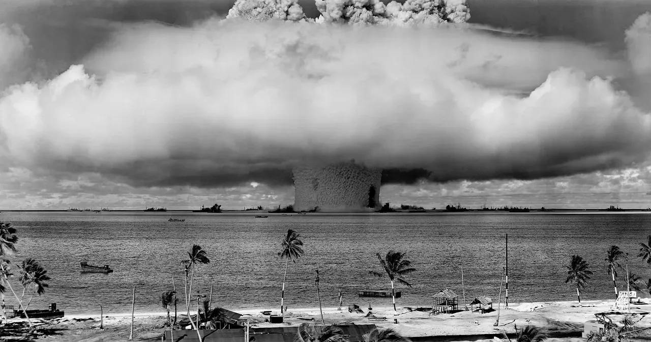
You might expect nuclear test sites to be easy to spot on a map – giant craters and weird geometric patterns in the desert seem hard to hide. But the moment militaries began using remote valleys and atolls to test nuclear devices, they also began treating the resulting landscape as information too sensitive to fully share. Public maps often kept contour lines coarse and aerial imagery out of date, even while internal classified maps logged every crater rim, fault line, and buried tunnel with forensic precision. When parts of those records have been released, they read less like a tourist guide and more like a cross between a seismology manual and an engineering logbook. You see how officials documented subsidence zones, mapped radioactive debris fields, and tracked how each blast deformed the surrounding land in ways you could never glean from a simplified public atlas. Later, as test bans and international monitoring increased, some of this precise mapping was quietly repurposed for safety and environmental work – but you’re still left with the unsettling realization that, for years, the official maps available to you near these sites were deliberately incomplete, even as the ground itself had been meticulously measured in secret.
7. Disaster Zones and Pollution Hotspots That Briefly Went Missing
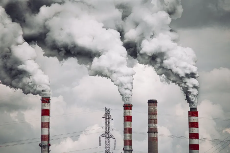
Not all map classification stories begin with missiles and spies; some start with toxic sludge or a collapsing hillside. In several countries, once authorities realized a particular valley, river bend, or industrial site posed a serious environmental or structural danger, they temporarily tightened control over the most detailed maps of the area. The public maps stayed polished and reassuring, while more precise survey data – showing sinkholes, unstable slopes, or contamination plumes – was shunted into restricted reports and confidential overlays used by emergency planners. Later, when investigations and court cases forced more transparency, declassified or newly released documents often spelled out what those hidden maps contained: neighborhood‑level breakdowns of risk, exact locations of buried waste, and projected spread of pollutants under different weather scenarios. You, as an ordinary resident, might have seen only a generic symbol for “industrial zone” or a smooth contour suggesting stable terrain, without any hint of the red lines and hazard shading that officials were quietly staring at. Reading those after the fact can feel jarring, because you realize the map on your wall was not lying outright – it was just omitting the parts that mattered most to your safety.
8. Modern Digital Map Blurs: Sites That Stay Fuzzy on Purpose
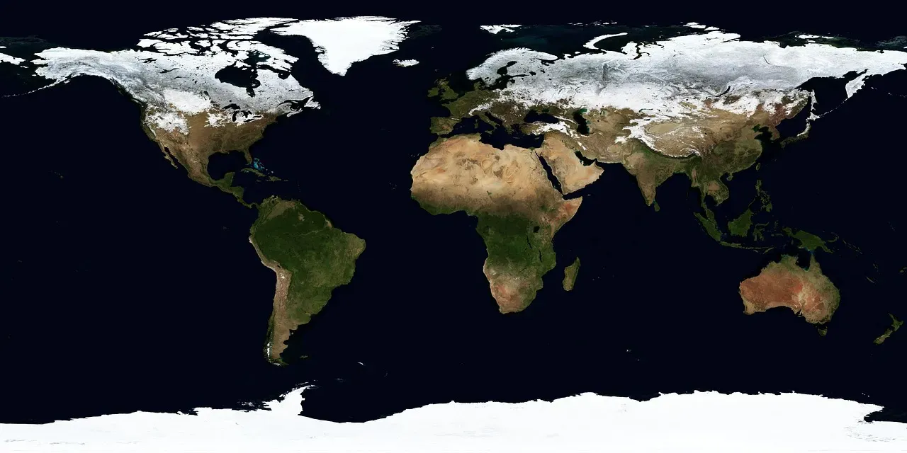
Today, you do not have to hunt down a paper atlas to see where maps are being carefully edited; you just have to zoom in and notice where the pixels turn strangely soft. Sensitive installations in many countries are subject to agreements that limit what commercial imagery providers can show you, leading to odd smudges, outdated tiles, or patches of suspiciously uniform texture. In a way, the act is the same as in earlier decades: once something strategically important is identified – a new radar array, a storage depot, a protected communications hub – the most detailed mapping is shunted into classified channels, and the everyday version you use is deliberately downgraded. You rarely see the classified layers themselves, but when military and intelligence material is partially declassified, descriptions reveal how different your view really is. Analysts talk in terms of exact coordinates, elevation profiles, and infrastructure layouts, while you are left with a softened rectangle that could be anything from a farm to a factory. The gap between those two worlds is not just about technical resolution; it is about who gets to align their mental map with reality and who has to live with the cartographic equivalent of frosted glass.
Conclusion: When the Map Is Not the Territory
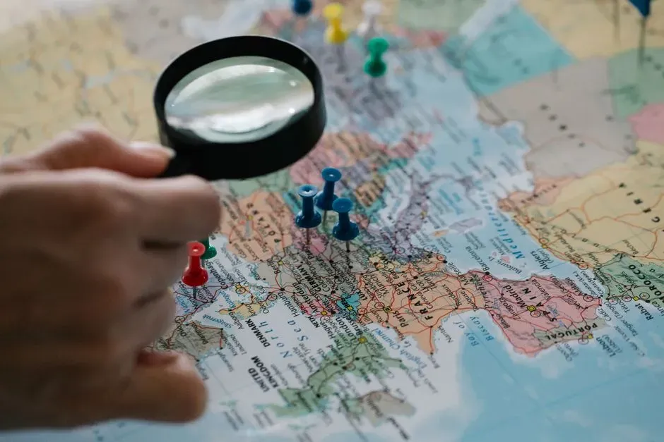
Once you know these stories, you start looking at every blank patch, blurred facility, or oddly generic coastline on a map with a little more suspicion. You realize that what you see is never just geography; it is a curated slice of reality shaped by what governments have found, feared, or decided you do not need to know. Sometimes the motives are understandable – national security, safety, crisis management – but the result is always the same: there is another, more detailed map out there that you are not allowed to see. The declassified files you can read today do not just fill in missing details; they expose the habit of treating maps as negotiable, something that can be edited for strategic storytelling. Next time you pinch‑to‑zoom and the image suddenly turns soft or oddly vague, you might wonder whether you are bumping up against that invisible line between the public and the classified. How many other places, do you think, are still hiding in the margins of the maps you trust every day?