Most people assume museum displays are frozen in time – dusty, unchanging monuments to “what really happened.” Walk in as a kid, walk in as an adult twenty years later, same skeleton, same statue, same story, right?
Except behind the scenes, curators have been quietly fixing mistakes for years: wrong colors, invented armor, impossible skeleton poses, even entire rooms built on a century-old guess. Almost none of it gets announced. So the story you remember from a school field trip may not be the story standing in that same building today – and once you know what to look for, you can’t unsee it.
#1 – The “Perfect” Dinosaur Skeleton That Suddenly Grew Feathers
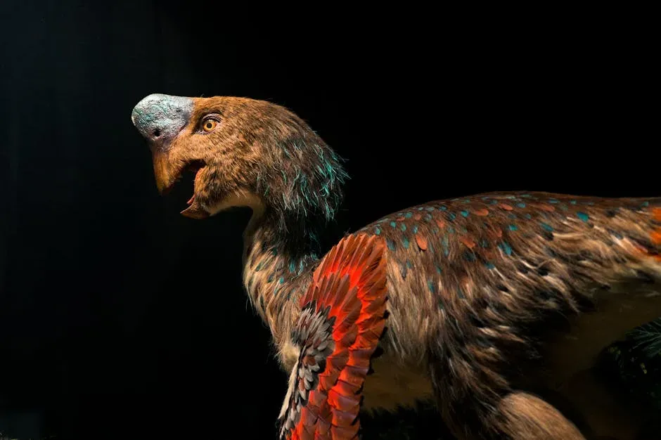
That towering, smooth-skinned raptor you grew up with? Many museums have quietly swapped in feathered versions over the past decade, sometimes overnight, between one visit and the next. As paleontologists uncovered more fossils with clear feather impressions, it became obvious that the classic naked-raptor mount was wildly wrong.
Instead of staging a big correction, institutions softened colors, tweaked posture, and added texture to make the animal look more bird-like – hoping nobody would ask why last year’s monster suddenly looked “fluffier.” Some museums still keep the old featherless sculptures in storage, almost like evidence of how confident they used to be. The new label usually says something safe like “updated to reflect new research,” quietly skipping the part where entire generations were shown an animal that never actually existed in that form.
Fast Facts
- The first dinosaur fossil showing clear feather-like structures, Sinosauropteryx, was described in 1996.
- Quill knobs found on Velociraptor forearms in 2007 provided direct evidence of wing feathers.
- Most feathered dinosaur fossils come from China’s Liaoning Province, known for its fine-grained fossil preservation.
- Some museums keep their original featherless mounts in storage rather than retiring them completely.
#2 – Cavemen Dioramas That Quietly Got Less Racist
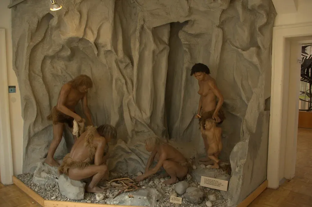
For decades, “early humans” in museum dioramas were shown as hunched, dirty, and oddly ape-like, especially non-European groups. Over the last twenty years, many institutions have quietly replaced those lurid wax “cavemen” with upright, fully human-looking reconstructions – without ever directly admitting how biased the originals were.
Hair textures, skin tones, and facial features have been reworked to reflect real population diversity instead of Victorian fantasy. You’ll notice fewer snarling “brutes” attacking each other and more scenes of toolmaking, family life, and cooperation. Some curators admit privately that the old displays reinforced a “primitive versus civilized” hierarchy that had nothing to do with science. Most museums just retire them quietly with vague language about “new discoveries” – because the real correction was social, not just scientific, and that’s exactly why it never gets spelled out on the wall.
#3 – Roman Statues That Quietly Got Their Color Back
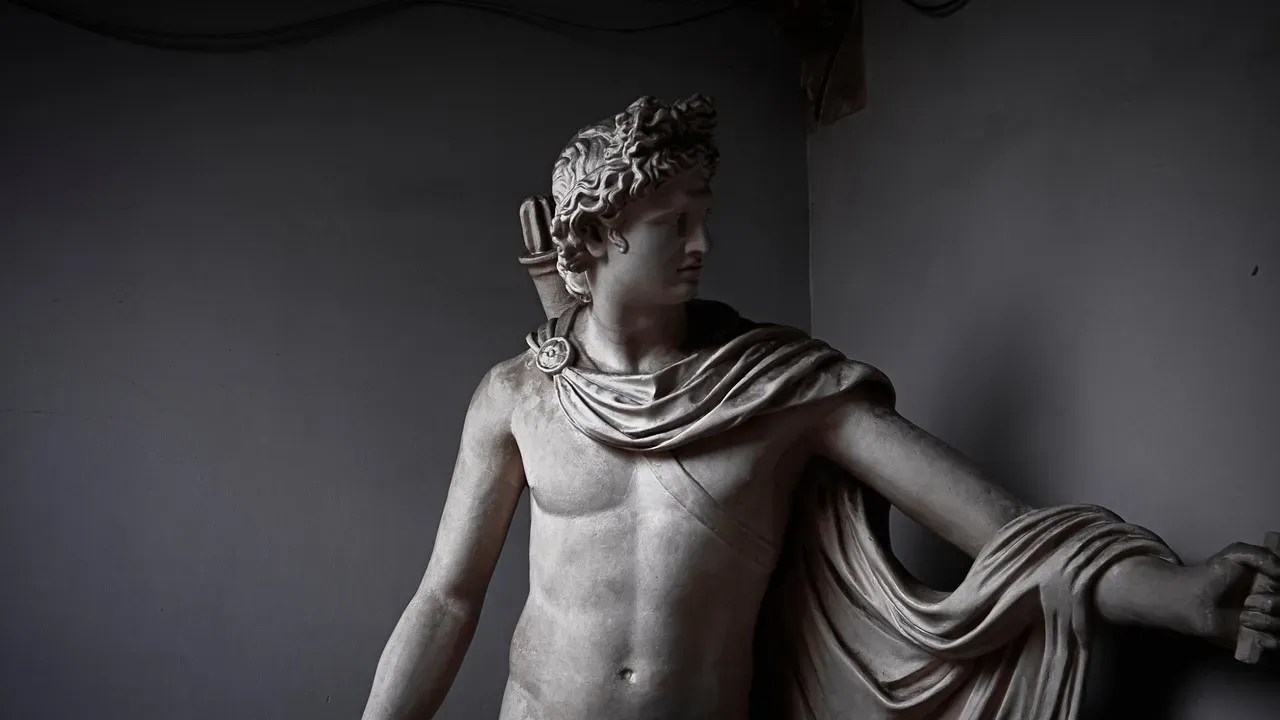
Most visitors still assume Roman and Greek statues were always meant to be pure white marble. In reality, many were painted in vivid, sometimes almost garish colors – reds, blues, gold leaf, even patterned fabric picked out in paint on stone.
Over the last two decades, museums have cautiously added reconstructed “polychrome” versions next to the classic white forms, often testing them as temporary exhibits before making them permanent. Some institutions have even changed their lighting to reveal old pigment traces and added digital overlays showing what the statues probably looked like in full color. What they rarely admit is how stubborn the “white marble equals purity and perfection” myth has been, or how deeply it shaped modern ideas of classical beauty. Instead of an apology, visitors get a fascinating interactive display and a quiet rewrite of art history.
Quick Compare
- Old assumption: Classical statues were always meant to be admired as bare white marble.
- Modern evidence: Pigment traces reveal many were painted in bright reds, blues, and gold leaf.
- Old belief: White marble symbolized timeless purity and elite taste.
- Current view: The “pure white” look mostly comes from centuries of pigment loss, not original design.
#4 – Medieval Armor Re-Posed To Look Less Like Superheroes
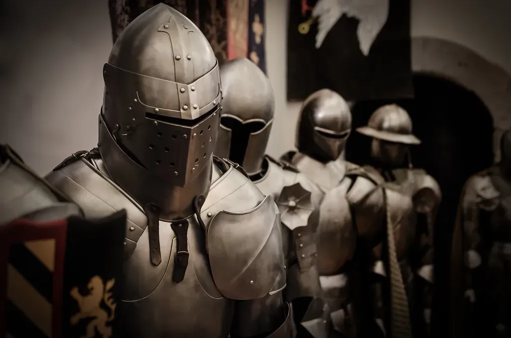
Old armor halls loved drama: suits puffed up on huge torsos, arms flung wide, chests broad enough for a bodybuilder. The problem is that a lot of it was simply wrong. As research into surviving garments and skeletons improved, curators realized many mounts had forced breastplates and helmets into impossible, exaggerated positions.
Behind the scenes, technicians have quietly re-articulated pieces so elbows bend naturally, shoulders sit correctly, and helmets actually line up with where a person’s eyes would be. Some major collections have even downsized their mannequins, because the average medieval warrior was shorter and leaner than Hollywood ever suggested. The label rarely admits, “we posed this wrong for seventy years.” Instead it talks about “enhanced understanding of historic fit and mobility” – a polite way of saying your favorite knight has been wearing his own armor wrong the entire time you’ve known him.
#5 – Dinosaur Battle Scenes Softened After Behavioral Science Changed
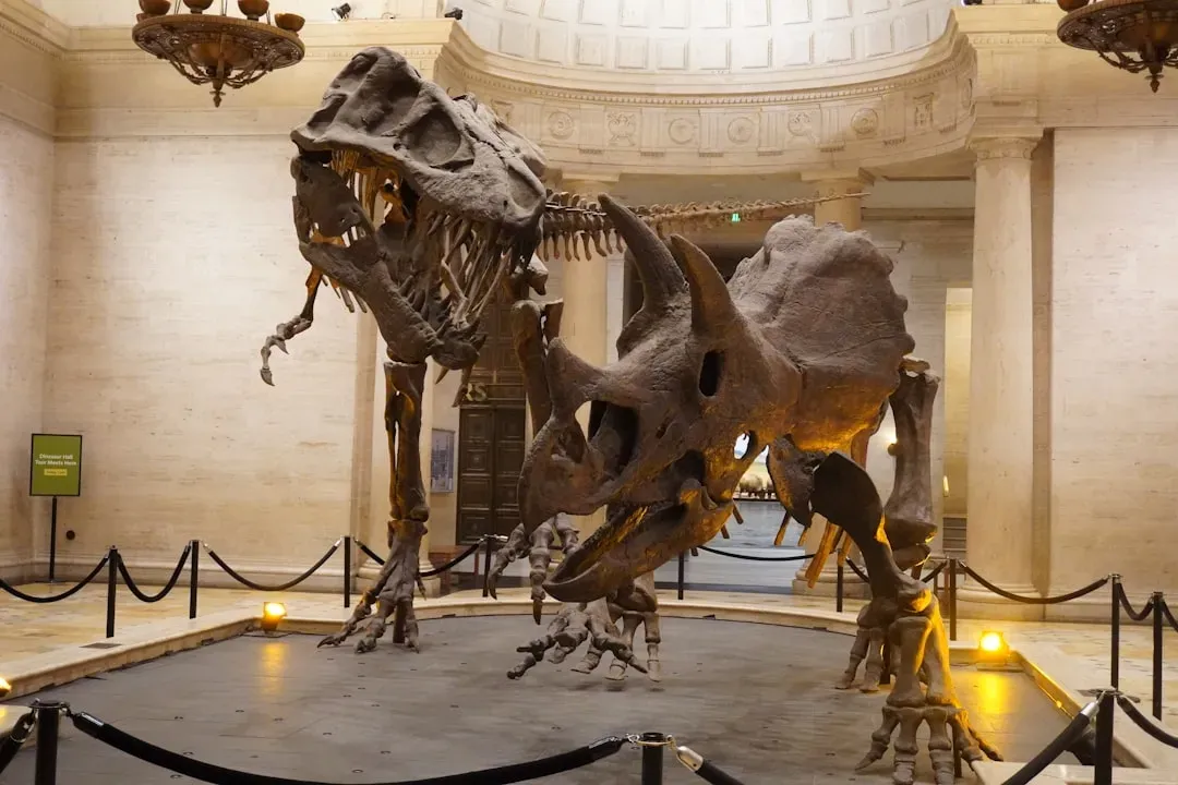
Remember those dramatic dioramas of two dinosaurs locked in an eternal, bloody battle? Many have quietly been toned down or entirely rearranged. As trackways, bonebeds, and modern animal behavior studies piled up, paleontologists realized a lot of the classic “fighting to the death” scenes were pure speculation dressed up as fact.
Several museums have recomposed ferocious brawls into quieter interactions – feeding, nesting, or group movement – without ever announcing the narrative U-turn. A T. rex once frozen mid-kill might now be reconstructed simply scavenging a carcass, or a once-lonely predator might be shown in a loose social group instead of eternal combat. Old labels about “savage conflict” have been swapped for cautious phrases like “may have behaved” or “possibly interacted this way.” The story quietly shifted from monster movie to careful natural history, and almost nobody clocked the change.
#6 – “Traditional” Egyptian Skin Tones Quietly Updated
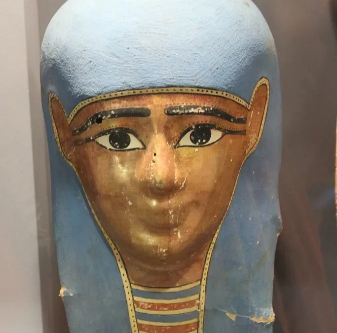
Earlier twentieth-century displays often gave ancient Egyptians oddly uniform, sometimes noticeably lightened skin tones that conveniently matched the politics of the era they were built in. As scholarship on North African diversity, climate, and ancient art conventions advanced, some museums reworked their mummy portraits, wall reconstructions, and figures with a broader, more accurate range of skin shades.
To the casual visitor, it just looks “more realistic.” Curators now lean on original pigments, tomb paintings, and population genetics instead of outdated racial categories that were never scientific to begin with. But the wall text rarely says, “we used to get this wrong in a way that mirrored modern prejudice.” Instead you get neutral phrasing about being “updated in consultation with current research” – the politics changed, but officially, it’s all just data.
#7 – Oversized Prehistoric Mammals Quietly Scaled Down
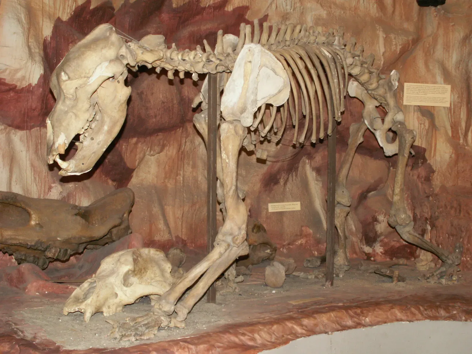
Remember the gigantic, almost Godzilla-sized cave bear or mammoth mounts? A lot of those early reconstructions were built from partial skeletons filled in with a scientist’s imagination. With better specimens and modern methods, museums have quietly rebuilt or rescaled prehistoric mammals to be shorter, slimmer, and far more anatomically believable.
The signage often stays nearly identical, leaving most visitors with the impression that nothing major changed at all. Mounts that once loomed menacingly over crowds have sometimes been moved to side halls or replaced outright, and the new versions frequently look, frankly, less cinematic – because the new reconstructions factor in real muscle mass, gait, and biomechanics instead of “bigger is more impressive.” In a lot of cases, museums were literally inflating the past to make it more exciting, and now the correction gets rolled out like a minor renovation.
Worth Knowing
- Many early prehistoric mammal reconstructions were built from incomplete skeletons filled in with artistic guesswork.
- Modern biomechanical modeling accounts for realistic muscle mass, not just raw bone length.
- Rescaled mounts often occupy smaller display footprints than their oversized predecessors.
- Some downsized reconstructions have quietly replaced record-breaking size claims once used in museum marketing.
#8 – Colonial “Discovery” Dioramas Discreetly Rewritten
Walk through older galleries and you might remember heroic scenes of European “explorers” planting flags while anonymous Indigenous people watched passively from the sidelines. Those dioramas have either vanished or been drastically altered in many museums, often with zero front-page announcement.
Curators are quietly replacing one-sided “discovery” narratives with scenes centering local communities, trade, and conflict – reflecting the fact that these lands were fully inhabited, complex societies, not blank slates waiting to be found. Plaques that once celebrated “opening up” a region now mention displacement, disease, or resource extraction in restrained, almost clinical language. In some redesigns, the explorers are literally moved to the back of the scene while Indigenous technology and daily life take center stage. It’s a total narrative flip, quietly dressed up as a routine “reinterpretation.”
#9 – Whale Skeletons Re-Hung After We Realized They Were Twisted
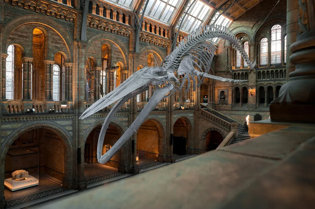
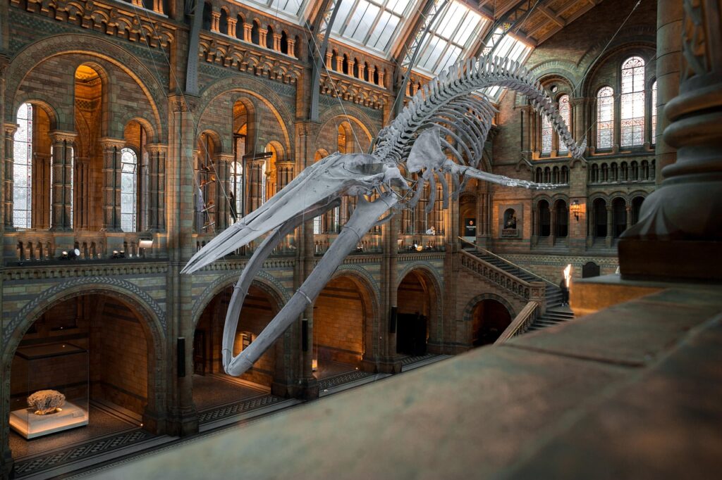
Those giant whale skeletons suspended over your head in the atrium? Many were originally assembled more like stiff submarines than living animals. As marine biologists learned more about swimming dynamics and spinal flexibility, structural teams went back and re-hung entire whales so the spine curves realistically, the flippers angle correctly, and the tail shows a genuine fluke beat.
It’s an enormous engineering job, yet museums often present it as nothing more than “upgraded rigging.” Old mounts sometimes had vertebrae in the wrong order, ribs at odd angles, or skulls tilted purely for better sightlines rather than accuracy. Now laser scans and digital modeling guide the corrections, so the animal actually looks like it’s moving through water instead of hanging like a prop. Visitors just see a more dramatic pose – not a fix to decades of anatomical error that was quietly wrong the entire time.
At a Glance
- London’s Natural History Museum re-hung its famous blue whale skeleton, nicknamed “Hope,” in 2017.
- The new pose shows the whale in a dynamic, diving position rather than a stiff, straight-line mount.
- Laser scanning and digital modeling are increasingly used to guide accurate spinal curvature.
- Older mounts sometimes had vertebrae assembled out of order or skulls tilted purely for viewing angles.
#10 – Historic City Models Quietly Redrawn For Accuracy
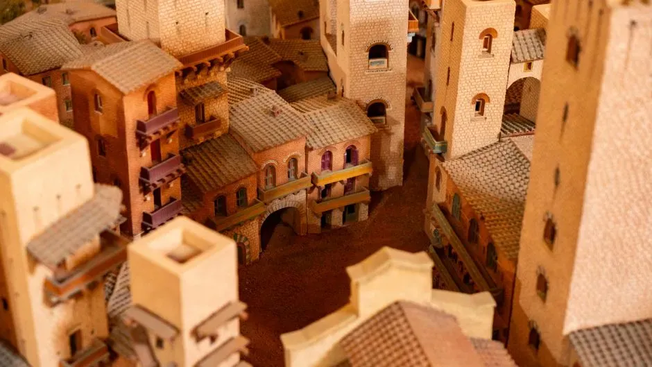
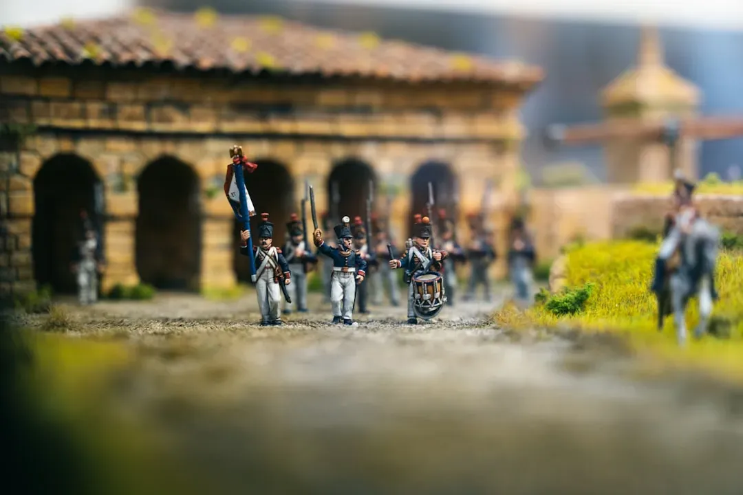
Scale models of famous cities – Napoleon’s Paris, medieval London, ancient Rome – feel authoritative simply because they’re so detailed. But many were built on best guesses that later turned out to be wrong. As new archaeological digs, maps, and LiDAR scans emerged, museums have systematically tweaked these models: moving walls, lowering towers, deleting buildings that never actually existed, and adding whole neighborhoods that did.
The signs rarely get rewritten beyond a line or two, and the changes happen so gradually that even regular visitors often don’t notice. Color schemes shift to reflect new research on roofing materials, street widths narrow to match updated surveys, and entire districts quietly reshape themselves over successive renovations. What looks like gentle restoration is often a major correction to our mental map of the past – but admitting how many times a city model has been “fixed” risks undermining trust in the version standing in front of you right now, so most institutions simply don’t.
#11 – “Authentic” House Interiors Re-Staged After Being Called Out
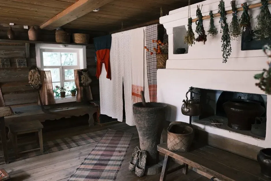
Period rooms – a “faithful” 1790s parlor, a 1920s kitchen – are museum favorites. The problem is that many were originally staged with whatever antiques happened to be available, mixing furniture from different decades and social classes into one falsely tidy scene.
As social historians and visitors pushed back, institutions have quietly swapped fabrics, removed anachronistic gadgets, and rotated entire furniture sets to match a specific time period and income level. Yet the wall text still calls them “typical” or “representative.” You’ll sometimes spot subtle new additions now – children’s toys, cleaning tools, worn textiles – acknowledging real, messy life instead of the Instagram-ready perfection earlier curators preferred. The reconstructions are more accurate now, and a little more uncomfortable, without any confession that the old version was closer to fantasy than history.
#12 – “Life Masks” And Busts That Quietly Got New Faces
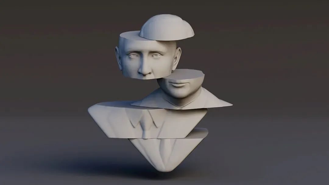
Some of the most famous historical busts in museums – scientists, writers, rulers – were originally modeled with heavy artistic license. As forensic techniques and digital scanning improved, a few institutions quietly went back and reshaped noses, jaws, and even eye spacing on reconstructions that were supposedly based on “life masks” or skulls.
Instead of announcing that a beloved face was partly guesswork, museums frame the update as routine conservation or a “digital refresh.” Several 3D reconstructions of historical figures now exist in two versions: an older, flattering one, and a newer, more data-driven one that often looks more ordinary, and sometimes older, than the myth ever allowed. The changes usually roll out gradually, through side exhibits, before quietly becoming the new standard – and by the time the old face disappears for good, most visitors have already forgotten it existed.
#13 – “Missing Link” Displays Softened As Evolution Messaging Evolved
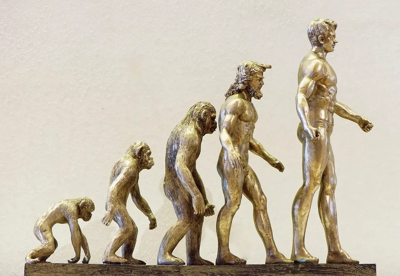
For years, museums displayed human evolution as a straight line: ape, caveman, modern man, with one fossil crowned the triumphant “missing link.” As research revealed a messy, branching tree instead of a tidy ladder, exhibits have slowly shifted from a neat progression to a tangled network of related species.
What used to be a smug climax – modern humans standing proudly at the top – has quietly become one complicated twig among many. Old reconstructions implying one species literally turned into another have been replaced with groups of contemporaneous cousins, sometimes shown existing side by side, with labels that now emphasize uncertainty and overlap instead of certainty and triumph. Some visitors genuinely hate this; it feels less satisfying than the clean “ascent” they were taught in school. But the new layouts are quietly correcting decades of misleading, almost cartoonish diagrams that turned real science into a tidy origin myth – and they’re doing it with almost no fanfare at all.
Why It Stands Out
- Modern evolution exhibits replace the single-file “ascent of man” image with a branching family tree.
- Several early human species are now shown as contemporaries rather than direct ancestors and descendants.
- Labels increasingly use cautious language like “possibly” and “may have overlapped” instead of firm claims.
- The shift reflects a broader scientific move away from linear progress narratives toward complex, branching evolution.
The Bottom Line
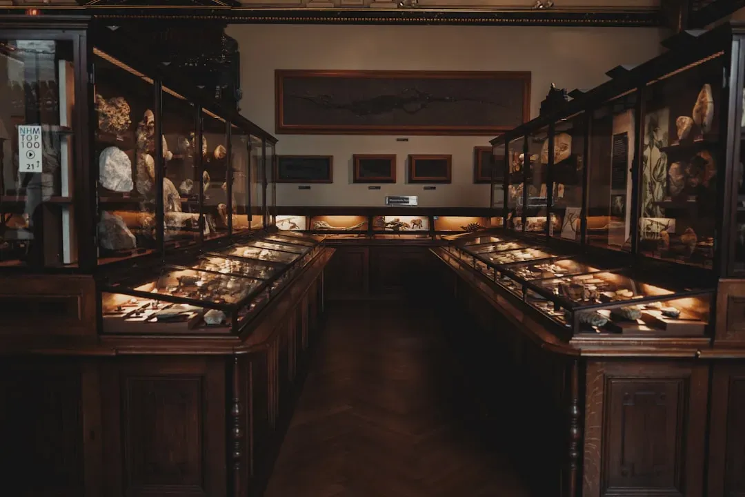
Taken together, these quiet corrections show that museums work more like living laboratories than stone-carved temples of unchanging truth. Dinosaur feathers, skin tones, city maps, even the slope of a whale’s spine – none of it is nearly as settled as the glass cases make it look.
Insiders will tell you this is normal: evidence improves, so reconstructions change. What they rarely admit is that for years, some of those “corrections” were driven just as much by politics, fashion, and bias as by hard data. If museums really wanted to earn trust, the most honest exhibit in the building would be a wall dedicated to their own past mistakes, not a quiet swap and a carefully neutral label.
Personally, I think visitors can handle the truth – and would trust museums more, not less, if they saw the edits instead of just the polished final draft. So here’s the real question worth asking on your next visit: what’s the one reconstruction you’re standing in front of right now that’s quietly wrong, and nobody’s told you yet?