You’ve probably noticed it: separate websites, different creators, no collaboration at all, yet strangely similar ideas, layouts, and trends seem to pop up everywhere at once. It almost feels like the internet is quietly copying itself behind the scenes. But most of the time, there’s no direct copying going on at all.
What you’re really seeing are patterns – recurring design choices, content structures, and psychological tricks – that emerge again and again because they work. Human attention, curiosity, and behavior follow certain rules, and websites bend around those rules whether the creators talk to each other or not.
In this article, we’ll dig into thirteen of the most common . Some are driven by algorithms, others by human psychology, and a few by pure laziness. Once you see them, you can’t unsee them – on blogs, e‑commerce stores, landing pages, news sites, and personal portfolios. And if you build anything on the internet yourself, understanding these patterns can be a quiet superpower.
#1 The “Hero + One Big Button” Above The Fold
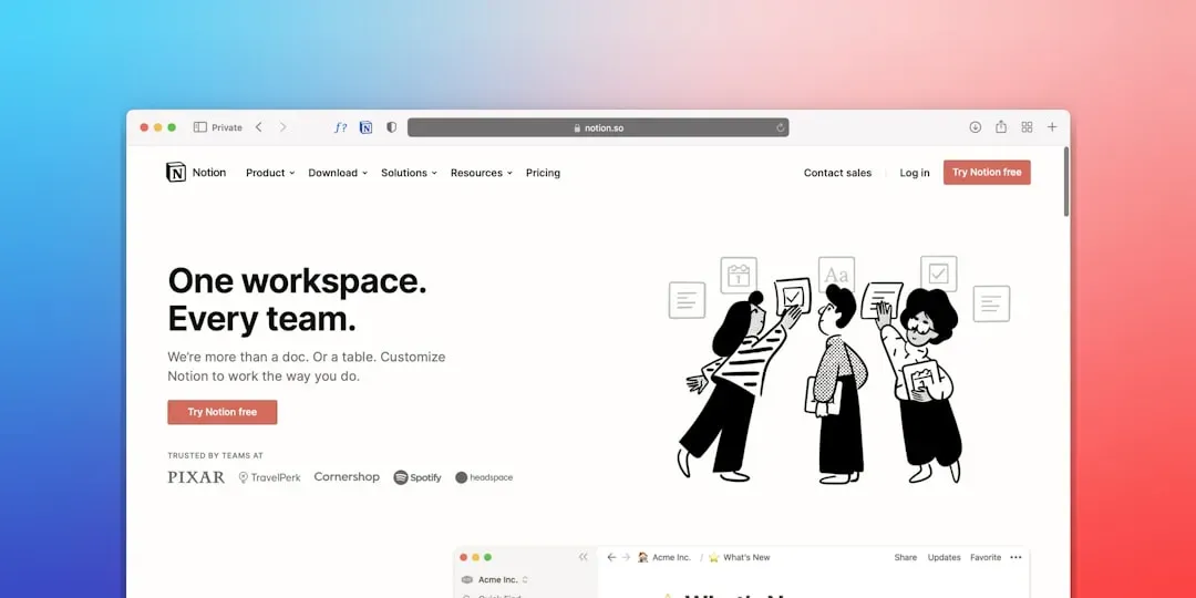
Have you noticed how so many homepages greet you with a giant image or clean color block, a short headline, a tiny bit of explanatory text, and one big button? Different industries, different brands, same basic layout. This so‑called “hero section” has become almost a default because it gives people what they crave most online: clarity in one quick glance.
From a psychological standpoint, this pattern calms decision fatigue. When someone lands on a new site, they’re asking three questions: What is this, is it for me, and what do I do next? The hero section answers all three in a single frame. That’s why the button usually does one primary thing – sign up, book a demo, shop now, learn more – rather than dumping options everywhere.
You’ll see variations in style, but the skeleton is nearly identical. Minimalist startups might use a solid background and simple text. Creative studios might choose a looping background video. Nonprofits might show a human face or an emotional scene. Underneath those stylistic choices, you still have: one headline, one short line of supporting text, and one prominent call to action. Different teams arrive at this same design because user testing and analytics keep pushing them toward it.
- One main message: a punchy line explaining the value.
- One core action: a button that moves the visitor forward.
- One visual focus: an image or color block to anchor attention.
#2 Endless Scrolling And The “Bottomless Page” Effect

It’s almost eerie how many unrelated sites have converged on the same behavior: once you start scrolling, they just keep feeding you content. News sites, social feeds, product listings, and even some blogs now behave like they don’t really have an end. That’s not because designers are in a secret group chat – it’s because our brains are highly vulnerable to infinite scroll.
Endless scroll taps into a well‑documented psychological mechanism sometimes loosely described with gambling analogies: small, unpredictable rewards keep people pulling the lever. In this case, the lever is your thumb. Every new scroll might reveal a more interesting post, a better product, or a piece of information you didn’t know you wanted. The small effort of scrolling is rewarded just often enough that people keep going.
On the practical side, infinite scroll is also cheaper than making users click through page after page. It reduces friction, increases time on site, and boosts ad impressions or product exposure. Even teams that never speak to one another end up adopting similar “load more” or auto‑loading patterns after looking at their analytics dashboards and seeing that removing pagination tends to keep visitors around longer.
- Less friction than clicking “Next page.”
- More impressions for content and ads per visit.
- A subtle sense that “something better” is just below the fold.
#3 The F‑Shaped And Z‑Shaped Layouts For Scanning Eyes

If you open ten popular content sites right now, you’ll see a suspiciously familiar structure: logo at top left, navigation across the top, main content starting on the left, key actions or sidebar elements positioned along a rough vertical line. That isn’t just design fashion; it maps onto how people scan screens with their eyes.
Eye‑tracking studies have repeatedly observed something like an “F‑shaped” or “Z‑shaped” reading pattern in many languages that read left to right. People skim horizontally across the top, drop down a little, skim again, then slide vertically down the left side as they decide whether to keep reading. Designers who’ve never met each other still land on similar layouts because, consciously or not, they’re designing for this reading rhythm.
So you end up with headlines aligned left, important bits like bullet points or bold subheads clustered along the main reading path, and less critical items pushed to the right or lower on the page. Even sites trying to be avant‑garde rarely stray too far – they might rotate colors, fonts, or imagery, but the underlying pattern of where information sits remains surprisingly consistent because moving it too far breaks readability.
#4 Recycled Headline Formulas And “You Won’t Believe” Hooks
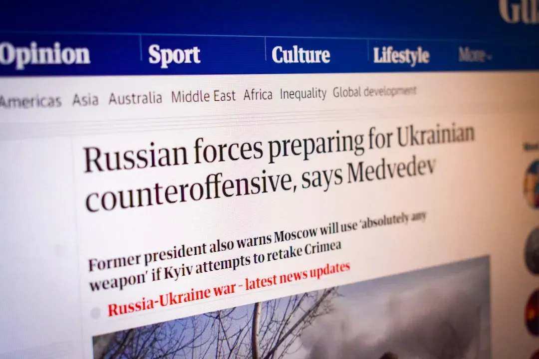
Across blogs, news outlets, and personal sites that have never exchanged a single email, you’ll see headline patterns that feel uncannily alike. Lists of “10 ways to…,” “How to X without Y,” “The surprising reason why…,” or “What nobody tells you about…” show up so often that they practically form a shared language of the internet. This isn’t mass plagiarism; it’s convergent evolution driven by attention economics.
Creators experiment with hundreds of headline variations and quickly see which ones produce more clicks, shares, and time on page. Over time, certain sentence structures quietly prove themselves. They promise usefulness, tap into curiosity gaps, or speak directly to fears and desires. As people copy what works, those structures spread and get slightly adapted, repeating across niches that have never directly interacted.
I’ve felt this personally when writing: you look at analytics and notice that a straightforward headline gets ignored while a slightly more curiosity‑driven version suddenly takes off. After a while, you develop your own favorite “templates” without even thinking about it. Multiply that subconscious learning across millions of writers, and you get a web full of eerily similar titles – even when nobody knows each other.
- Listicles promise a clear, finite payoff.
- “How to…” headlines promise instruction and clarity.
- “The real reason…” and “Nobody tells you…” spark curiosity and FOMO.
#5 Familiar Navigation Bars And Sticky Headers
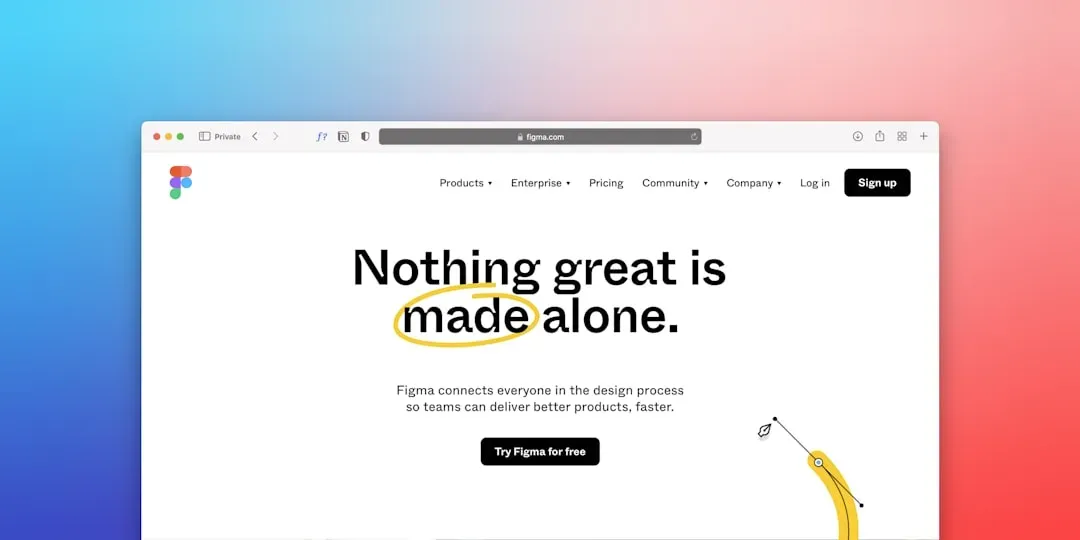
Open almost any modern site and you’ll likely see a horizontal navigation bar sitting at the top, often sticking there as you scroll. It might have Home, About, Services, Pricing, Blog, Contact, or something very close. Different brands, different goals, yet the same skeleton appears over and over. The reason is blunt: visitors get confused incredibly fast if navigation is too weird.
People bring expectations from one site to the next. When they click a logo, they expect to go home. When they see three horizontal lines, they expect a menu. When something labeled “Pricing” isn’t where they imagine, frustration spikes. Even if designers want to feel original, they usually end up bending to those expectations because analytics show that conventional menus reduce bounce rates and support conversions.
Sticky headers – where the navigation bar stays visible as you scroll – also repeat everywhere now. They solve a simple usability problem: users might be halfway down the page, change their mind, and want to navigate elsewhere. Forcing them to scroll all the way back up is a small friction that many will not bother with. Keeping navigation “always available” looks like a stylistic choice, but under the hood it’s a user‑behavior pattern that keeps reasserting itself.
#6 Trust Badges, Logos, And Social Proof Walls
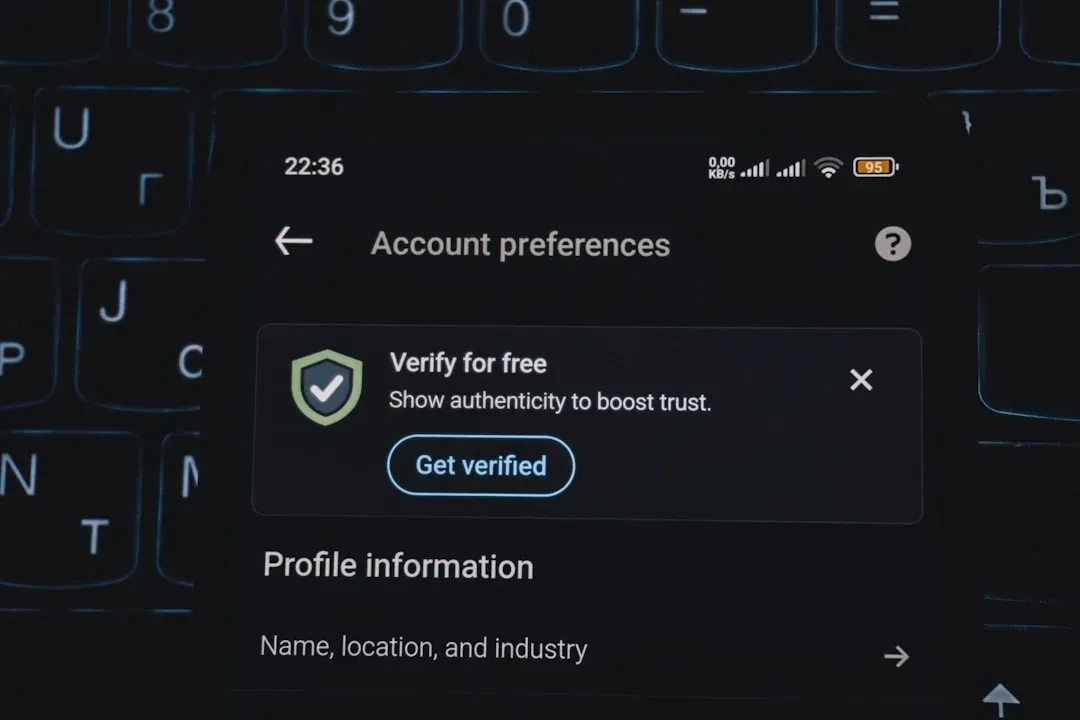
You can land on an e‑commerce store, a SaaS homepage, a personal coaching site, or an online course platform and still find the same element: a strip of logos showing media mentions, client brands, or “as seen on” badges. On other pages, you might see clustering of star ratings, purchase counts, or user numbers. These blocks of social proof keep popping up because most people are wary of being scammed or disappointed online.
When someone is hesitant, they scan for evidence that others have gone before them and survived. Client logos, review scores, and usage numbers all quietly whisper the same message: other humans trusted this, and nothing exploded. Even teams who never talk to each other will independently discover, often through A/B testing, that adding visible trust signals near key decisions (like adding to cart or signing up) increases completion rates.
There’s also a status effect at work. Showcasing recognizable brands or impressive‑sounding numbers makes the site feel more established and less risky. That’s why you see similar phrases, like “trusted by thousands,” repeated across completely unrelated sites. It’s a convergent language of reassurance that operates more on emotion than logic, even when we know those badges can sometimes be shallow or selectively chosen.
- Logos offer shorthand credibility in a fraction of a second.
- Star ratings tap into familiar review patterns from marketplaces.
- Usage numbers frame the product as a default choice rather than a gamble.
#7 Repeated Color Palettes And Font Pairings
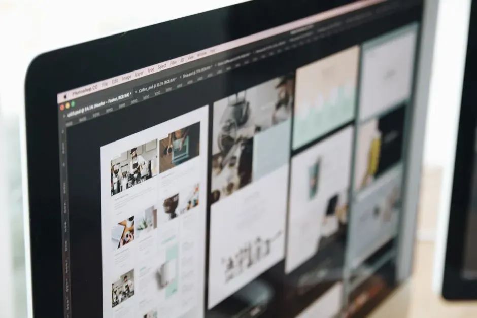
Without any coordination, tons of websites seem to lean on the same color worlds: soft neutrals with one bright accent, dark backgrounds with neon highlights, or pastel gradients that feel airy and modern. The same thing happens with fonts: clean sans‑serifs for body copy, maybe a distinctive display font for headings. You’d think a global internet could look wildly diverse, yet so many sites feel visually related.
A big reason is that designers and non‑designers alike draw from the same toolkits and presets. Website builders, design systems, and style libraries offer default combinations that are tested for readability and accessibility. When you pick from those presets – because they’re safe and convenient – you’re quietly plugging into a shared visual vocabulary that thousands of other sites are also using.
On top of that, trends in fashion, tech branding, and social media bleed into web design. When one major platform popularizes a gradient style or a clean monochrome look, countless independent creators adopt similar palettes, not because they talked to each other, but because everyone’s absorbing the same cultural signals. The end result is a web full of analogous color and type patterns that repeat across projects with no direct contact at all.
#8 Long‑Form Sales Pages With Reassuring Repetition
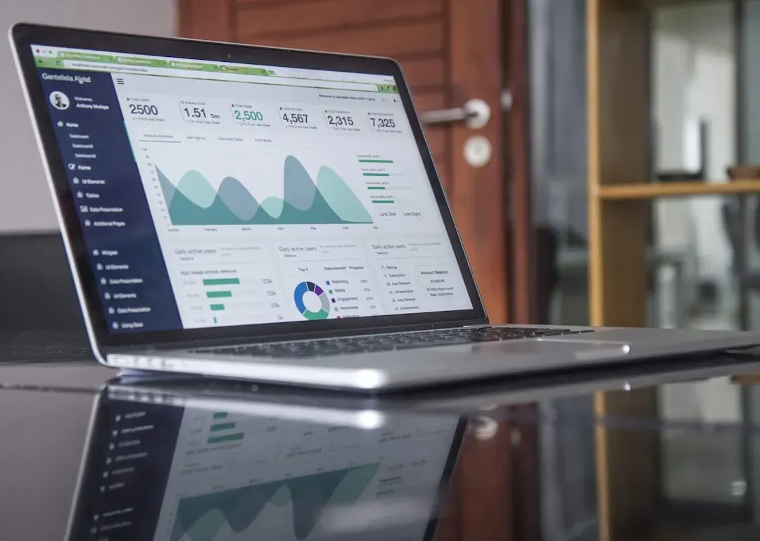
If you’ve wandered through different online courses, coaching programs, or digital product launches, you’ve almost certainly seen the same kind of long‑form sales page again and again. It usually starts with a big promise, then moves through a series of sections: who it’s for, what you’ll get, testimonials, bonuses, pricing options, and finally a FAQ that answers objections. Different industries, same skeleton, spreading without any formal coordination.
This pattern sticks because it mirrors how people move from skepticism to commitment. First they want to know if the offer is relevant. Then they want details. Then they want proof. Then they want a guarantee they won’t regret the purchase. Long‑form pages walk through that emotional arc systematically, layering reassurance and information until the risk feels manageable.
I used to roll my eyes at these pages, assuming they were manipulative clones. But when you look at them as structured conversations, their repetition makes more sense. If you had to convince a friend to invest in something important, you’d probably move through similar steps: listen to fears, explain benefits, tell stories, offer options, and answer their concerns. Different creators keep rediscovering the same conversational sequence, and it shows up across the web in remarkably similar layouts.
- Early sections focus on relevance and benefits.
- Middle sections stack features, stories, and proof.
- Final sections handle objections and make the decision feel safe.
#9 Reused Content Structures: Listicles, How‑Tos, And Explainers
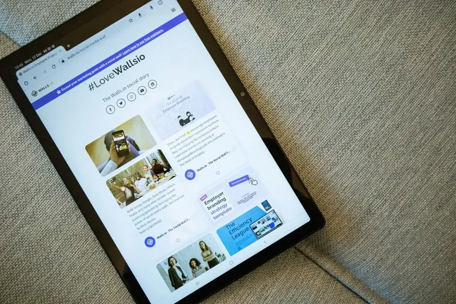
Even when sites cover totally different topics – tech, parenting, fitness, finance – you see the same content shapes over and over: numbered lists, step‑by‑step how‑to guides, quick explainer pieces, pros‑and‑cons breakdowns. There is often no collaboration between these sites, but they keep leaning on the same formats because those formats match how people like to think through problems.
Listicles break complex subjects into digestible pieces that you can skim or dive into. Step‑by‑steps match the way we perform tasks in real life: one action at a time, in order. Explainers meet the need to get oriented in a subject quickly without drowning in jargon. Once creators find that these structures keep people reading and sharing, they naturally reuse them – sometimes almost compulsively.
There’s also a hidden search engine angle. Search algorithms often favor content that clearly answers practical questions, and these formats map neatly onto those queries. If a “how to” article tends to surface higher in results and bring in more traffic, more writers will use that format, even without ever speaking to each other. Over time, the structure itself becomes part of the invisible architecture of the web.
#10 Shared Microcopy And Button Language
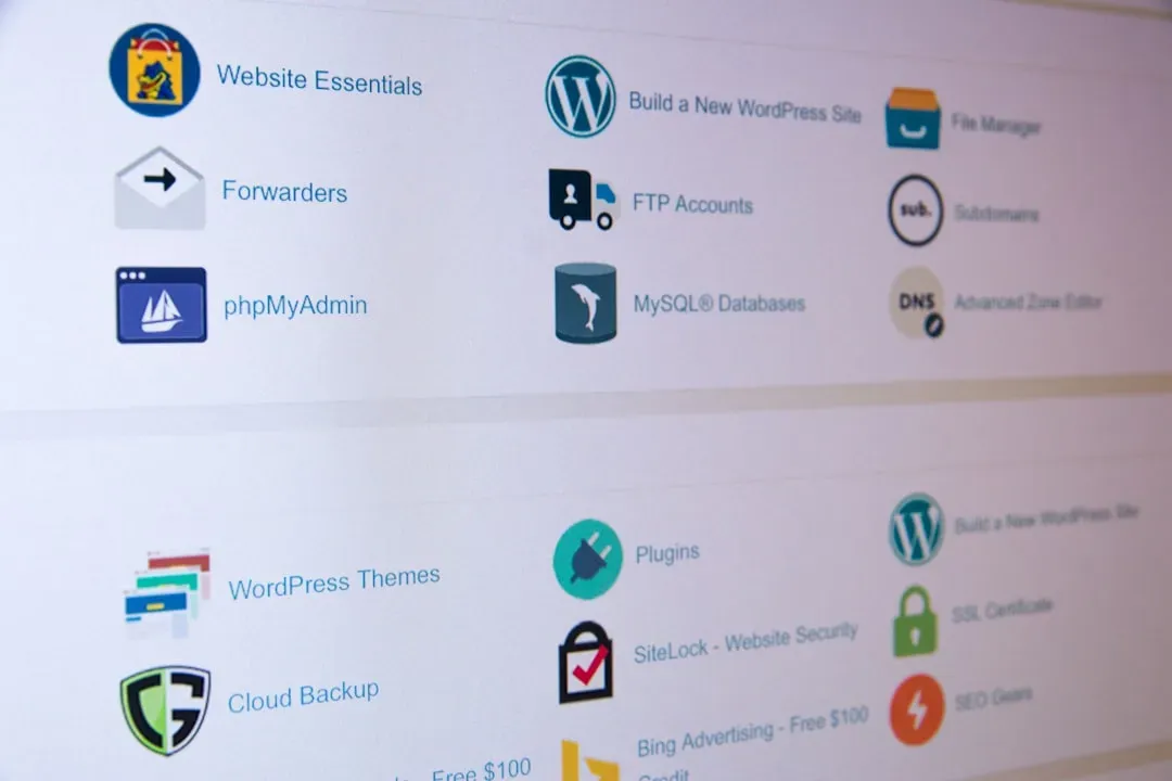
Look closely at the words on buttons and tiny bits of helper text across unrelated sites: “Get started,” “Learn more,” “Try for free,” “Continue as guest,” “Skip for now.” These short phrases, known as microcopy, repeat so often that they can feel invisible, like street signs you stop noticing. Yet they play a huge role in guiding behavior, and most teams independently converge on the same language.
The reason is simple but powerful: consistent wording reduces friction. When people see familiar phrases, they don’t have to think as hard about what will happen if they click. Weird or overly clever button text might feel playful, but it also introduces uncertainty. Many teams experiment and eventually discover that straightforward language converts better, so they quietly retire the quirky lines and adopt the same simple words everyone else uses.
You can even see this pattern in warnings, cookie banners, and error messages. Phrases like “Something went wrong” or “Please try again later” appear everywhere, even though the teams behind them have never talked. They’re short, neutral, and easy to understand, so they stick. The end result is a global, shared layer of interface language that most users never consciously think about.
- Clear microcopy reduces hesitation and confusion.
- Familiar phrases feel safer than novel or ambiguous ones.
- Testing often squeezes out cleverness in favor of clarity.
#11 The “Content Hub + Search Box” For Complex Topics
Whenever a site deals with a big, messy domain – health information, finance, software docs, even gaming guides – you’ll often see a similar pattern emerge: a central content hub or knowledge base anchored by a prominent search box, plus topic categories or tags. It looks obvious now, but it’s the product of many teams independently bumping into the same information overload problem.
When there are hundreds or thousands of pieces of content, navigation alone can’t carry the load. People want to jump straight to their question: a symptom, a tax situation, an error code, a specific game boss. A central search bar lets them bypass the maze. Categories give them a backup map if their search query doesn’t work perfectly. This dual structure quietly repeats across platforms because it mirrors how we look for information in our heads.
It reminds me of wandering a giant library: you either go straight to the librarian and ask, or you head to the clearly labeled section and browse. Sites that act like good librarians earn trust and repeat visits, so more creators mimic that structure, even if they never realize they are following the same pattern as countless others.
#12 The Rise Of “Card” Layouts And Modular Blocks
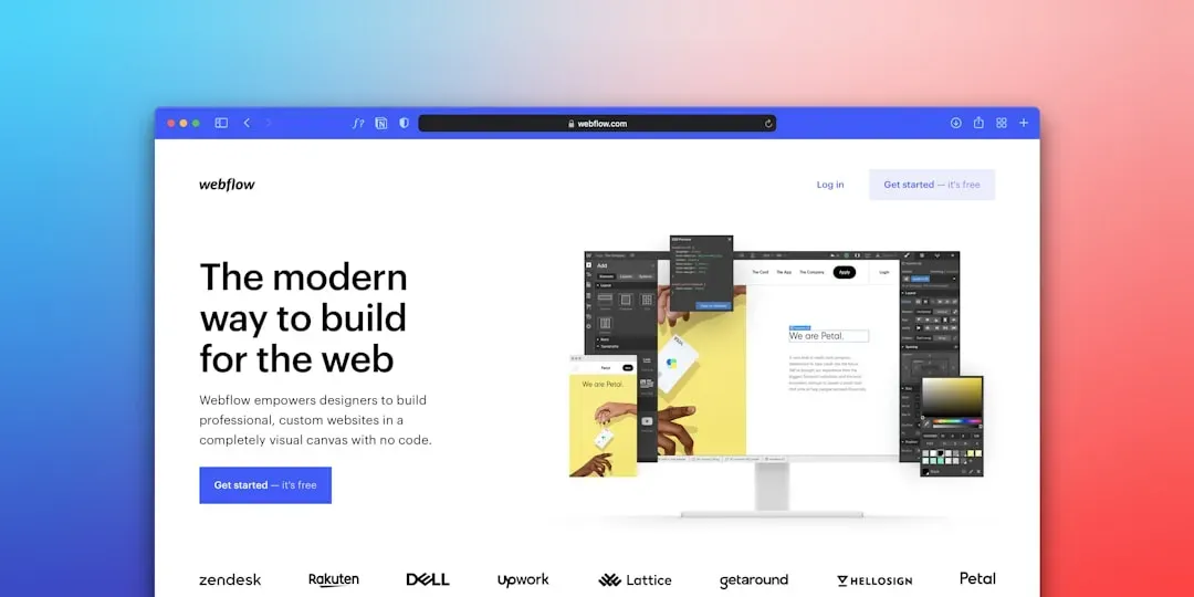
From news homepages to product grids to portfolio galleries, content is increasingly broken into “cards”: rectangular blocks with an image, a title, maybe a short description, and a clickable area. You can rearrange, filter, or scroll through them easily. This pattern has spread widely without coordinated planning because it solves multiple design and technical problems at once.
Cards are modular, meaning they can resize for different screens, adapt to different amounts of content, and be reused in many contexts. They also match how people visually chunk information; each card feels like a self‑contained unit of meaning. Designers at different companies, confronting responsive design challenges on phones, tablets, and desktops, keep realizing that cards offer a flexible, legible solution.
On the human side, cards give a comforting sense of order. Faced with an overwhelming amount of content, users can scan card titles and images quickly, like browsing book covers on a shelf. That’s why even sites that look very different aesthetically may share the same grid of tiles or cards underneath – a quiet, repeating pattern that makes chaos feel navigable.
- Cards are easy to rearrange and reuse for different layouts.
- They adapt gracefully to small screens and large monitors.
- They help users visually chunk and prioritize content at a glance.
#13 Repeating “About” Narratives And Authenticity Scripts

Visit enough “About” pages on unrelated sites, and you start to notice the same narrative beats: a humble origin story, a moment of frustration or realization, a turning point, and a mission to help people avoid the pain the founder once felt. Even personal portfolio sites and small businesses with no marketing departments echo this structure, almost like they are all following an unspoken script.
This pattern exists because it mirrors how people intuitively tell meaningful stories about their work. We tend to frame our efforts around problems we cared about, obstacles we faced, and reasons we kept going. When translated onto the web, that natural storytelling arc turns into a formula, whether or not anyone sees it as one. The result: separate sites that all lean on similar “why we do this” narratives, even though their creators have never met.
I’ve felt this tension when writing my own bios. You want to sound relatable, credible, and not too self‑absorbed – all at once. It’s easy to fall back on familiar structures that you’ve subconsciously absorbed from other sites: a personal struggle, a moment of change, then a commitment to serve others. Those building blocks repeat because they resonate with readers who are silently asking, “Who are you, and why should I trust you?”
Conclusion: Patterns Are Proof That The Web Has A Memory
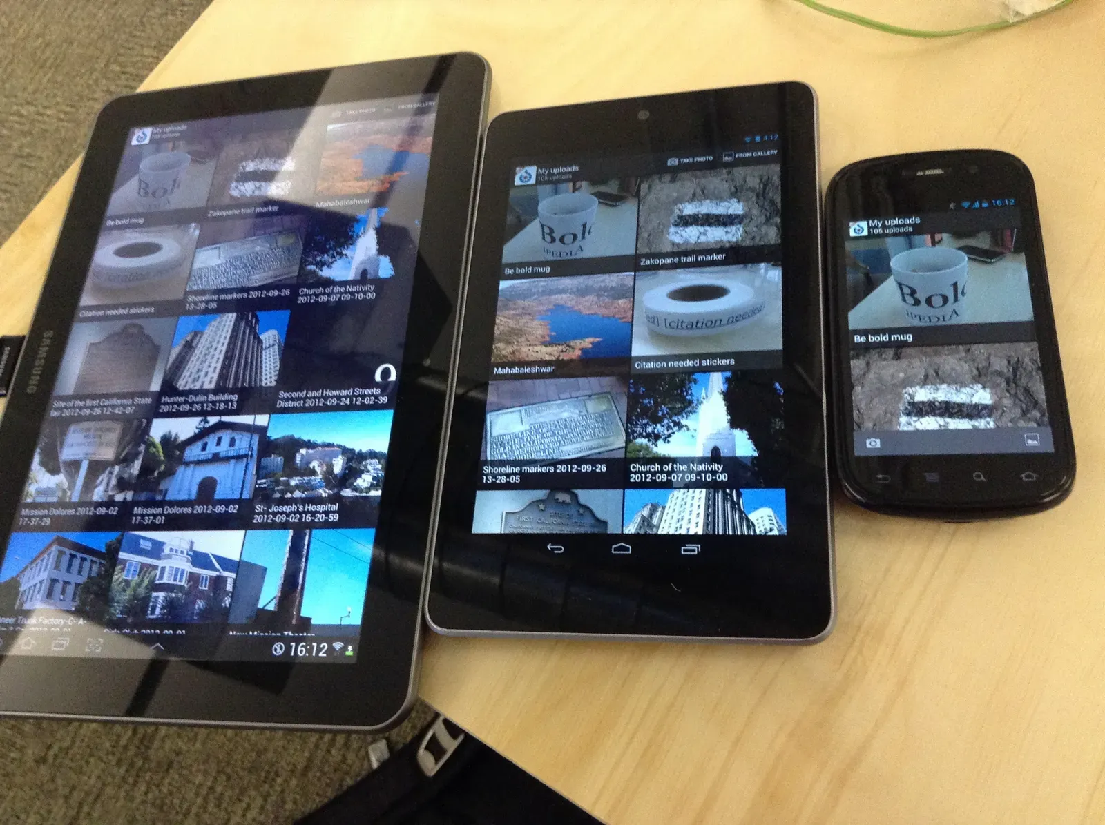
When you zoom out, the thirteen patterns above reveal something bigger than design fads. They’re evidence that the web, as chaotic as it feels, has a kind of collective memory. Separate teams, freelancers, and hobbyists keep rediscovering what works for human minds and devices, and those discoveries echo outward as repeating structures – in layouts, words, colors, and stories.
I think we sometimes underestimate how much these patterns shape what we believe, buy, and even how we see ourselves. When every site you visit serves you an infinite scroll, a hero banner, familiar buttons, and the same flavor of origin story, it subtly narrows your sense of what is normal or possible online. That repetition can be comforting, but it can also make the internet feel like a mall full of slightly different stores selling the same experience.
My opinionated take is this: learning to see these patterns is the first step toward using them on your own terms. You don’t have to blindly repeat them, and you also don’t have to reject them to feel original. You can borrow what genuinely helps users while breaking the script in small, intentional ways that fit your values and your audience. The web doesn’t need fewer patterns; it needs more conscious ones. Now that you’ve spotted these thirteen, which ones will you keep – and which will you quietly rewrite?