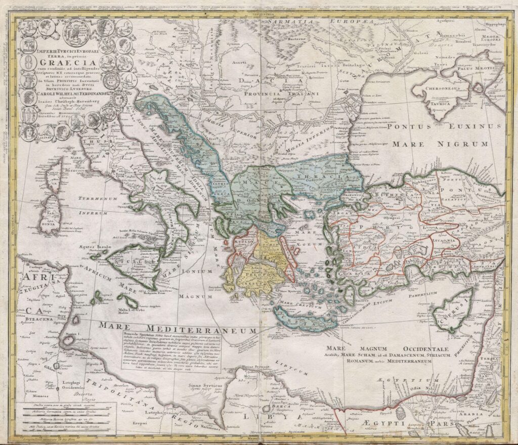
Old maps are supposed to be lovably wrong. Squiggly coastlines, invented sea monsters, continents shrunk down to guesswork – that’s the comfortable story most of us grew up with. Except a stubborn handful of centuries-old charts keep showing coastlines that shouldn’t have been knowable yet, and the cartographers who spent careers debunking fringe theories are suddenly choosing their words very carefully.
This isn’t a UFO conspiracy dressed up in old parchment. It’s something stranger: serious historians, using satellite overlays and digitized archives, admitting that certain medieval and Renaissance maps line up with coasts no recorded voyage had reached yet. Thirteen of those maps are quietly rewriting the timeline of who actually explored the planet first – and the explanations get more uncomfortable the further down the list you go.
#13 – The Piri Reis Map: Antarctica Without Ice?
Some old maps are mysterious. The Piri Reis chart is downright radioactive. Drawn in 1513 by an Ottoman admiral, the surviving fragment clearly shows parts of South America and West Africa. The wild claim that won’t die is that the curling “tail” at the bottom is an ice-free Antarctic coast, sketched centuries before anyone actually reached the continent.
Cartographers now concede the coastline looks uncomfortably close to reality for a world that supposedly had no idea Antarctica existed. At minimum, Piri Reis was copying older source maps that no longer survive. Here’s the part experts hate admitting out loud:
- The map’s latitude is wildly off in places.
- Yet some coastal contours align with modern charts far better than chance should allow.
Most professionals now say it’s probably a distorted South America, not Antarctica. Still, the level of inherited detail raises a blunt question nobody has fully answered: who drew the original charts he was copying, and when?
#12 – The Oronce Finé Heart-Shaped World and Its Southern Secret
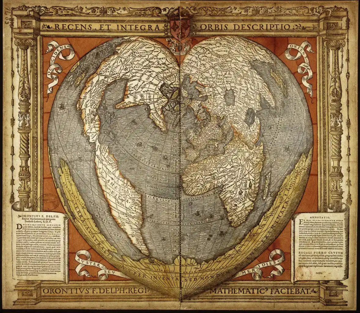
A 1531 world map shaped like a heart shouldn’t be controversial. Yet Oronce Finé’s elegant cordiform projection quietly hides one of cartography’s biggest arguments. Across the bottom, Finé draws an enormous southern continent, Terra Australis, which isn’t surprising on its own – scholars of the time assumed a “balancing” southern landmass had to exist somewhere.
Fast Facts
- Published in 1531 using a heart-shaped (cordiform) map projection
- Depicts a massive southern landmass labeled Terra Australis
- Europeans didn’t officially confirm Antarctica’s coastline until 1820
- Rooted partly in classical Greek theories about a “balancing” southern continent
What makes people uneasy is how much of Finé’s drawn coastline vaguely resembles Antarctica’s real outline, particularly the Antarctic Peninsula and parts of East Antarctica. Traditional historians call it coincidence plus imagination. Critics fire back that coincidence doesn’t usually trace real bays and headlands. Modern cartographers now walk a careful middle line, admitting Finé likely drew from older, semi-empirical sources – explorers’ logs, dead reckoning, maybe even lost portolan-style charts. That doesn’t prove an ice-free Antarctica, but it does suggest far more southern probing than any textbook mentions.
#11 – Gerard Mercator’s Polar Charts and the Four-Island Arctic
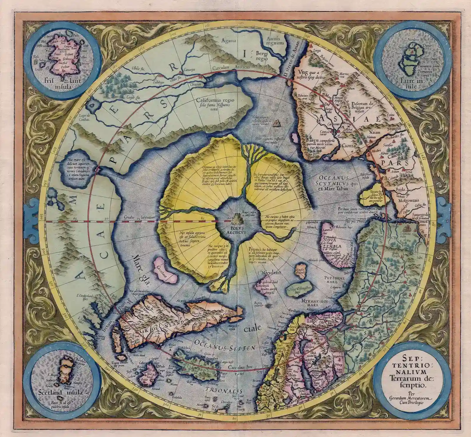
Mercator is supposed to be the safe mapmaker – the rational projection guy, not a conspiracy magnet. Yet his 16th-century Arctic maps still spark tense arguments in academic offices. On his famous polar chart, Mercator draws the North Pole not as a single ice cap but as four distinct islands surrounding a central whirlpool, rendered with surprisingly specific coastlines.
Mainstream history says nobody had charted the central Arctic in usable detail then, let alone precisely enough to draw tidy island coasts. Worse for skeptics, some coastlines near Greenland and the Canadian Arctic echo later discoveries with unnerving familiarity. Defenders insist Mercator relied on old travelers’ tales, distorted beyond recognition – but that explanation is wearing thin. Modern historians now grudgingly admit he almost certainly had access to now-lost northern sailing reports, likely from Norse and Basque mariners. That still doesn’t confirm a four-island Arctic, but it does suggest our tidy timeline of polar exploration is missing chapters.
#10 – The Dulcert Portolan and Its Suspiciously Confident Atlantic
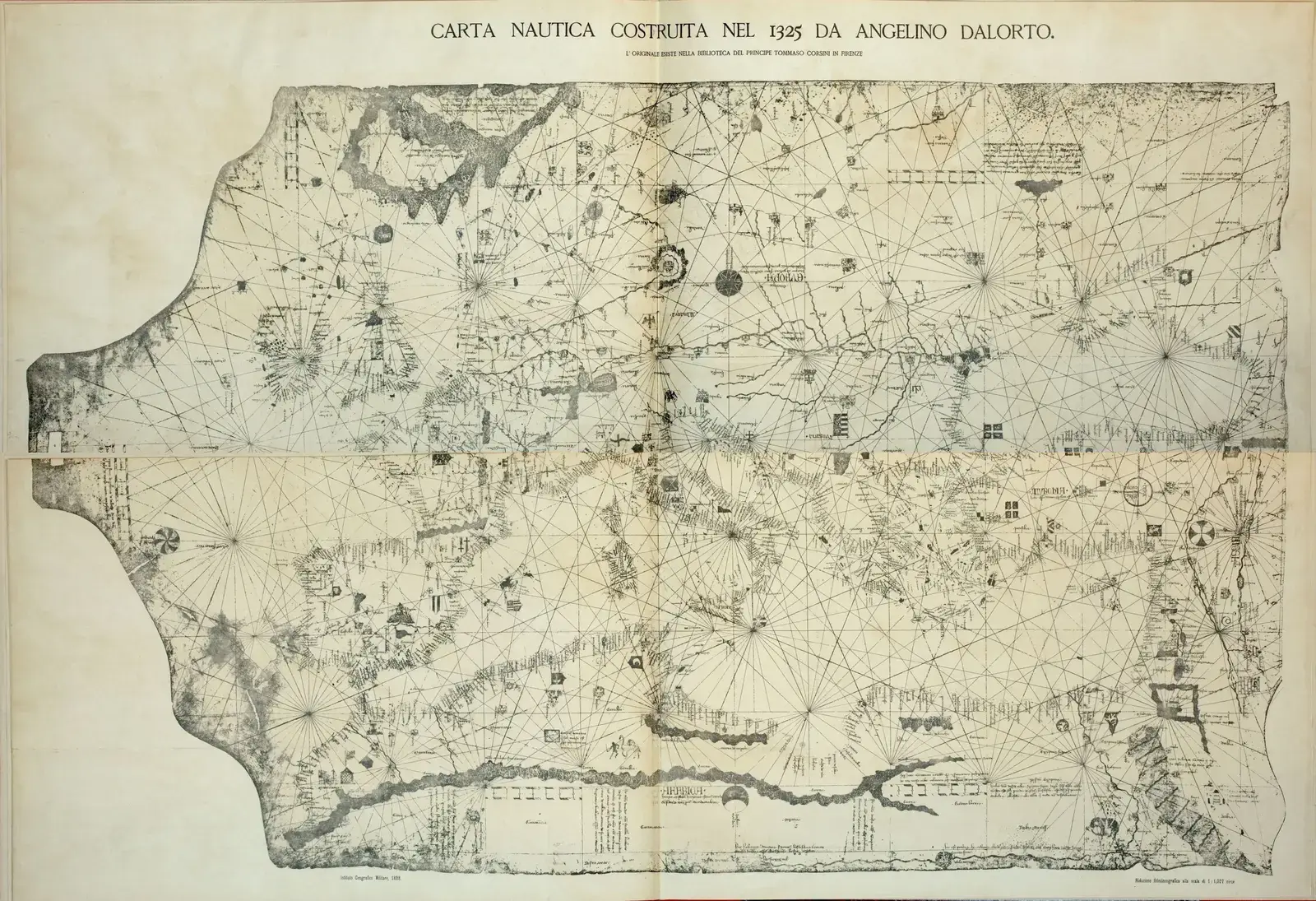
If you want to see medieval mapmakers in their comfort zone, look at portolans – hyper-practical sea charts built for sailors, not scholars. Angelino Dulcert’s 1339 chart is one of the best, which is exactly why one detail embarrasses modern experts. The Dulcert map shows the Atlantic coasts of Iberia and northwest Africa with precision that rivals 18th-century charts in certain stretches.
That much is impressive but explainable. The headache is how far south and west that confidence extends. Some promontories and bays along the northwest African coast appear with shapes so clean that historians now suspect long-distance reconnaissance voyages that were never written down anywhere that survived. The old line used to be “sketchy, stylized, not to be taken literally.” That’s quietly changed – contemporary cartographers now openly say many portolans, Dulcert’s included, deliver real-world coastal geometry built from iterative surveying no one bothered to chronicle. Your textbooks are underplaying how aggressively medieval sailors mapped the Atlantic.
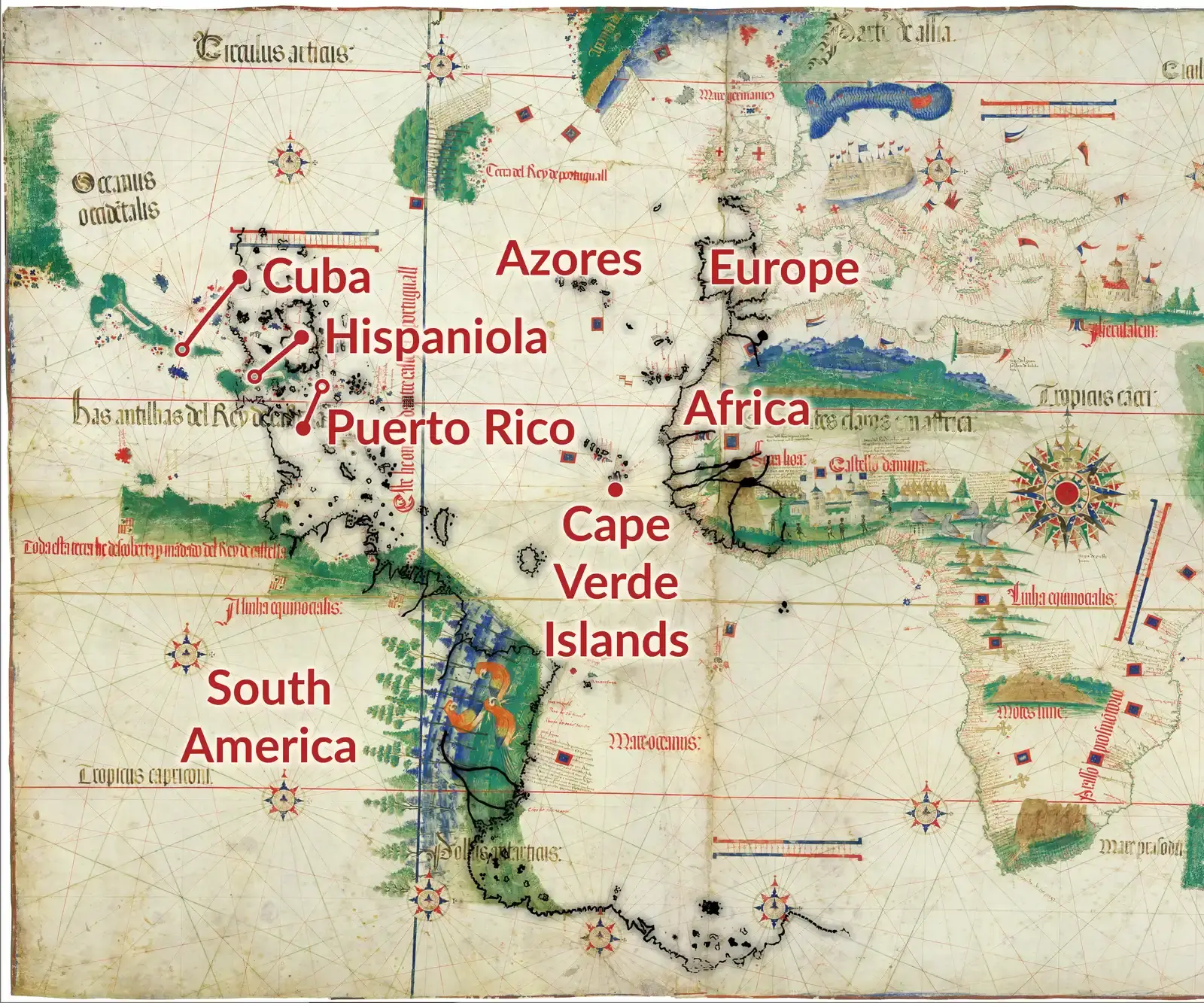
#9 – The Cantino Planisphere: Brazil Before Brazil Was “Discovered”
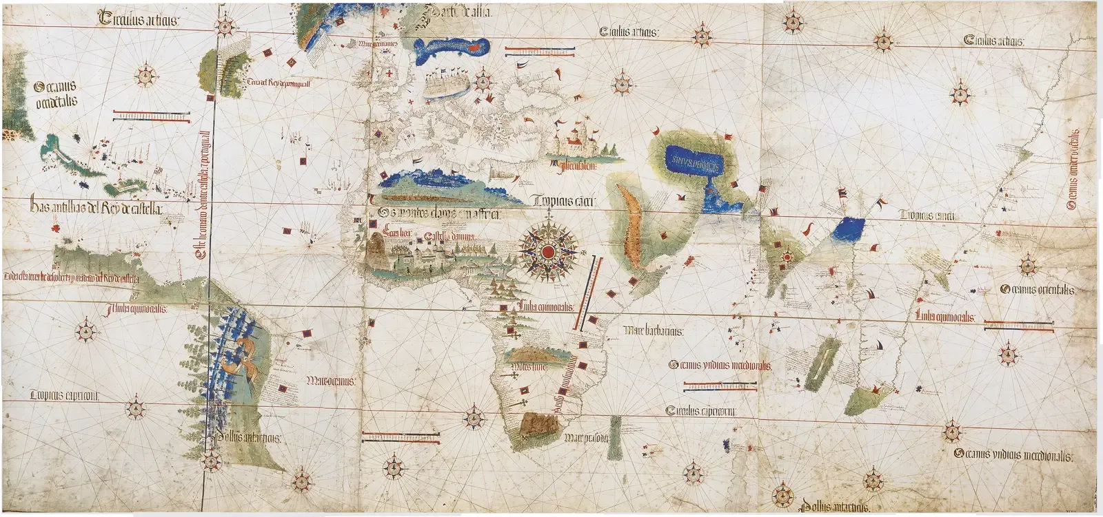
Ask a random traveler who discovered Brazil and they’ll say “Cabral, 1500,” and move on. The Cantino Planisphere, smuggled out of Portugal in 1502, tells a more awkward story. On this map, the bulge of South America is clearly visible, its northern and eastern coasts drawn with startling assurance for something so recently “found.”
At a Glance
- Created in 1502 and smuggled out of Portugal by an agent named Alberto Cantino
- Shows the Brazilian coastline just two years after Pedro Álvares Cabral’s 1500 landfall
- Now housed at the Biblioteca Estense in Modena, Italy
- One of the earliest surviving maps to depict the Treaty of Tordesillas line
The Brazilian coastline is depicted with enough fidelity to suggest multiple voyages hugging the shore, not a single accidental landfall. Some river mouths and capes even match modern charts beyond what you’d expect from a two-year-old discovery. Portuguese archives are famously patchy – and selectively silent – about early Atlantic probes. Cartographers now mostly agree Cantino’s map draws on pre-Cabral reconnaissance, possibly clandestine voyages meant to quietly test the Treaty of Tordesillas line. That implies working charts of Brazil existed before the “official” discovery story ever made it into a textbook.
#8 – The Waldseemüller World Map and the Pacific That Arrived Too Early
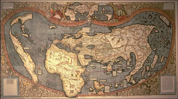
Most people know the 1507 Waldseemüller map because it’s the first to label “America.” Fewer notice it also hints at oddly early knowledge of the Pacific. On the massive wall map, South America ends with a thin isthmus and an implied ocean beyond it – effectively predicting the Pacific years before Europeans officially laid eyes on it in 1513.
Traditional explanations call it clever geographical theorizing: water west of Europe, land in the middle, so there’s probably more water beyond. But parts of the southern coastline look oddly specific for pure geometry. Modern cartographic historians are split – some still treat the far western edge as an educated guess. Others now candidly admit the map’s structure makes more sense if someone had second-hand reports of western seas, possibly filtered through Indigenous trade routes that reached the Atlantic side. Official voyages don’t back this up, but trade gossip has a habit of arriving before conquerors do.
#7 – The Zeno Map: A Forgery With Real Coastlines in It
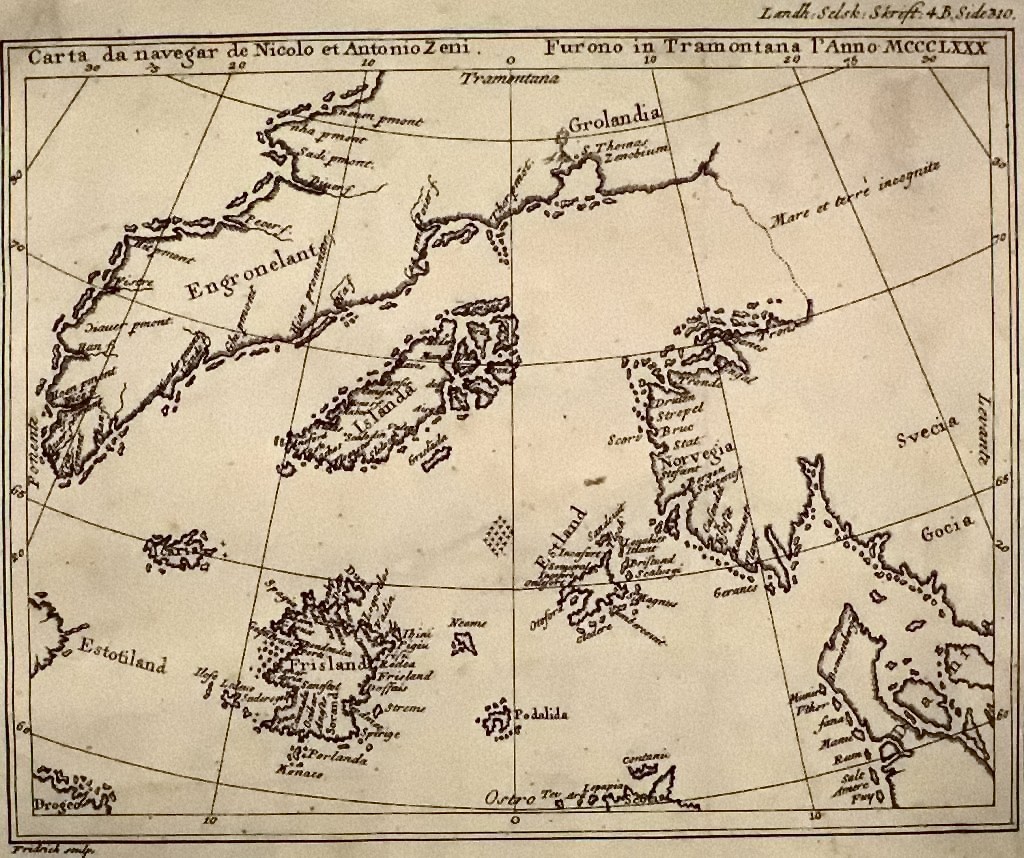
The Zeno map is a historian’s nightmare. Allegedly drawn from 14th-century voyages by Venetian brothers in the North Atlantic, it surfaced only in the 16th century with a sketchy backstory that smells of forgery. And yet the controversial sheet shows a network of islands and coasts stretching from Scotland to Greenland, and not all of it is fantasy.
Here’s the part experts now admit: certain fragments line up eerily with genuine parts of Iceland, the Faroe Islands, and Greenland’s coast, right down to the orientation of the fjords. For a supposed fake, it gets too much right. Too right to dismiss, not quite right enough to fully trust. Current scholarly opinion treats the Zeno map as a hybrid document – part propaganda, part recycling of older, accurate northern charts. That means someone had detailed knowledge of those northern coasts long before systematic Danish and British surveys ever began.
#6 – The Reinel Charts and an Indian Ocean Nobody Should Have Mastered Yet
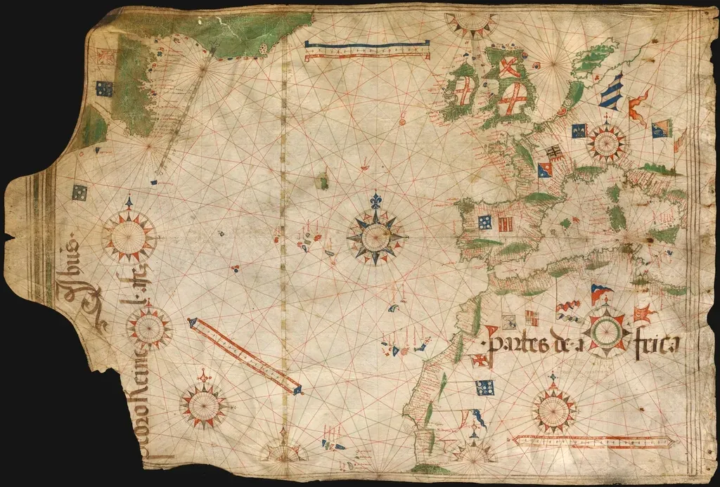
Look at early 16th-century Portuguese charts by Pedro and Jorge Reinel and you’ll see something that doesn’t fit neatly into schoolbook history: an Indian Ocean and Cape of Good Hope coast drawn with almost modern confidence. By the time da Gama rounded Africa in 1497–99, Europeans finally had a route. But the precision on Reinel’s coastlines, especially southern Africa and parts of India, suggests far more than a decade of rushed exploration could produce.
Worth Knowing
- Pedro and Jorge Reinel were a father-and-son team of Portuguese royal cartographers
- Vasco da Gama’s historic route around Africa was completed in 1497-99
- Their work fed into Portugal’s official “padrão real,” the master map used to train new pilots
- Southern African and Indian coastlines on their charts show detail not systematically surveyed until decades later
The bays, river mouths, and curvature often mirror maps drawn a full century later, once systematic surveying finally caught up. Today’s cartographers are blunt about it: these were not quick sketches after one lucky voyage. They were composite products of multiple, often unrecorded Portuguese probes, built on meticulous dead-reckoning logs that are now lost. To the public, that sounds like a secret head start on world exploration. In reality, it means the archive of early European mapping is far more incomplete than anyone likes to admit.
#5 – The Caverio Map and a North America Europe Barely Touched
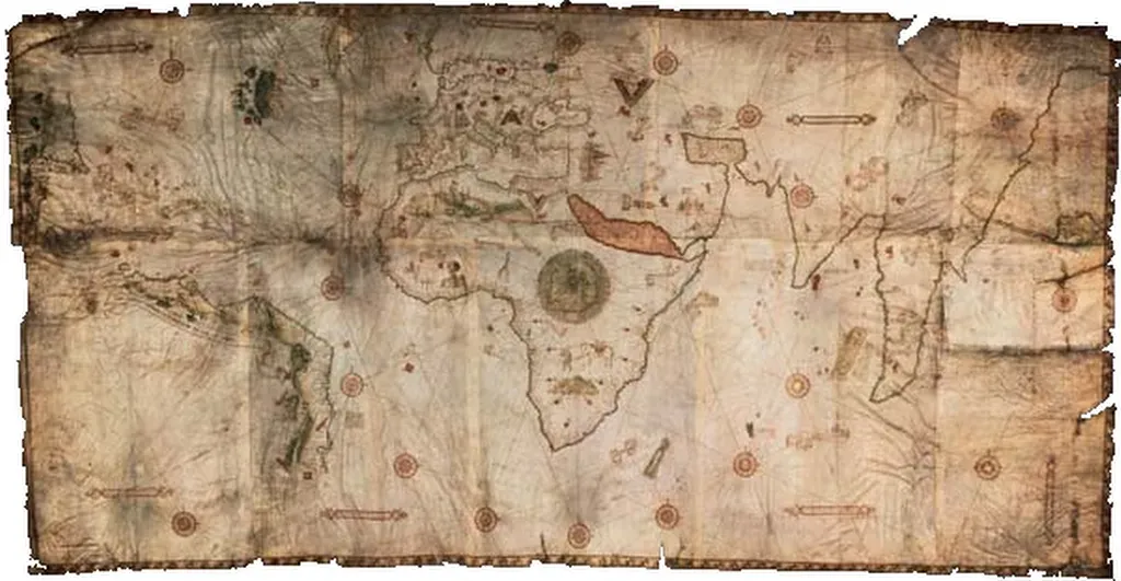
The 1505 Caverio map has become a quiet obsession among cartography geeks, because it seems to know too much about a coastline Europe had supposedly barely explored. Stretching from Brazil to Newfoundland, Caverio’s Americas show a string of bays, capes, and peninsulas that anticipate later French and English discoveries by decades.
Some researchers argue the general sweep of Nova Scotia and the Gulf of St. Lawrence appears in ghostly form on the North American coast. Orthodox historians blame projection distortions and wishful thinking, but as digitized overlays improve, the coincidences keep piling up. Experts now accept Caverio leaned heavily on Portuguese sources no one else had access to. The uncomfortable leap is admitting what that implies: quieter, longer reconnaissance along the North American seaboard than official narratives allow, likely chasing fisheries rather than glory. It doesn’t shock economic historians – but it does wreck the neat “Cabot, then a pause, then real colonization” story you learned in school.
#4 – The Fra Mauro Map and an Indian Ocean That Was Never Supposed to Be Open
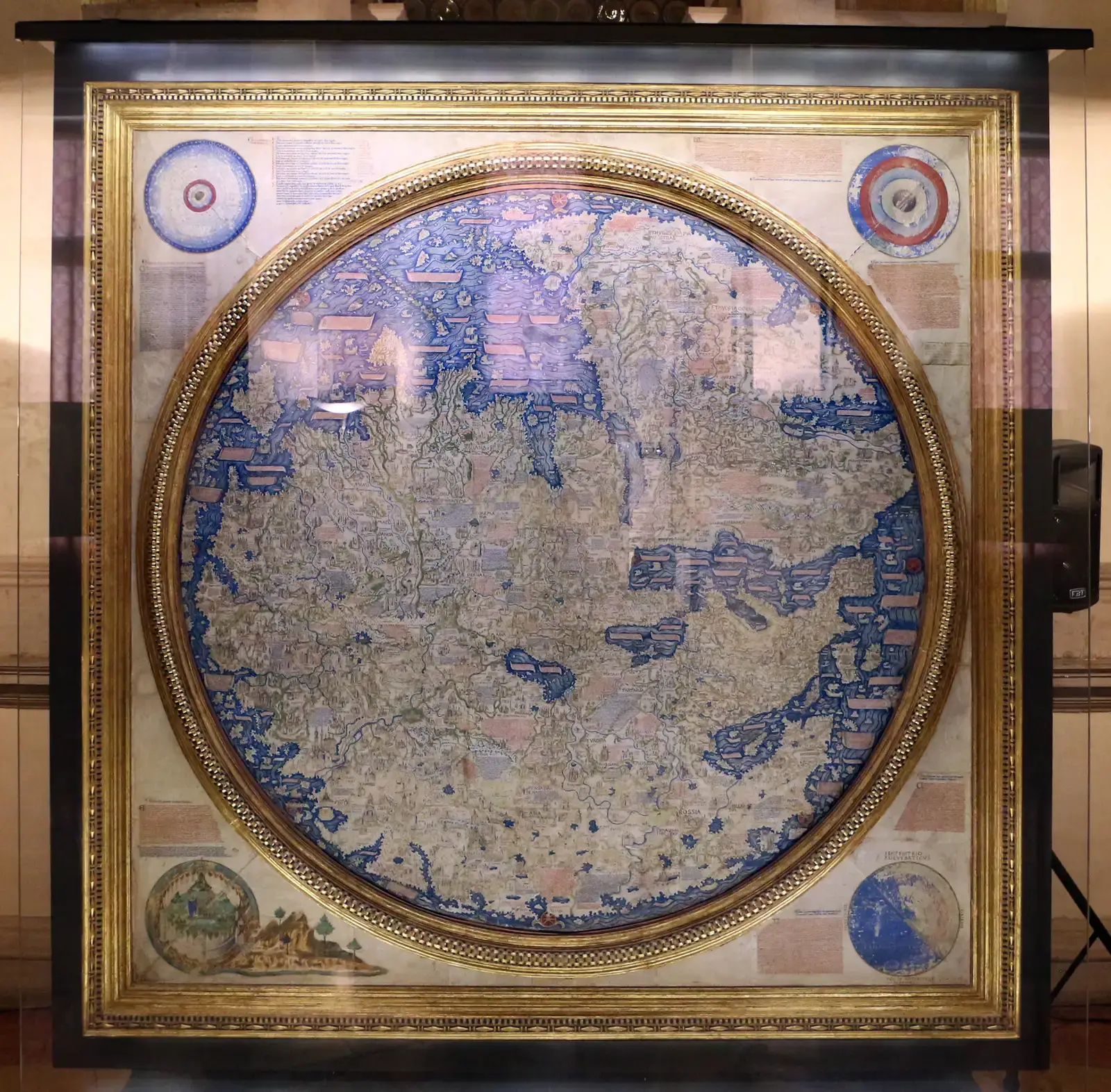
Drawn around 1450 in Venice, the Fra Mauro map is a circular masterpiece stuffed with text – medieval and quaint on the surface, unsettling underneath for anyone who likes simple timelines. Fra Mauro shows the Indian Ocean not as a land-locked basin, the way Ptolemy insisted, but as an open sea with a route wrapping around Africa, decades before Europeans officially proved that path existed.
Quick Compare
- Ptolemy’s model: Indian Ocean shown as a closed, land-locked sea
- Fra Mauro’s map (c. 1450): Indian Ocean shown as open water, wrapping around Africa
- Official European proof: Didn’t arrive until Vasco da Gama’s voyage of 1497-99
- Gap between claim and confirmation: Roughly four decades
Certain coasts along East Africa, India, and Southeast Asia are drawn with a practicality that smells like real sailors’ input, not armchair speculation. The map even describes a ship that allegedly rounded the Cape from west to east, a note conservative scholars long dismissed as a garbled legend. Less dogmatic cartographers now concede the obvious: Muslim, Chinese, and possibly African sailors had empirically mapped far more of these coasts than Latin Europe knew, and Fra Mauro’s team simply tapped those sources. It doesn’t mean Europeans secretly circumnavigated early – it means the functional map of the Old World was already fuller than Eurocentric timelines want to admit.
#3 – Early Chinese Coastal Charts: Precision With No Fanfare Attached
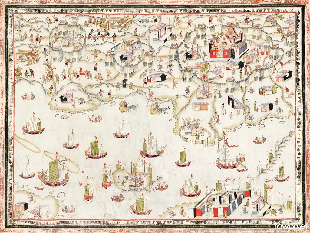
Unlike the European portolans splashed across Atlantic history, many early Chinese coastal charts stayed quietly practical, and for centuries they went mostly unread in the West. When scholars finally dug in, the timelines got messy. Ming-era navigation charts, especially the strip-style sea routes, show highly accurate coastlines of South China, Vietnam, and parts of the Malay world – in some cases outperforming European attempts drawn a full century later.
Even more provocative, scattered evidence suggests earlier Song and Yuan navigators already had detailed knowledge of Indian Ocean coasts, built from steady commercial voyages rather than one dramatic “discovery” event. Modern cartographers now admit that if you stitch these Chinese charts together, you get a robust Indian Ocean map centuries before Europe trumpets its own breakthroughs. It doesn’t prove global circumnavigation, but it does expose how selectively European textbooks have treated non-European cartography. The shorelines were already charted. Europe just wasn’t listening yet.
#2 – Polynesian Mental Maps: Coastlines With No Paper at All
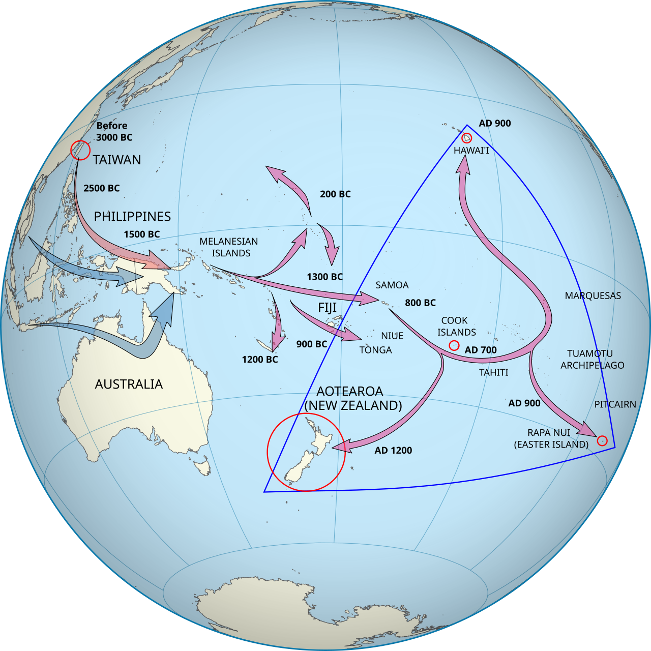
Here’s the part that irritates traditional map historians the most: some of the most accurate “coastlines” in history were never drawn on parchment. Polynesian navigators developed intensely precise mental charts of island chains and currents across the Pacific, encoded into stick charts, chants, and hands-on training voyages passed down for generations.
Why It Stands Out
- Navigation knowledge was encoded in stick charts, chants, and oral training rather than paper
- Wayfinding relied on reading stars, swells, and wildlife patterns across open ocean
- Voyaging canoes covered thousands of miles across the Pacific long before European contact
- Modern navigators have successfully retraced these routes using only traditional, non-instrument methods
When anthropologists finally compared these knowledge systems to modern maps, they hit something uncomfortable: the implied layout of islands and sea routes matches real geography with astonishing fidelity across thousands of miles, centuries before European “discovery.” Conservative scholars used to wave this away as folklore. That excuse is gone. Many cartographers now openly acknowledge that functional, empirically tested maps can exist in oral and tactile form, revealing coasts Europe hadn’t charted yet. If you only count ink on paper, you’ll always conclude “no one knew this coastline.” The Pacific proves that’s a category error, not a historical fact.
#1 – Indigenous North American Mapping: The Atlas History Tried to Skip
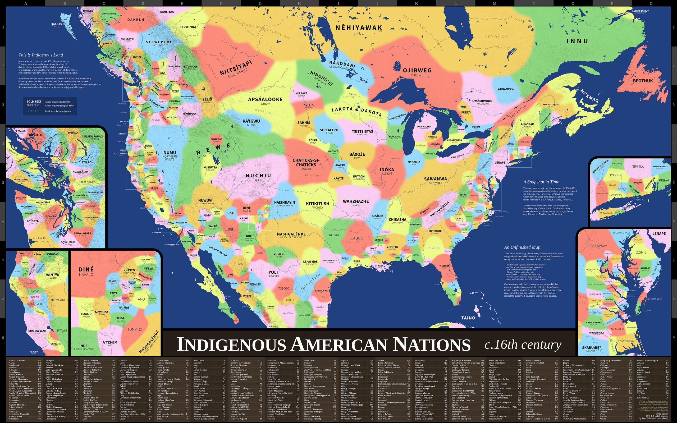
If there’s one map tradition that blows up the idea of Europeans as the sole chart-makers, it’s Indigenous cartography in the Americas, and modern experts are finally saying so out loud. For centuries, Indigenous nations across North America produced astonishingly accurate maps of rivers, lakes, and coasts, drawn in sand, carved on bark, or explained through guided journeys on foot and by canoe.
Early French and British surveyors quietly relied on this knowledge more than their journals ever credited. In multiple documented cases, Indigenous guides sketched river systems and shorelines that later matched modern surveys almost perfectly, long before any formal European mapping team arrived. The catch is that the original charts were rarely preserved on materials that survive – only referenced secondhand in letters and expedition logs. Cartographers today are increasingly blunt: a huge portion of “first” European maps of North American coasts are, in practice, cleaned-up copies of Indigenous geographic knowledge. Many shorelines in your atlas were charted centuries, sometimes millennia, before any European voyage – just not in a form archivists ever felt comfortable citing.
The Bottom Line
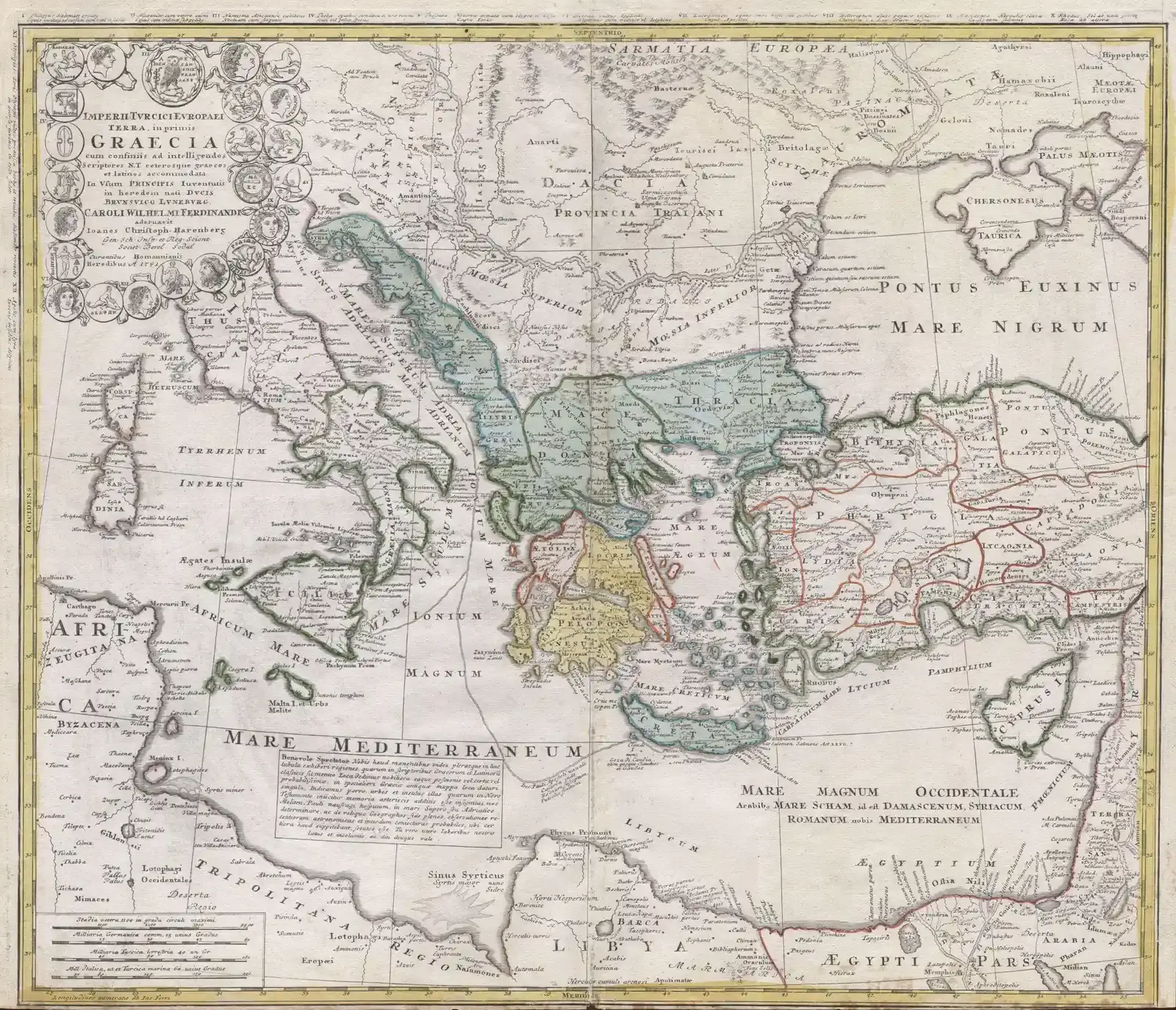
Taken together, these thirteen maps don’t prove time-traveling sailors or a hidden global empire. They prove something more embarrassing: our official timeline of who mapped which coastline, and when, is a highly edited story, trimmed down to fit a small cast of well-documented European “discoverers.”
Medieval portolans hint at Atlantic voyages nobody bothered to write down. Portuguese charts scream missing expeditions. Chinese and Islamic sailors quietly beat Europe to entire oceans. Polynesian navigators and Indigenous American mapmakers proved you don’t need ink and parchment to know a coastline better than the people who later got credit for finding it.
My honest opinion? The wildest claim on this whole list isn’t that ancient people got somewhere early. It’s that textbooks kept teaching a version of history where only a handful of well-documented Europeans really mattered, long after the evidence stopped supporting it. These maps aren’t glitches in the timeline. They’re the timeline – the parts nobody wanted to put in the textbook.