You’ve probably grown up thinking that people in the distant past believed in flat Earths, sea monsters, and wildly distorted worlds. Then you stumble onto an old map that seems to show a coastline exactly where modern satellite images place it, and suddenly history feels a lot more complicated. When you look closely, some ancient and early modern charts line up with today’s data far better than you’d expect from an age of wooden ships and dead reckoning. In this article, you’re going to walk through seven striking examples where old mapmakers sketched coastlines that modern satellite surveys later confirmed with surprising accuracy. You’ll also see where the hype sometimes runs ahead of the evidence, especially in the more sensational claims about lost civilizations and impossible knowledge. By the end, you’ll have a sharper eye for what these maps really tell you about human curiosity, persistence, and the slow, messy way knowledge actually advances.
1. The Piri Reis Map: Myth, Hype, And Real Geographic Skill
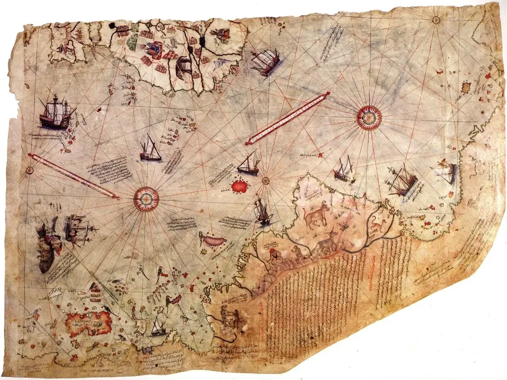
If you’ve ever browsed fringe history videos, you’ve seen the Piri Reis map held up as proof that someone long ago mapped Antarctica without ice. When you actually look closer, you find something more grounded but still impressive: a sixteenth‑century Ottoman admiral combining Portuguese and Arabic sources to sketch the Atlantic world with surprising accuracy for his time. The coastlines of parts of South America and West Africa fall close enough to modern satellite outlines that you can immediately tell what you’re looking at. Where things get wild is in how people interpret the southern section of the map. Some see it as a perfectly mapped Antarctic coast, but when you compare it carefully to modern charts, you’re really viewing a distorted extension of South American coastline pushed too far south. So yes, you’re looking at a skilled synthetic map of the early Age of Discovery, but you’re not holding a secret satellite preview of the ice‑free polar world. The real story is already fascinating enough: early sixteenth‑century cartographers, working with scattered voyage logs, managed to trace coastlines closely enough that today’s satellites confirm the broad outlines.
2. Fra Mauro’s World Map: Medieval Eyes On The Indian Ocean
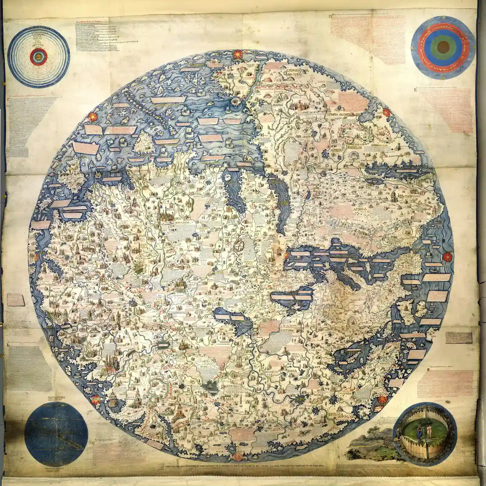
When you stand in front of a reproduction of the fifteenth‑century Fra Mauro map, it looks like a dense circular puzzle of text and tiny drawings. But as you orient yourself, you notice that large stretches of the African coast, the Arabian Peninsula, and parts of South Asia sit roughly where your modern mental map expects them. Without satellites, GPS, or even a global coordinate system in the modern sense, medieval Venetian and Arabic sources still managed to outline the general shape of the Indian Ocean world. What makes this powerful for you today is not micrometer‑level accuracy, but the clear match between this sprawling diagram and modern satellite coastlines when you flip and scale it properly. You see the Red Sea, the rounded bulge of East Africa, and the long stretch toward India rendered with a confidence that could only have come from sustained sea travel and information trading. Instead of imagining medieval people adrift in ignorance, you start to picture a world buzzing with pilots, merchants, and scholars comparing notes and gradually sketching the coasts you now check on your phone.
3. The Cantino Planisphere: A Smuggled Snapshot Of A Changing World
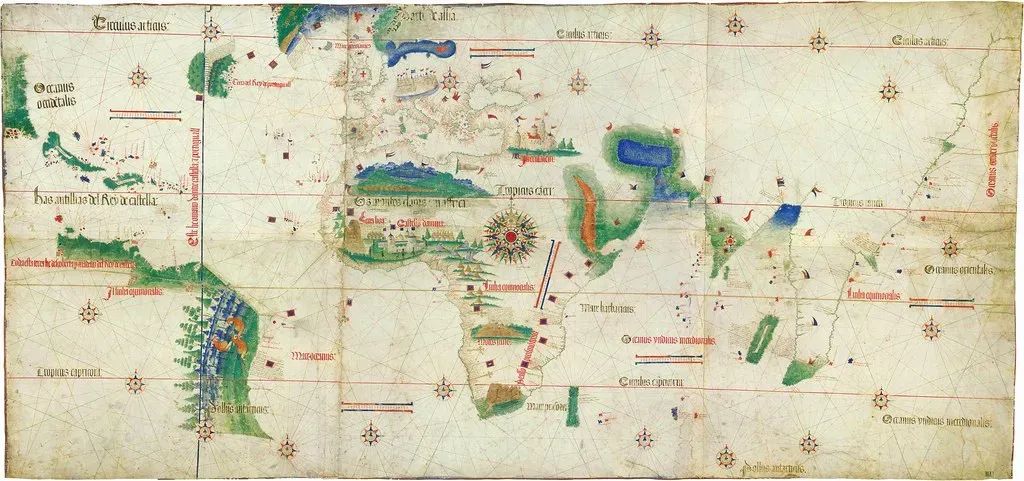
If you want a moment where the old and new worlds collide on parchment, you look at the Cantino Planisphere from the early sixteenth century. This secretly exported Portuguese chart captures a pivotal instant: mariners had just started to probe the coastlines of Brazil and West Africa, and those shapes spill across the page in ways that echo your modern satellite views. The north‑east curve of Brazil, in particular, lines up in a way that feels almost eerie given how new those coasts were to European mapmakers. You need to remember, though, that this wasn’t magic; it was method. Explorers were using systematic latitude readings, coastal soundings, and repeated voyages to refine their sense of where each cape and bay belonged. When you overlay the Cantino coastline with a modern map, you see a close family resemblance along major stretches, even if some details are still off. What satellites later confirmed is that those early navigators had already captured the backbone of the Atlantic coasts they were sailing, piece by dangerous piece.
4. The Kangnido Map: Korea’s Window On An Unexpectedly Wide World
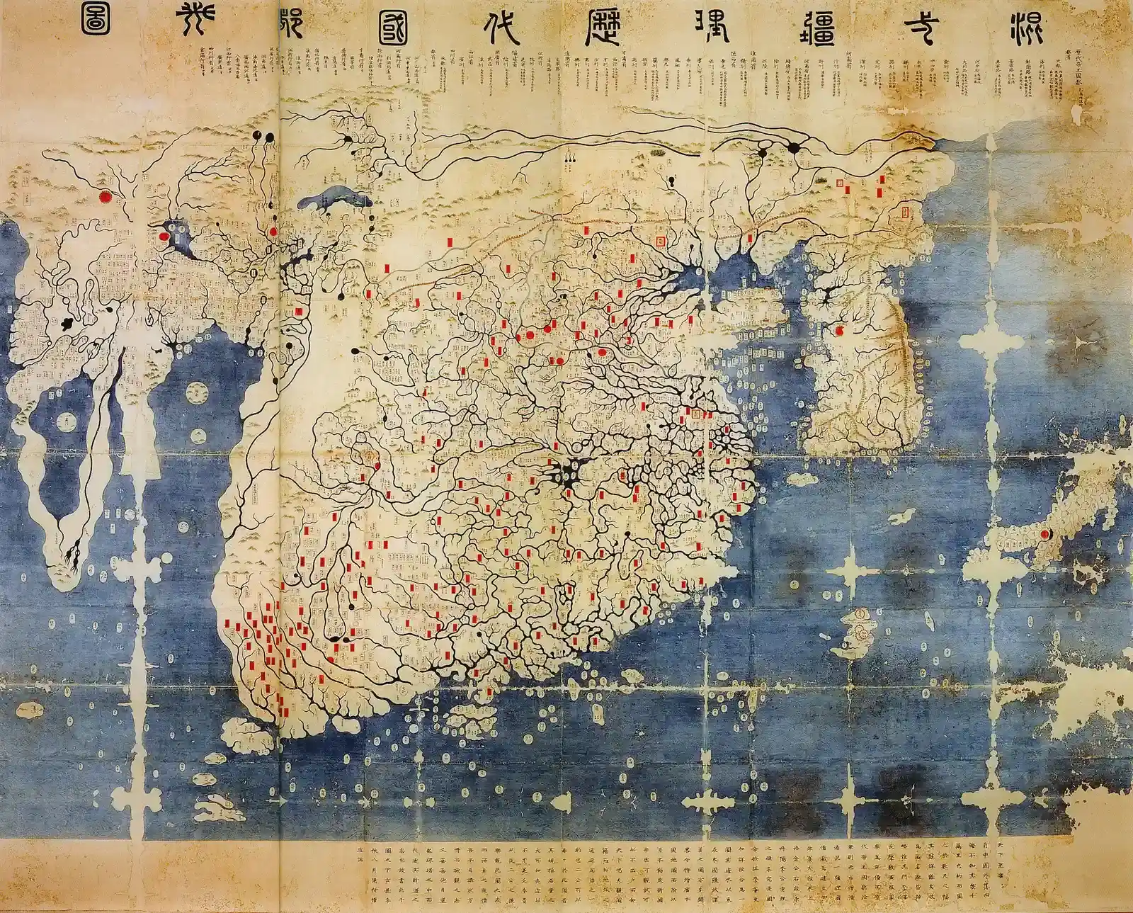
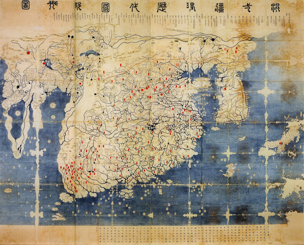
The Kangnido map, created in the early fifteenth century in Korea, can feel like a shock if you expect East Asian maps from that period to be purely local. When you study it, you realize it does far more than show you Korea and China; it reaches across to sketch large parts of Africa, the Middle East, and even Europe in broad strokes. While the coastlines are not precise in the modern technical sense, you can still recognize the general outlines of the Mediterranean and the African continent once you rotate and scale the projection. From a satellite perspective, you would not call this map accurate down to individual bays or inlets. But if you zoom out, the way the coasts bend and extend shows that Korean and Chinese scholars were absorbing geographically meaningful information from Islamic and other sources. For you, this changes the story: instead of imagining isolated civilizations, you see knowledge traveling along trade routes, pooling into a map that, at a continental scale, matches what orbital sensors now confirm about how land and sea are actually arranged.
5. Portolan Charts Of The Mediterranean: Razor‑Sharp Coasts Before GPS
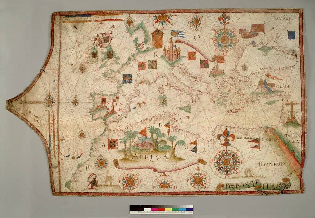
If you want an example where ancient or medieval charts really do hug modern coastlines with uncanny tightness, you look at portolan charts of the Mediterranean. These nautical maps, drawn from roughly the thirteenth century onward, show the coasts of Italy, Greece, Spain, and North Africa traced with a crispness that still impresses modern cartographers. When satellite outlines are layered on top, many stretches match so closely that you can imagine a sailor from those days recognizing familiar bays from a modern screen. You get this level of accuracy not because of some lost advanced technology, but because of relentless practical feedback. Sailors depended on these charts to survive, and every mistake could mean wrecked cargo or lost lives, so coastlines were refined voyage after voyage. When you see how well a good portolan chart fits today’s satellite coastlines around the Aegean or the Balearic Islands, you’re looking at centuries of empirical trial and error etched into parchment long before anyone dreamed of a satellite.
6. Early Dutch Charts Of Australia’s Western Coast: Edges Of A Hidden Continent
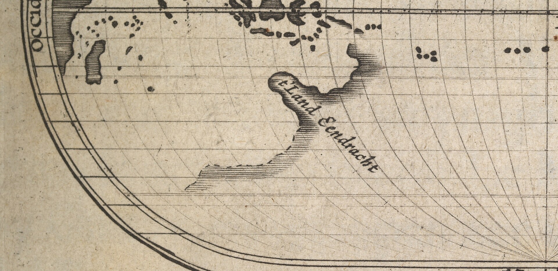
When you think of Australia’s outline, you probably picture a clean, iconic shape as you’ve seen it in modern atlases. But if you look at seventeenth‑century Dutch charts, you already see much of the western and northern coastline taking form, drawn from voyages that hugged those shores long before the continent was fully mapped. Modern satellite data confirms that many of those linear stretches and blunt capes along the west coast sit very close to their real positions, considering the tools the navigators had. For you, this shows how incremental discovery looks on a map: you see accurate coastlines abruptly stopping, blank spaces where no one from that mapping tradition had yet sailed, and puzzling gaps that later expeditions would fill in. The uncanny part is that the pieces which are present – those rocky western stretches and the curve into the Timor and Arafura Seas – stand up well to modern measurements. Even in the age of space‑based surveying, you can still recognize the careful work of sailors watching reefs, keeping soundings, and marking down each bend of the coast.
7. The Jesuit Mapping Of China’s Coasts: Astronomy Meets Cartography
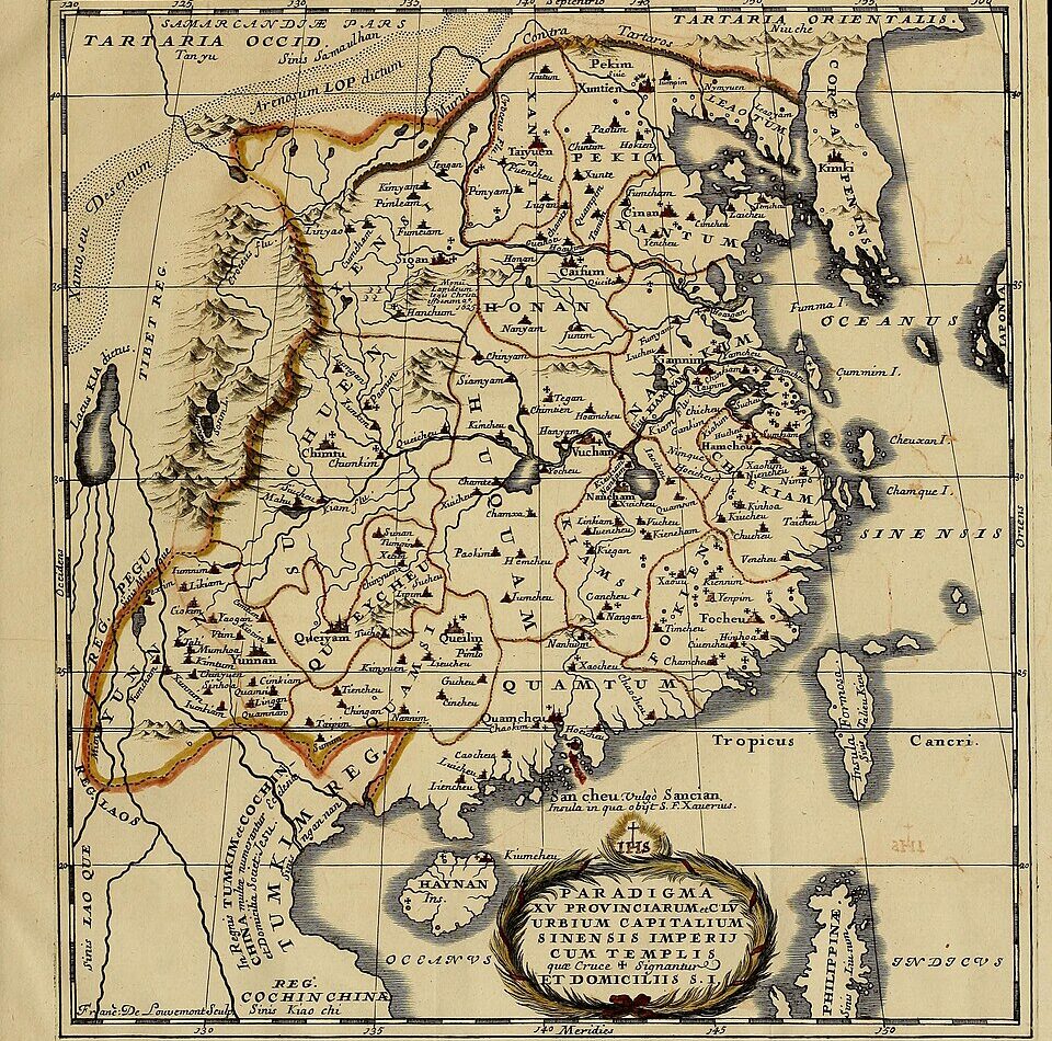
In the seventeenth and eighteenth centuries, Jesuit missionaries working in China brought with them advanced European surveying and astronomical techniques, and you see the results most clearly along China’s complex coastline. When you compare some of these coastal charts with modern satellite imagery, major features like the Shandong Peninsula, the sweep of the southeast coast, and the placement of large estuaries align closely. You’re looking at a fusion of traditional Chinese geographic knowledge with imported methods for calculating latitude and longitude more rigorously. For you, the fascinating part is how quickly this collaboration tightened the match between map and reality. Instead of wild distortions, you get coastlines that, while not perfect, hold up remarkably well when checked against modern measurements from space. Satellites later refined what those early surveyors started, but they did not overturn it; they confirmed that, by the early modern period, human eyes, instruments, and persistence had already traced much of East Asia’s shorelines in ways your twenty‑first‑century tools would recognize.
Conclusion: What These Old Coastlines Really Tell You
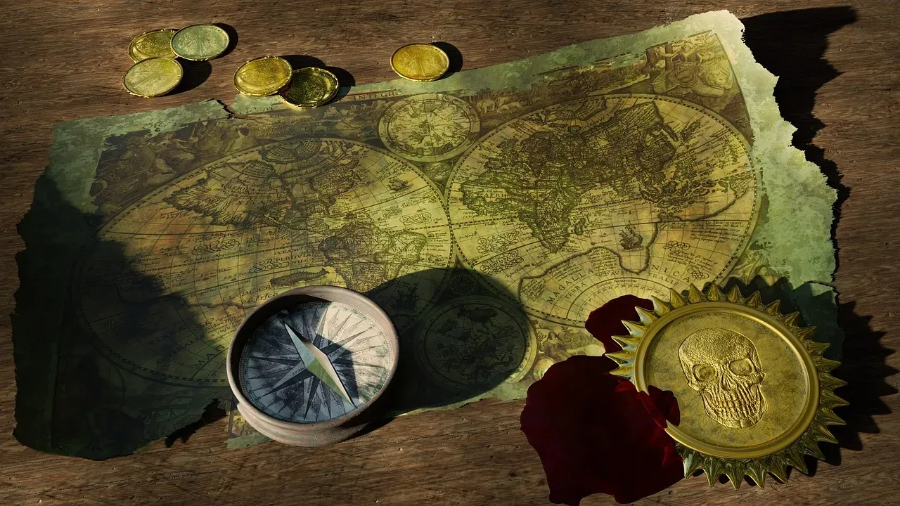
When you step back from these seven examples, a pattern emerges that’s more grounded – and ultimately more inspiring – than the dramatic stories about secret ancient satellites or lost global civilizations. Time after time, you see coastlines that modern surveys later confirmed as broadly accurate, not because of magic, but because people kept sailing, measuring, arguing, and redrawing. You’re witnessing centuries of error correction and shared curiosity hard‑coded into ink and parchment. The lesson for you today is that human beings, working with limited tools but relentless effort, can get surprisingly close to the truth about their world. Satellites gave you sharp boundaries, precise coordinates, and wraparound global coverage, but they also quietly validated a lot of what earlier mapmakers had already figured out the hard way. So the next time you zoom in on a crisp satellite coastline, ask yourself: how many anonymous navigators and patient cartographers already sketched that same outline, long before anyone could see Earth from above?