If you think Google Maps is impressive, wait until you hear about ancient sailors sketching shorelines they’d never supposedly seen, or monks drawing landmasses that “didn’t exist” for centuries more. Old maps can feel almost supernatural: they freeze a moment in time, but sometimes they also seem to peek way ahead of their era. When a crumbling parchment shows a coastline no one was meant to reach yet, it hits you with that strange mix of wonder and discomfort, like history is winking and saying, “You don’t know the whole story.”
I remember staring at a reproduction of a medieval world map in a museum, realizing half the things on it weren’t supposed to be there – mysterious islands, half-guessed continents, shockingly accurate features drawn long before “official” discovery. In that moment it felt less like a piece of geography and more like a conspiracy between cartographers and time itself. In this article, we’ll walk through 18 of the most talked‑about, debated, and downright eerie ancient maps that people claim show places humanity “wasn’t supposed to know about yet” – and we’ll separate genuine oddities from pure fantasy along the way.
#1 The Piri Reis Map: A 16th‑Century Puzzle of the Atlantic World
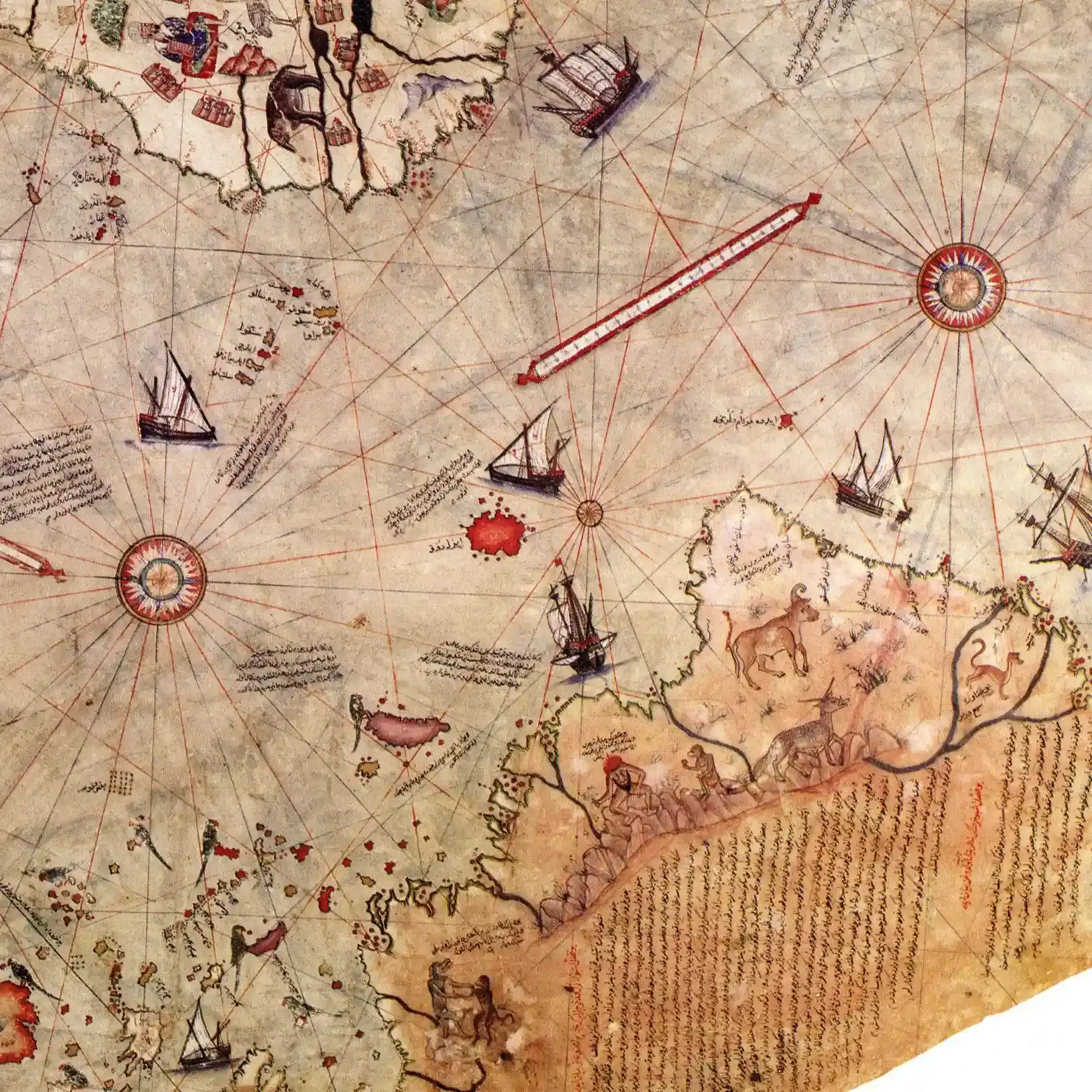
The Piri Reis map, created around 1513 by the Ottoman admiral and cartographer Piri Reis, is the poster child of “how did they know that?” map lore. Drawn on gazelle skin, it shows the Atlantic coasts of Europe, Africa, and parts of the Americas with a level of detail that feels surprisingly modern for such an early date. What makes it so captivating is that Reis openly admitted he compiled it from about twenty earlier charts and maps, some of which he claimed dated back to the time of Alexander the Great. That single statement has fueled more armchair theories than almost any other line in cartographic history.
People often point to the way the coastline of South America is drawn, stretching farther south than you’d expect, and the strange landmass drawn way down at the bottom, which some insist is Antarctica drawn centuries before its “discovery.” Most historians argue it’s more likely a distorted continuation of South America or a mythical southern continent, since medieval and Renaissance maps loved to balance the world with a great southern land. Personally, I think the real marvel of the Piri Reis map isn’t that it proves some hidden super‑civilization; it’s that it shows how seafarers shared and layered knowledge over generations, stitching together fragments into something that feels almost ahead of its time.
#2 The Oronce Finé World Map and the “Early Antarctica” Obsession
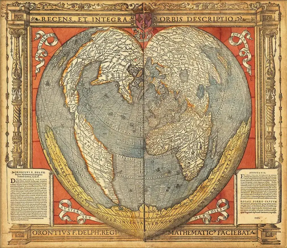
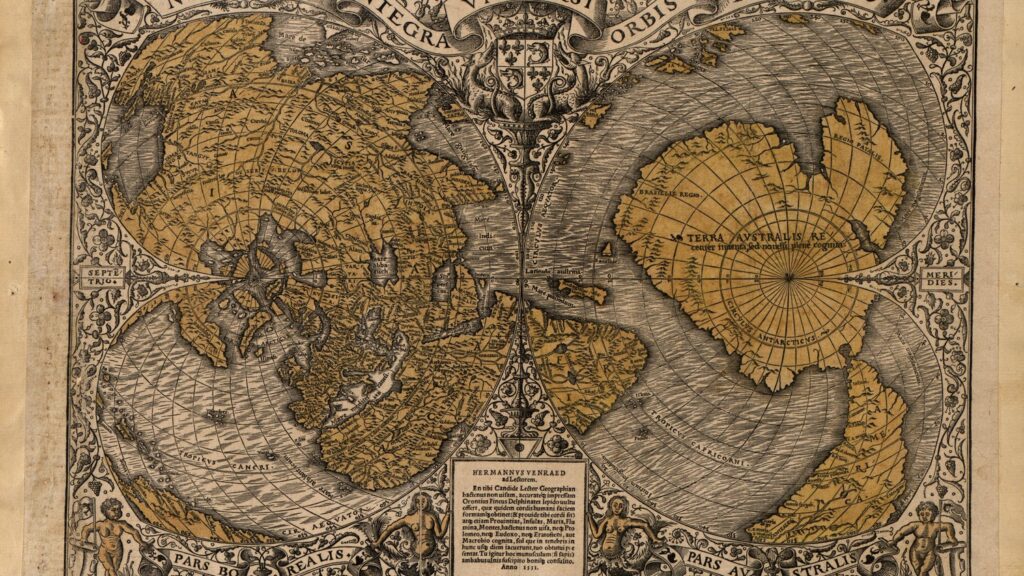
Oronce Finé, a French mathematician and cartographer, published a famous cordiform (heart‑shaped) world map in the early 1530s that has become a magnet for speculation. At the bottom of his map sits a large southern continent labeled Terra Australis, drawn with bays and peninsulas that some enthusiasts say look uncomfortably similar to the outline of Antarctica. Considering Antarctica was only sighted in the nineteenth century, that idea sounds explosive: how could a sixteenth‑century European have mapped anything like it?
Most scholars give a much less dramatic explanation: Finé combined older classical ideas about a “balancing” southern land with second‑hand traveler tales and a big dose of imagination. Renaissance cartographers often believed there must be an enormous landmass in the south to counter the weight of land in the north, a kind of cosmic symmetry. Still, when you look at Fine’s “Antarctica,” you can see why people get goosebumps; there are just enough coincidental shapes to tease the brain. To me, this is where our minds betray us – we’re so good at recognizing patterns that we sometimes connect dots that were never meant to be connected.
#3 The Cantino Planisphere: New Worlds Leaking Out Early
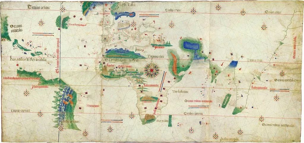
The Cantino Planisphere, made around 1502, is one of the earliest surviving maps to show the results of the great Portuguese voyages, and it probably should never have left Portugal at all. It was allegedly smuggled out by an Italian agent, Alberto Cantino, desperate to bring these secret geographic discoveries back to his patrons. On its parchment, you can see parts of Brazil and the Caribbean sketched out astonishingly soon after Europeans first reached them, like classified information that somehow slipped through the cracks.
In an age when knowledge of new trade routes and lands meant power and profit, this map is basically a leak of state secrets. It reveals how quickly early explorers mapped coasts once they got there, and how fiercely monarchies tried to keep that information under wraps. Yet, the Cantino Planisphere also shows distortions and guesswork: stretches of coast elongated or bent, shapes that don’t quite fit reality. It’s a great reminder that even when a map looks “ahead of its time,” it can still be a messy, evolving snapshot rather than a flawless crystal ball.
#4 The Waldseemüller Map: Naming America Before It Was Ready
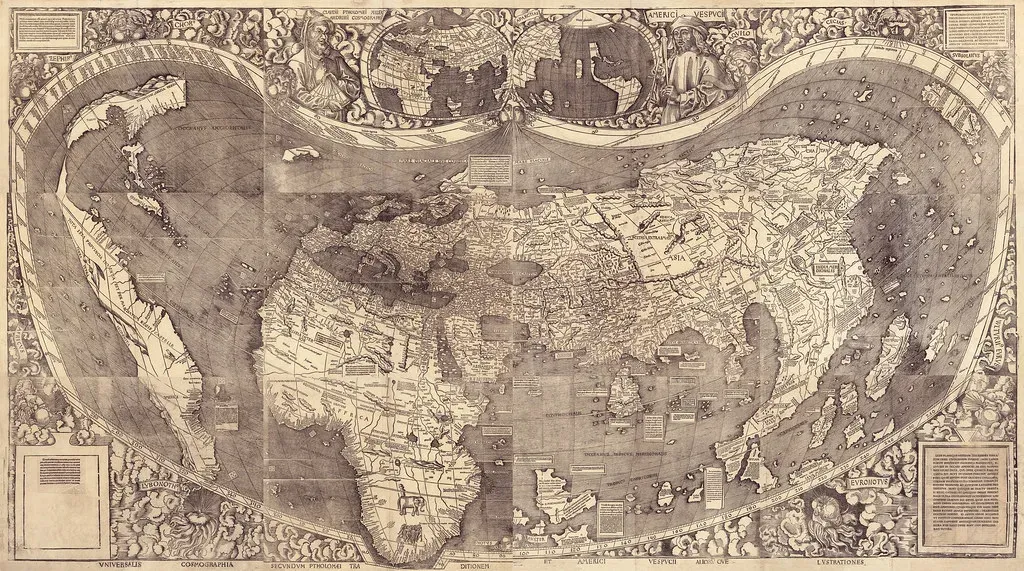
In 1507, Martin Waldseemüller created a wall map that did something quietly revolutionary: it labeled a big chunk of the western hemisphere “America,” after explorer Amerigo Vespucci. At that time, Europeans were only beginning to understand the scale and shape of this “new world,” yet Waldseemüller’s map boldly split the world into two great landmasses separated by a vast ocean. It feels like watching someone sketch the outline of a new chapter in history while still half in the dark.
The most surreal thing is how confident the map looks despite being based on extremely limited voyages and reports. There’s a strange courage in drawing a continent you have never seen as a whole, trusting fragmentary logs and imagination. Waldseemüller later seems to have doubted his own naming choice, but by then, the label had stuck. When people say this map “knew” about America before its time, what they really mean is that it crystallized a transformation in European thinking – accepting that these lands weren’t just odd extensions of Asia, but something entirely different.
#5 The Vinland Map: Controversial Glimpse of Pre‑Columbian America
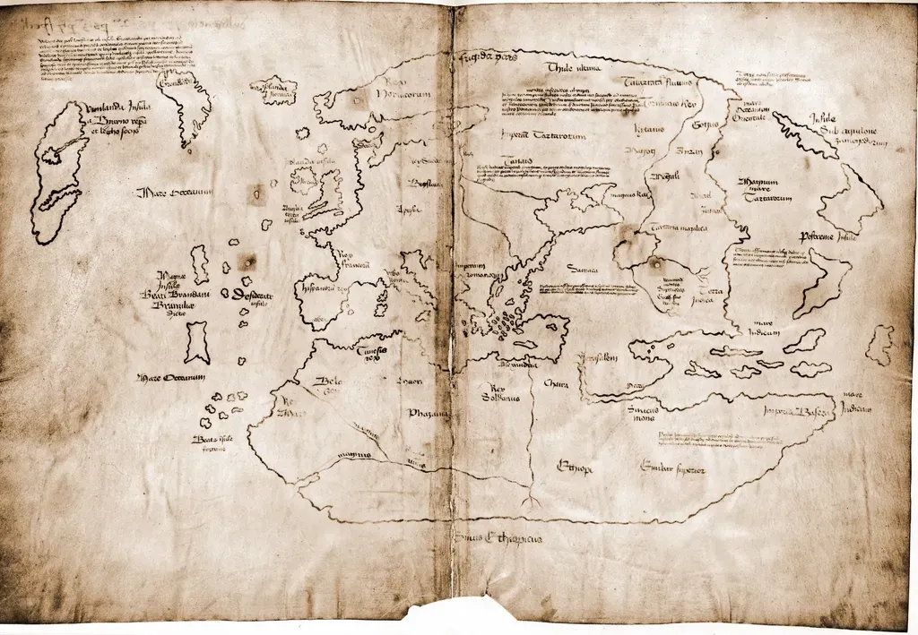
The Vinland Map is one of those artifacts that refuses to quietly retire, no matter how many times experts weigh in. It surfaced in the twentieth century and appears to show a chunk of North America labeled as Vinland, supposedly drawn in the fifteenth century. Given that Norse sagas describe voyages to a place called Vinland around a thousand years ago, the idea of a medieval European map of North America is intoxicating. It would mean that people in Europe had at least some cartographic idea of western lands well before Columbus.
But here’s the catch: scientific testing and scholarly debate have repeatedly raised huge red flags, from the ink composition to the parchment history. Many specialists now see it as a likely modern forgery made to look old. To me, the Vinland Map is still important, just not in the way the hype suggests. It shows how hungry we are for proof that official discovery timelines are incomplete, and how easily that hunger can be exploited. The real story is probably less dramatic but more human: we long for secrets hidden in plain sight, even when the evidence just does not convincingly hold up.
#6 The Zeno Map: Phantom Islands in the Far North
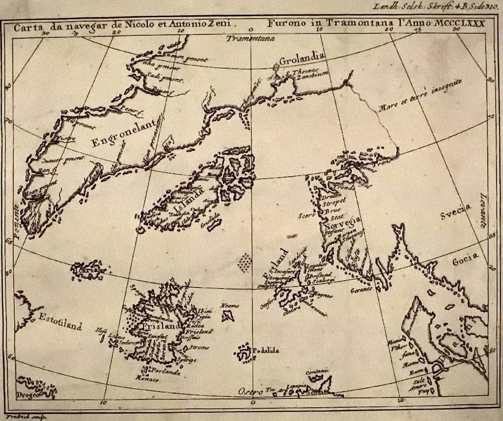
The Zeno Map, published in the mid‑sixteenth century but claiming to show older voyages by the Zeno brothers, is full of strange northern islands and coastlines. It’s famous for showing a place called Frisland, a big island south of Iceland that simply does not exist. Some enthusiasts have suggested that certain shapes on the map hint at Greenland or even parts of North America charted earlier than official accounts admit. At first glance, the whole thing feels like a chilly treasure map of lost lands and forgotten journeys.
Most historians, though, see the Zeno Map as a blend of fabrication, misinterpretation, and recycled geographic myths. In an age when sea stories traveled faster than truth, it was easy for an enthusiastic mapmaker to elevate rumor into “fact.” I find this map fascinating not because it proves hidden exploration, but because it shows how powerful stories can become when they are frozen in ink. Once a fictional island appears on a widely copied map, it suddenly becomes real in the minds of sailors and scholars, an imagined place people genuinely search for over the horizon.
#7 The Portolan Charts: Shockingly Accurate Coasts Without “Modern” Tools
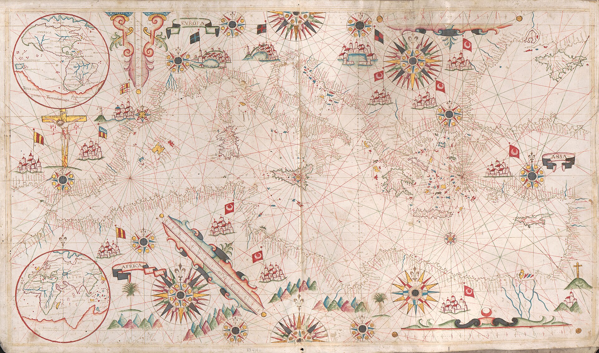
Medieval portolan charts, which started appearing around the thirteenth century in the Mediterranean world, are so precise that they almost feel like cheating. These sea charts show coastlines, ports, and sailing routes with a level of detail that looks centuries ahead of their time, especially considering they were drawn before modern longitude calculations. When you place a good portolan chart over a modern satellite image of the Mediterranean, the match is close enough to be unsettling.
Yet the secret is not time travelers; it’s hard‑earned empirical knowledge. Sailors constantly refined these maps based on bearings, distances, and practical experience, turning the sea into a grid of lived data. One reason they feel like they “knew too much” is that we often underestimate how sharp and iterative real-world navigation can be. To me, portolans are a humbling reminder that patient observation and collaboration can rival fancy instruments, and that ancient mariners probably knew their world more intimately than many of us know our own cities.
#8 The Da Ming Hun Yi Tu: China’s Grand World Vision
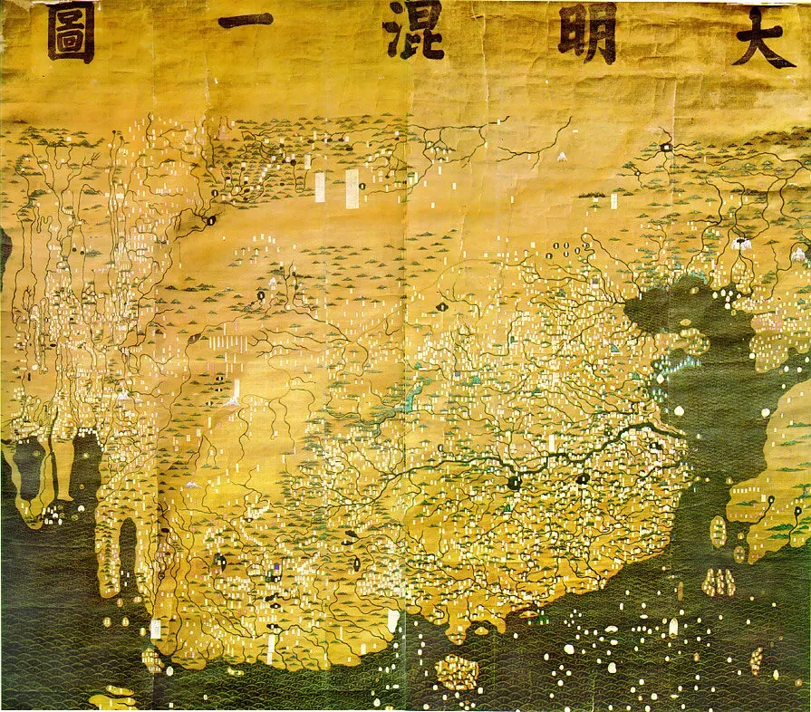
The Da Ming Hun Yi Tu, a large world map from the early Ming dynasty, offers a sweeping Chinese view of the known world in the fourteenth and fifteenth centuries. It includes not only East Asia but also reasonably recognizable versions of India, the Middle East, parts of Africa, and distant western lands. For a map produced long before European global exploration had fully unfolded, its geographic reach feels surprisingly ambitious, almost like someone stretched the horizon by sheer will.
Some observers claim the map suggests deeper knowledge of Africa or other regions than China was “supposed” to have at the time, sometimes pulling it into grand theories about massive secret fleets. The more grounded explanation is that Chinese cartographers skillfully combined local surveys with information traded through the Silk Road and maritime contacts, then projected it into their own worldview. What really impresses me here is less any alleged secret continent, and more how connected the pre‑modern world already was. Ideas and geographic details spread along trade networks long before explorers planted flags on distant shores.
#9 The Kangnido Map: Korea’s Early Glimpse of a Bigger World
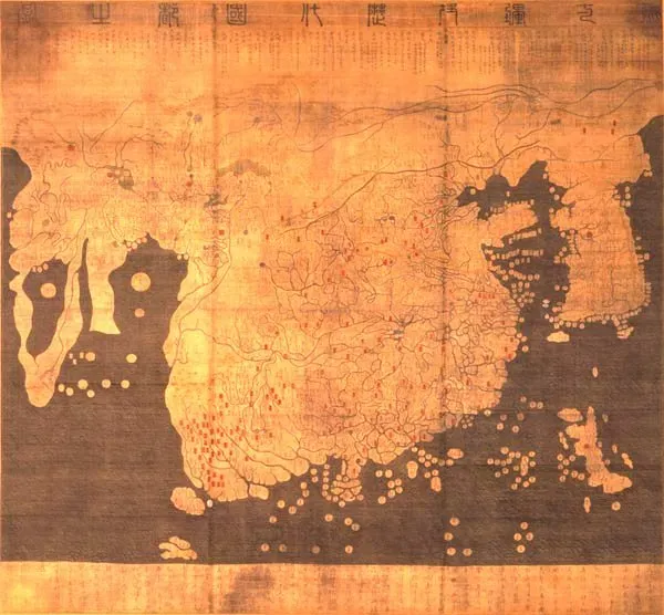
The Kangnido map, compiled in Korea in the early fifteenth century, is another striking example of an unexpectedly global vision. It displays a large Eurasian landmass with impressive detail for China, Korea, and Japan, but it also includes India, Arabia, and even an extended Africa reaching far to the south. Seeing such a broad world drawn from an East Asian perspective at that time can be a bit shocking if you grew up on strictly European‑centric history.
Some enthusiasts argue that the shape of Africa on Kangnido hints at knowledge of its southern reaches earlier than standard narratives suggest. Scholars usually attribute this to a mix of Islamic cartography, travel reports, and guesswork, smoothed into a single grand image. What I love about Kangnido is how it quietly undermines the idea that only European explorers were “discovering” the world. It reminds us that information flowed in multiple directions, and that distant lands could be mentally mapped long before anyone from a particular culture physically stood there.
#10 The Tabula Peutingeriana: A Roman World Stretched Across a Scroll
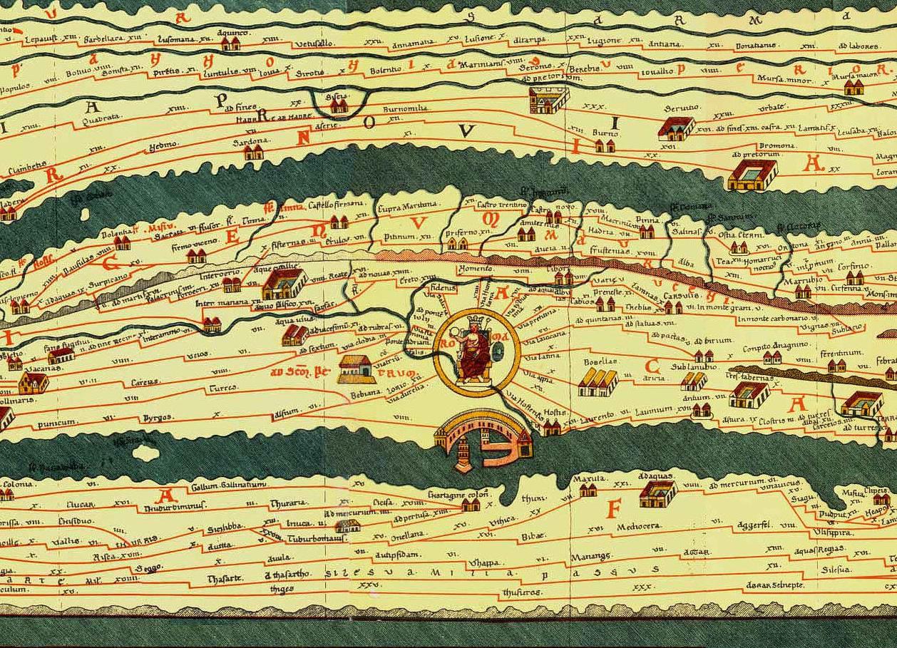
The Tabula Peutingeriana is not a map of hidden continents, but it does something almost more surreal: it turns the Roman world into a long, thin strip that unfurls like an ancient subway diagram. This medieval copy of a Roman road map shows routes from Britain through Europe, the Mediterranean, the Near East, and into parts of Asia, connecting far‑flung places that many people today still struggle to locate. Looking at it, you realize Rome had a mental map of connected lands that feels eerily global for such an early era.
Some interpretations suggest that the map hints at knowledge reaching beyond Rome’s direct control, including vague regions in far Asia that sound mythical yet might echo real geography. The truth is that Roman and later mapmakers blended verified routes with vague hearsay, stretching the known world to meet curiosity. For me, the Tabula is a reminder that “globalization” is not purely modern; the ancient world had its own networked reality, one where news, goods, and geographic tidbits traveled thousands of miles long before people had any concept of a “world map” like ours.
#11 The Fra Mauro Map: Medieval Curiosity About the Indian Ocean
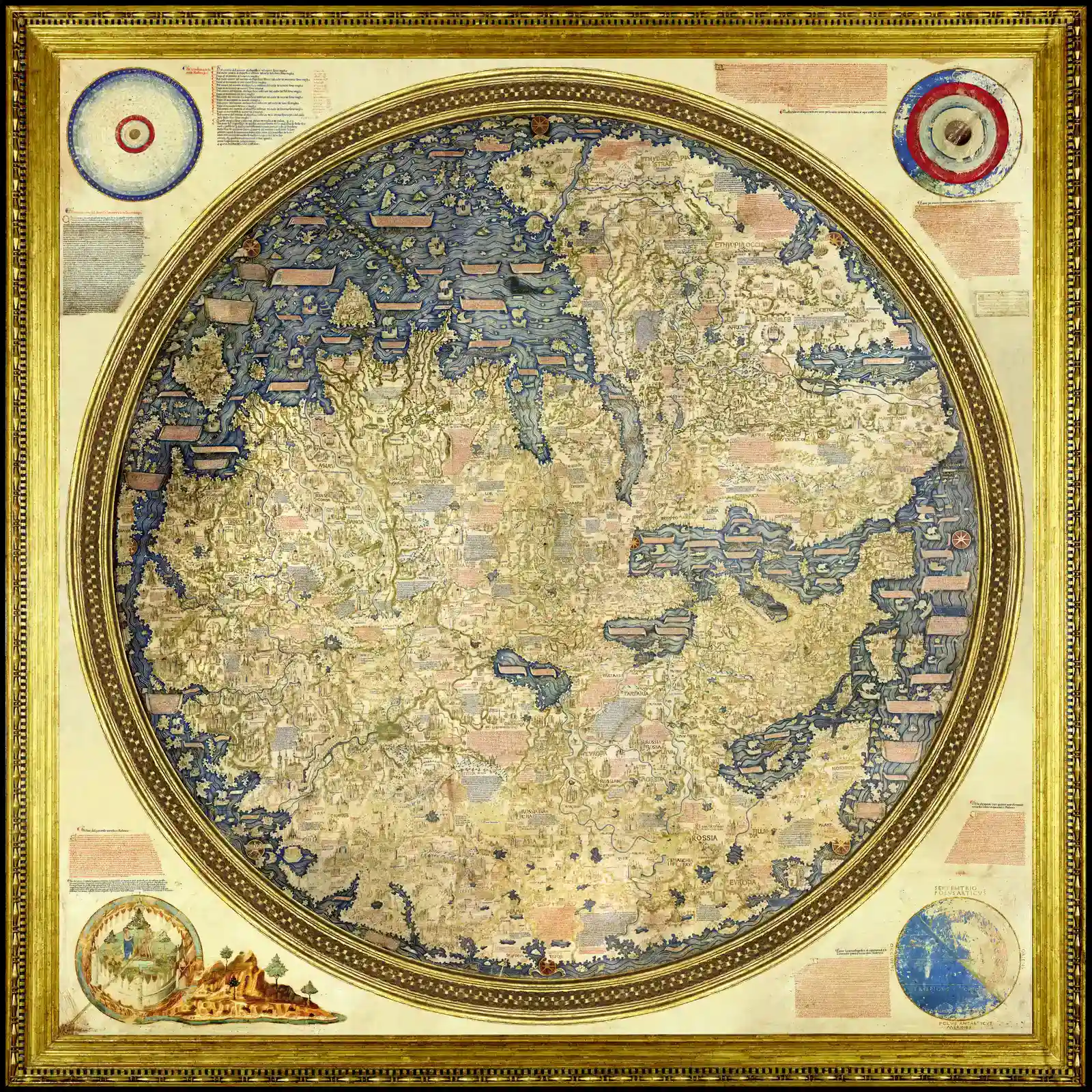
Created around the mid‑fifteenth century by the Venetian monk Fra Mauro, this massive circular map is a masterpiece of patient information‑gathering. It places south at the top and crams the parchment with notes describing lands, trade routes, and strange stories from travelers. One of its most striking features is the relatively convincing depiction of the Indian Ocean, including routes that circle Africa rather than locking it into a land‑enclosed basin as many older maps did. That feels almost prophetic, given how important the sea route around Africa would soon become for European empires.
Some commentators argue Fra Mauro’s work shows knowledge of circumnavigation of Africa before the “official” Portuguese rounding of the Cape of Good Hope. Others think it reflects accumulating rumors from Arab and possibly Chinese sailors who knew those waters far better. Either way, the map suggests that by the time Europe stepped into its big Age of Discovery, the idea of sailing around Africa was more rumor‑turned‑model than pure leap into the unknown. Personally, I see it as proof that maps can hold not just facts but the edge of what people were daring to believe might be possible.
#12 The Mercator World Map: Hidden Grids Behind Distorted Seas
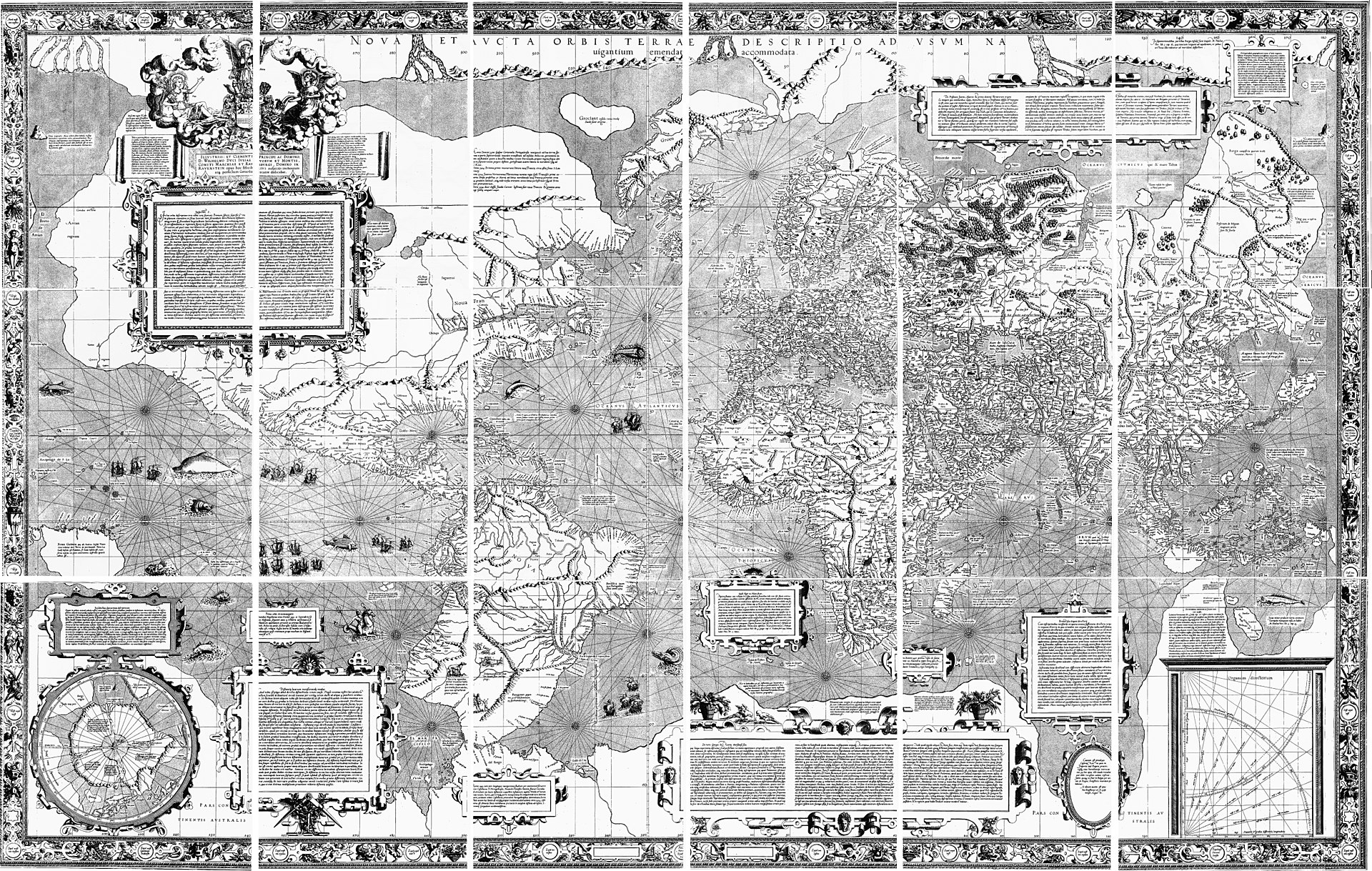
Gerardus Mercator’s 1569 world map is famous today for its huge distortions – Greenland bloated, Africa stretched – but in its own time it was revolutionary for navigation. The map’s projection allowed sailors to follow straight lines that matched constant compass bearings, turning the globe’s curves into manageable geometry. Even though many coastlines were still rough approximations, the underlying math already hinted at a more precise and gridded understanding of the planet than most people were ready for.
Some people look at how crisply certain regions are drawn and assume hidden earlier surveys or advanced techniques were quietly feeding into the work. In reality, Mercator was brutally honest about his sources, mixing the best contemporary charts with older geographic ideas and a lot of mathematical skill. What makes it feel like a “forbidden knowledge” map is that it reveals a shift in thinking: the world is not just a picture, but a system you can measure, predict, and exploit. In a way, it marks the start of maps becoming tools of control as much as tools of curiosity.
#13 The Hereford Mappa Mundi: Myths, Monsters, and Odd Geography
![#13 The Hereford Mappa Mundi: Myths, Monsters, and Odd Geography (File:Hereford Mappa Mundi 1300.jpg, notes in: 1.; 2.; 3.; [1]., CC BY-SA 3.0)](https://nvmwebsites-budwg5g9avh3epea.z03.azurefd.net/dws/945a46b8981846276145f6b8198a77b4.webp)
The Hereford Mappa Mundi, a huge medieval world map from around the late thirteenth century, seems at first like the opposite of scientific. Jerusalem sits at the center, the world is oriented with east at the top, and the parchment is crowded with biblical scenes, monstrous races, and symbolic imagery. Yet among all that allegory, you can pick out surprisingly recognizable features of Europe, North Africa, and parts of Asia. It is as if the mapmaker tried to cram both spiritual truth and physical geography into the same tight circle.
Some like to scan it for hints of lands or connections that medieval Europe “should not” have known about, but the more important insight is how knowledge and belief wove together. Medieval cartographers were not just plotting coasts; they were mapping a worldview, including stories of distant peoples and places that blended travel reports with moral lessons. For me, the Hereford map is a reminder that even when ancient or medieval maps get something eerily right, they are never just about literal terrain – they are also about what people feared, hoped, and imagined lay beyond the edges of their own experience.
#14 The Ebstorf Map: A Lost Giant That Envisioned a Whole World
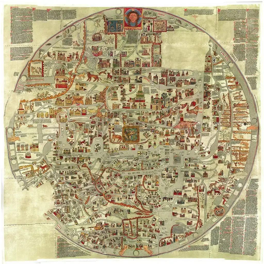
The Ebstorf Map, destroyed in the twentieth century but preserved through photographs and descriptions, was one of the largest medieval world maps ever made. Like the Hereford map, it showed the known world wrapped inside the body of Christ, with countless notes, cities, rivers, and legendary places squeezed into its surface. Within that religious framework, it still managed to sketch a surprisingly extensive Eurasian and North African geography, including routes and regions that medieval Europeans only knew from second‑hand tales.
When people talk about ancient maps revealing things humanity “wasn’t supposed to know yet,” they often mean continents or coasts. But the Ebstorf Map’s real shock factor lies in how much information medieval scholars had stitched together from travelers, merchants, and older texts. It shows an appetite for comprehensiveness that feels strangely modern: a desire to fit everything – fact, rumor, and myth – into one encompassing model. I think the loss of the original map hurts a bit because it would have been an amazing visual reminder that curiosity about the wider world thrived even in eras we stereotype as inward‑looking.
#15 The “City of the Caesars” and Phantom South American Maps
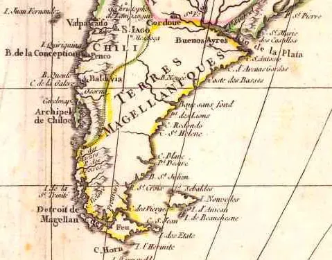
In early European maps of South America, you sometimes find half‑imagined cities and regions tucked into mountain ranges or along unexplored rivers. One of the strangest legends is the so‑called City of the Caesars, a mythical settlement somewhere in Patagonia, rich and hidden, that appeared in rumors and occasional cartographic hints for centuries. It never existed in any verifiable way, but it haunted maps much like Atlantis haunted the minds of Greek philosophers and later romantics. These ghost cities can make it look like mapmakers knew about secret places long before they were “discovered,” when in fact they were chasing illusions.
What fascinates me is how tenacious these phantom places were; once a legend made it onto a respected map, other cartographers often copied it uncritically. Over time, the ink lent those fantasies a kind of truth. I see a parallel with modern internet culture: once an idea is repeated often enough, it takes real effort to kill it, even if evidence never shows up. In that sense, these old South American maps do show us something we were not supposed to know yet – not hidden cities, but the enduring human weakness for stories that are too exciting to let go.
#16 The “Islands That Move”: Antillia, Hy‑Brasil, and Other Western Phantoms
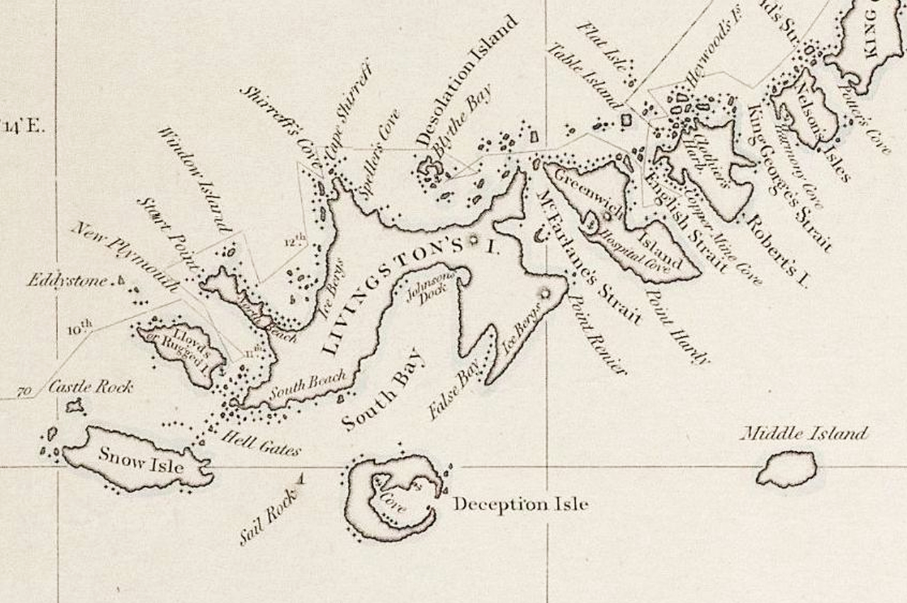
Medieval and early Renaissance maps of the Atlantic are dotted with islands that seem to drift or vanish from edition to edition. Antillia, Hy‑Brasil, St. Brendan’s Isle – these names float on the page like promises of land that never quite materialized. Sailors genuinely went looking for some of them, convinced they might stumble onto new territories rich with opportunity. When you look back at these maps now, it can feel like evidence that people somehow knew about the Americas or other western lands in a hazy, off‑target way.
In reality, these phantom islands were probably born from optical illusions, misunderstood reports, and wishful thinking, slowly solidified into “geography” because no one wanted to erase them. At the same time, their presence might have nudged more exploration. If you keep seeing an enticing island drawn just beyond the horizon, eventually someone is going to go check. To me, these maps prove something subtle: even mistakes can be strangely productive, pushing humans toward real discoveries that the original cartographers never truly foresaw.
#17 The T and O Maps: Tiny Diagrams Hinting at a Bigger Reality
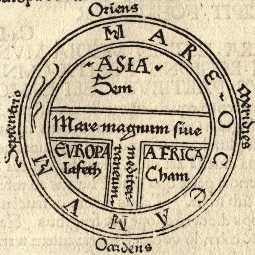
Early medieval “T and O” maps look laughably simple compared to elaborate later charts. They divide the world into three parts – Asia on top, Europe and Africa below – separated by a T-shaped arrangement of seas, all enclosed in a circular O. On the surface, they have nothing to do with secret knowledge; they are schematic, more theological than geographic. Yet tucked into these little diagrams is a powerful idea: the world is one connected unit, even if we do not yet know all its details.
When people argue about ancient maps showing lands that “should not” be known, they often miss how radical this basic mental model was. Once you believe the earth is a single coherent stage, it becomes much easier to imagine unknown regions logically filling the gaps. From my perspective, T and O maps show knowledge humans were not fully ready to act on yet: the sense that beyond the slim edges of the known world, something must be there. That quiet realization is what later made large‑scale exploration almost inevitable.
#18 The “Ancient Antarctica” Hypothesis and Our Desire for Lost Civilizations
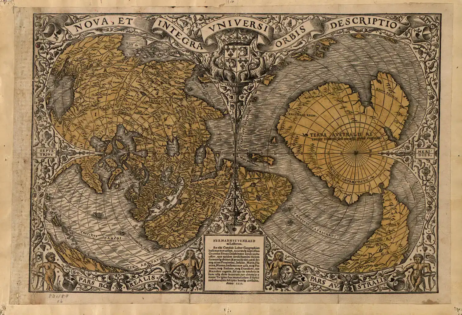
A cluster of old maps – Piri Reis, Oronce Finé, and a few others – keep getting dragged into a dramatic claim: that they show Antarctica, ice‑free and mapped by some long‑lost advanced civilization. The idea is seductive: buried beneath miles of ice lies evidence of a forgotten global culture, and only a few surviving maps hint at its existence. People pore over distorted southern blobs, tracing familiar shapes the way others see faces in clouds. It is thrilling, in the same way ghost stories are thrilling.
But when you strip away the romance and really compare these maps with modern geography, the match is never clean; most historians and geographers see them as mixtures of guesswork, mythic “southern continents,” and the natural distortion that comes from forcing a round earth onto flat parchment. I will admit, a part of me wants the wild theory to be true – who wouldn’t love a genuine lost civilization reveal? – but the evidence just does not honestly reach that bar. What these maps truly show us is something more grounded yet still profound: how fiercely humans hunger for mysteries, and how willing we are to bend old ink to fit new hopes.
Conclusion: Maps, Myths, and the Edges of What We Know
Looking across these eighteen maps, a pattern emerges that has little to do with secret empires or alien cartographers and everything to do with us. Again and again, mapmakers pushed beyond what they “should” have known, combining traveler tales, older charts, trade gossip, religious ideas, and pure imagination. Sometimes they accidentally got things uncannily right; other times they confidently drew places that never existed. What makes these maps feel almost forbidden is not that they break history, but that they expose how messy, creative, and interconnected the process of discovery really was.
My own opinion, after getting lost in this world of parchment and speculation, is that the true mystery is not whether ancient people knew about Antarctica or pre‑charted America in secret, but how quickly information could travel and transform long before modern tech. We underestimate our ancestors at our own risk. They did not have satellites, but they had time, persistence, and networks of trade and story that stitched continents together in the background. Maybe the real question these maps leave us with is not “What did they hide from us?” but “What parts of our own world are we still only half‑mapping in our minds, waiting for someone brave – or reckless – enough to draw them in?”